

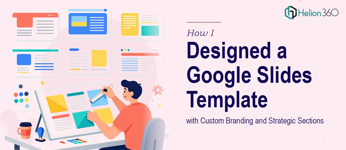
The Brief Sounded Simple Enough
We had a project launch coming up and needed a presentation ready within the week. The requirements were clear on paper — a professional Google Slides template with a consistent color scheme, clean typography, custom logos, and organized sections covering everything from the team overview to action items and a Q&A block at the end.
I figured I could knock it out in a day or two. I had used Google Slides before and understood the general structure. How hard could it be?
Where Things Started to Fall Apart
The moment I got into the actual design work, the gap between "I know how to use Google Slides" and "I can build a polished, branded template" became very obvious.
Getting the color scheme to feel cohesive across twenty-plus slides was harder than expected. Every time I adjusted one master element, something else shifted. Fonts that looked clean on one slide felt inconsistent on another. Aligning the logo placement so it sat naturally in every layout — without crowding the content — took far longer than I budgeted. And that was before I even started on the section structure.
The presentation needed dedicated sections for the introduction, project goals, timelines, milestones, team overview, key benefits, action items, and a final audience Q&A block. Each section needed its own visual identity while still feeling like part of the same deck. I was essentially building a presentation design system from scratch, and I was not equipped for that.
Reaching Out for the Right Help
After spending a full evening getting nowhere productive, I reached out to Helion360. I sent over the brand assets — the logo files, color codes, and a rough outline of the section structure — and explained what the deck needed to accomplish. Their team asked a few focused questions about the intended audience and the meeting context, then got to work.
What I noticed immediately was that they approached it as a structured design problem, not just a formatting task. They were thinking about how each section would flow into the next, how the visual hierarchy would guide the audience's attention, and how the custom branding elements would integrate without making the slides feel cluttered.
What the Final Template Looked Like
When the Google Slides template came back, it was a significant step up from where I had been struggling. The color scheme was consistent and intentional — a primary palette used for headings and section dividers, with neutral tones keeping the content areas clean and easy to read.
Each section had its own opening slide with a clear label and visual anchor, so the audience always knew where they were in the presentation. The timeline and milestones section used a visual layout that made the sequence easy to follow at a glance. The team overview slides had a structured format that balanced photos, names, and roles without feeling like a corporate directory. The Q&A and feedback section at the end was designed to feel open and inviting rather than just a blank slide with a question mark.
Typography was locked to two fonts across all slides — one for headings, one for body content — and the custom logo appeared consistently in the same position on every layout. The whole deck felt like it came from one cohesive visual system.
What I Took Away from This
Building a reusable, professionally branded Google Slides template is genuinely complex work. It is not just about making individual slides look good — it is about building a framework that holds up across dozens of different content types and use cases. The design decisions compound quickly, and without a strong foundation in presentation design, the inconsistencies add up just as fast.
For straightforward one-off slides, I can manage on my own. But for anything that needs to function as a template — something the team will actually reuse and adapt — the quality difference that comes from working with experienced presentation designers is immediately visible.
If you are in the same position, trying to build a branded Google Slides template that needs to look polished and work reliably across multiple sections, Helion360 is worth reaching out to — they handled exactly this kind of work and delivered something we could actually use.