

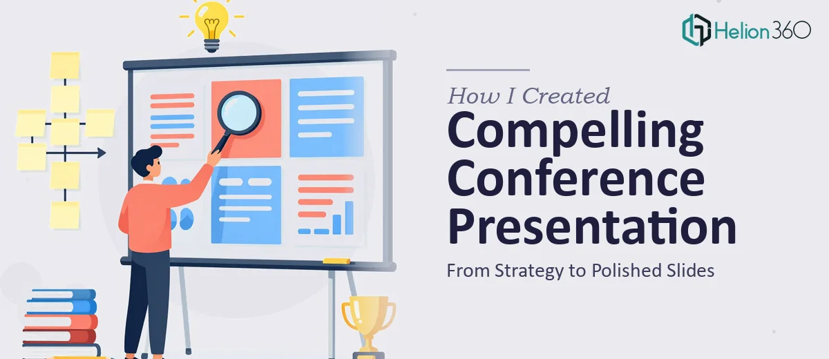
The Situation That Made Me Take This Seriously
We were in the middle of a full rebrand — new logo, updated color palette, revised typography — and an industry conference was coming up faster than anyone had accounted for. The presentation we needed wasn't just a slide deck. It was functioning as a visual brochure for the company: something attendees would see on screen during our session and potentially receive as a leave-behind artifact afterward.
The stakes were real. This was a room full of potential partners and clients seeing our new brand identity for the first time. A presentation that looked inconsistent, generic, or out of step with what we were trying to communicate would undo a lot of the work that had gone into the rebrand itself. I knew straight away this needed to be done properly — not patched together.
What I Found the Solution Actually Required
When I started mapping out what doing this well actually involved, the scope expanded quickly. A branded conference presentation isn't just a matter of swapping in a new logo and changing some colors. Done properly, it requires the visual language of the new brand to be systematically applied across every element — backgrounds, headline treatments, icon styles, chart formatting, and transitions — so that every slide feels like it came from the same place.
The first signal of real complexity was the brand consistency requirement. New brand guidelines often exist at a high level — logo usage rules, primary and secondary palettes, approved typefaces — but translating those into a working slide master with correctly configured layouts takes deliberate, detailed work.
The second signal was the dual-purpose nature of the piece. A presentation meant for live delivery and for use as a brochure-style document has competing design demands: screens need high contrast and large type, while document-style layouts need density and detail. Reconciling those two modes without producing a compromise that works poorly for both is a real design challenge, not a formatting task.
The third signal was simply the volume of slides involved and the deadline sitting right in front of us.
What the Work Actually Involves
The right approach to a branded conference presentation starts with the master slide architecture. A well-built master uses a 12-column grid system, defines no more than four brand colors in the theme palette, and establishes a strict typographic hierarchy — typically 36pt for headlines, 24pt for subheadings, and 16pt for body copy. Getting this foundation right is what makes every subsequent slide consistent without needing manual adjustment. For someone building this from scratch without an established template workflow, the master setup alone — done correctly so it propagates across all layout variants — routinely takes a full day before a single content slide is started.
Visual mechanics across the content slides introduce their own layer of complexity. Each slide type — section opener, data slide, comparison layout, text-heavy narrative slide — requires its own grid-aligned layout that still feels like part of a unified system. The decision a practitioner makes here involves choosing which content types warrant their own layout template versus which can be handled by a flexible base layout. Applying brand photography treatments, icon stroke weights, and color usage rules consistently across 30 or 40 slides requires both design judgment and disciplined execution. Small inconsistencies — a misaligned margin here, an off-brand blue there — accumulate into a presentation that feels unpolished even when individual slides look fine in isolation.
Polish and final consistency pass is where most self-managed decks fall apart. This involves checking every slide against the brand guide, verifying that no legacy colors or fonts survived from an earlier draft, ensuring that transitions and animations follow a single logic rather than a mixed bag of defaults, and confirming that the file is export-ready in both presentation mode and PDF format at the right resolution. For a deck that doubles as a conference brochure, this final pass also includes checking that text remains legible at reduced sizes and that no visual elements break when the file is viewed outside of the original design environment. This is painstaking work, and without a systematic review process already built into your workflow, it is easy to miss the details that matter most.
Why I Brought in Helion360 to Handle It
I didn't attempt to build this myself. The combination of a tight deadline, a new brand identity that needed to be applied correctly the first time, and the dual-purpose demands of the piece made it obvious that this required a team with the tooling and process already in place.
Helion360 handled the full project end-to-end — from translating the brand guidelines into a working master slide system, to building out all the content layouts, to the final consistency and export pass. What would have taken me weeks of learning curve and iteration was turned around quickly. The speed was possible because the process for exactly this kind of work — branded conference presentation design with a brochure-style output requirement — was already built into how they operate. I handed off the brief, the brand assets, and the content structure, and the work came back done.
What I'd Tell Anyone Facing the Same Decision
The result was a polished company presentation that held together visually from the first slide to the last, reflected the new brand accurately and consistently, and worked both as a live conference deck and as a document people could take away and read. The conference session landed well, and more than a few attendees commented on the quality of the materials — which, for a rebrand debut moment, is exactly the outcome that mattered.
If you're looking at a compelling company presentation — a branded conference presentation, a company profile deck, anything where visual consistency and brand accuracy are non-negotiable — and you want it handled end-to-end without the weeks of iteration it would take to get there yourself, Helion360 is the team I'd engage. They delivered fast and brought exactly the execution depth this kind of work requires.