

The Brief Was Clear, But the Execution Was Not
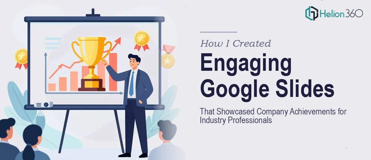
Our annual conference was coming up in a few weeks, and I had one job: put together a Google Slides presentation that would represent the company well in front of industry professionals. The deck needed to cover recent achievements, outline upcoming projects, and communicate our vision for the future — all in a way that felt organized, visually sharp, and confident.
Four days. That was the window I had to pull this together.
I started with the content. Drafting the key messages was manageable. I had internal reports to pull from, a rough narrative in my head, and a clear sense of what the audience cared about. The harder part came when I opened Google Slides and tried to turn that content into something worth presenting.
Where Things Started to Break Down
I know my way around Google Slides well enough to build a functional deck. But functional and compelling are two very different things. The slides I was putting together felt flat. The layouts were inconsistent, the font choices were clashing, and the flow from section to section did not feel like a cohesive story — it felt like a series of bullet-pointed slides stapled together.
The brief also called for interactive elements to keep the audience engaged throughout. That meant clickable navigation, smooth transitions between sections, and a structure that allowed for non-linear movement if needed. I tried a few approaches, but nothing looked polished enough for a room full of industry professionals.
Time pressure was the other factor. With the conference close and other responsibilities stacking up, spending another two days wrestling with slide design was not a realistic option.
Bringing In Helion360
After hitting a wall on the design side, I reached out to Helion360. I shared the content outline, the key messages I needed to land, the tone I was going for, and the deadline. Their team asked the right questions — about the audience, the conference setting, the brand guidelines — and got to work.
What came back was a Google Slides presentation that looked nothing like what I had started with. The structure was clear and logical, moving from achievements to upcoming projects to future vision in a way that built momentum rather than just listing information. Each section had its own visual identity while still feeling part of a unified deck.
The interactive elements were handled thoughtfully. Navigation was built in so that if questions came up mid-presentation, I could jump to a relevant section without the audience watching me scroll awkwardly through slides. The transitions were clean — nothing distracting, just smooth enough to signal a change in topic without pulling focus away from the content.
What Made the Difference
A few things stood out when I reviewed the finished deck.
The visual hierarchy was handled well. Key figures and milestones were given space to breathe rather than buried in text. The slide design reinforced the message rather than competing with it. And the pacing felt right — not too dense, not too sparse — which matters a great deal when you are presenting live to a professional audience.
The deck also held up under scrutiny. When I ran through it with colleagues before the conference, the feedback was that it looked credible and well-prepared. That kind of reaction matters when the room is full of people who see a lot of presentations.
The four-day turnaround was met. The files were delivered in the right format, fully editable, and ready to present without any last-minute fixes needed.
What I Took Away From This
Building an engaging Google Slides presentation for a professional conference is not just about putting the right content in the right order. The design, the flow, the interactive structure — all of it contributes to how the message lands. Getting those elements right under a tight deadline requires both skill and focused time, and sometimes it makes more sense to work with people who do this every day.
If you are facing a similar situation — a conference deck, a company showcase, a presentation that needs to hold the attention of a professional audience — consider company profile presentation design services. They handled the parts I could not get right on my own and delivered a presentation that was genuinely ready to perform.
For additional perspectives on this process, explore how others have tackled similar challenges: compelling company presentations that impressed investors and polished presentations for startups.