

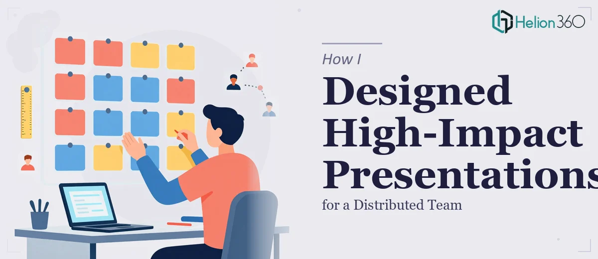
The Problem With Presentations Nobody Wanted to Open
Our team was spread across three different locations, and somewhere along the way, our PowerPoint presentations had become a collection of mismatched slides. Different fonts, inconsistent colors, varying layouts — each deck looked like it had been built by a different person in a different decade. Which, honestly, it had.
I was the one tasked with fixing it. Not because I was a designer, but because someone had to step up, and I happened to care about how things looked.
What I Tried First
I started by downloading a few free PowerPoint templates online and tried to retrofit our existing content into them. That took longer than expected, and the result still looked off. Our brand colors didn't match the template palettes, the fonts were close but not quite right, and when I shared a draft with the team, the feedback was politely brutal.
I then tried building a master slide layout from scratch using PowerPoint's Slide Master view. I had watched a few tutorials, understood the concept, but applying it cleanly across 40-plus slides with varied content types — data-heavy slides, text summaries, team introduction pages — was more complex than I had anticipated. Every time I updated the master, something else broke.
The real issue wasn't just design skill. It was the scale of the problem. We needed a consistent visual system that could work across all our presentation types, not just one cleaned-up deck.
When I Realized I Needed Outside Help
After two weeks of back-and-forth edits that weren't moving us forward, I reached out to Helion360. I explained that we had a distributed team, a loose sense of brand identity in our slides, and a pressing need to make everything look unified and professional without overwhelming our audiences with visual noise.
Their team asked the right questions from the start. What were the presentations used for? Who was the audience? Did we have existing brand guidelines? What slide count were we working with? It felt less like handing off a task and more like a proper brief.
What the Redesign Actually Involved
Helion360 started by establishing a visual foundation — a clean slide master with proper font hierarchy, a restrained color palette drawn directly from our brand, and a grid-based layout system that kept slides balanced without looking templated or generic.
From there, they worked through each presentation type we used regularly. Internal team updates got a lighter, more conversational design. Client-facing decks received a more polished, structured treatment with stronger visual emphasis on key messages. Data slides were reworked so charts and figures were readable at a glance rather than requiring the presenter to explain everything verbally.
One thing that stood out was how they handled the brand integration. It wasn't heavy-handed — the brand colors appeared in accents, headers, and icon choices rather than dominating every slide. The result felt modern and on-brand without feeling like a logo had been stamped on every corner.
What Consistent Presentation Design Actually Changes
Once the new design system was in place, something small but significant happened — our team started using the slides without modifying them. Previously, people would open a deck and immediately start tweaking fonts or colors to their personal preference. Now they didn't feel the need to, because the design already looked intentional and complete.
Presentation quality across locations became consistent for the first time. Whether a colleague in one office or another was presenting, the slides looked like they came from the same organization. That consistency built credibility in meetings and reduced the back-and-forth that used to happen before every major presentation.
The process also taught me that improving PowerPoint design at a team level isn't just about making things look better. It's about creating a shared visual language that people trust and actually use.
If your team is dealing with the same kind of slide inconsistency I was, Helion360 is worth a conversation — they handled the complexity I couldn't and delivered a design system our whole team could work with.