

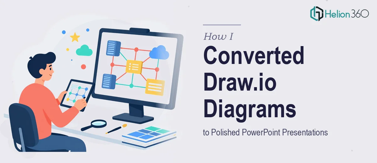
When a Simple Diagram Export Turned Into a Real Problem
It started with what seemed like a straightforward task. I had a set of network diagrams built in Draw.io — layered, detailed, with custom node shapes, color-coded connectors, and carefully arranged labels. The goal was simple: get these diagrams into PowerPoint so they could be presented to a technical and non-technical audience in the same meeting.
I figured it would take an afternoon. It took much longer than that.
The Trouble With Moving From Draw.io to PowerPoint
Draw.io is excellent for building network diagrams. It handles complex topologies cleanly, lets you layer components, and keeps everything organized. PowerPoint, on the other hand, is built for storytelling — not for housing detailed infrastructure maps. When you try to bridge the two, things start to fall apart fast.
My first attempt was to export the Draw.io diagrams as PNG images and drop them into PowerPoint slides. The result was blurry at anything above a small size, and the text inside the diagrams became unreadable on a projector. SVG export helped with sharpness, but PowerPoint's handling of SVG files is inconsistent — grouped elements broke apart, and some connectors disappeared entirely.
I then tried rebuilding the diagrams manually using PowerPoint's own shape library. That approach preserved editability, but recreating every node, connection line, label, and color accurately was enormously time-consuming. After spending several hours on just one diagram, I was maybe sixty percent done — and I had several more to go.
The layout precision was another challenge. Draw.io allows you to snap components to a grid with mathematical accuracy. Replicating that same spacing and alignment by hand in PowerPoint, especially for diagrams with dozens of elements, is genuinely difficult without a systematic method.
Bringing in the Right Support
After hitting that wall, I came across Helion360. I sent over the Draw.io files along with a brief explaining what the final PowerPoint slides needed to look like — editable shapes, consistent branding, readable labels, and a layout that matched the original diagrams as closely as possible.
Their team reviewed the files and came back with a clear plan. They would rebuild each diagram natively in PowerPoint using grouped shapes and SmartArt-compatible components, preserving the original layout logic while making everything fully editable. They also flagged a few areas in the original diagrams where the visual hierarchy was unclear and asked whether I wanted those cleaned up in the conversion — which I did.
What the Converted Slides Actually Looked Like
The turnaround was faster than I expected. When I opened the delivered PowerPoint file, the first thing I noticed was how closely the diagrams matched the Draw.io originals — same node positions, same connector routing, same color coding. But everything was now built with native PowerPoint shapes, which meant I could click on any element, change its color, move it, or update the label without breaking the diagram.
The connectors used PowerPoint's built-in elbow and curved line tools with proper arrowhead formatting, so they behaved predictably when elements were repositioned. The text was embedded directly in shapes rather than floating as separate text boxes, which kept everything clean during editing.
Helion360 also applied a consistent slide layout with proper margins and a neutral background that made the diagrams easy to read on both screens and printed handouts. A few of the more complex diagrams were split across two slides with a visual cue indicating they were connected — a practical decision that made the content far more digestible in a live presentation setting.
What I Took Away From This
Converting Draw.io network diagrams to Board Presentations is not just an export step — it is a design and technical reconstruction task. The challenge is not only visual accuracy but also maintaining the diagram's logical structure in a format that remains editable and presentation-ready. Trying to shortcut that process either with low-resolution image exports or rushed manual rebuilds leads to slides that undermine the quality of the original work.
If you are dealing with the same conversion challenge, Helion360 is worth reaching out to — they handled the technical and design complexity of this task precisely and delivered complex business ideas into visually stunning PowerPoint presentations that worked exactly as needed in a professional setting. For similar transformation needs, you might also explore how complex data can be simplified in PowerPoint presentations.