

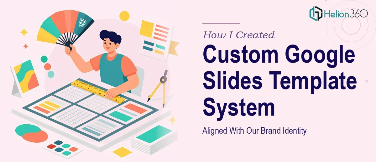
The Problem With Our Presentations Ran Deeper Than I Expected
We had a brand identity — a proper one, with defined colors, typography, and logo usage rules. But every time someone on the team opened Google Slides to build a deck, the output looked like a different company. Fonts drifted. Accent colors were guessed. Slide layouts were improvised from scratch each time, even for routine updates.
It wasn't just an aesthetic problem. We were heading into a stretch of external-facing presentations — partner briefings, a company profile deck, a few business review decks — and the inconsistency was going to be visible. The kind of visible that makes people quietly question how organized you actually are.
I recognized quickly that patching individual slides wasn't going to fix this. What was needed was a proper custom Google Slides template system — one built around our brand, usable by the whole team, and durable enough to hold up across dozens of different decks. That meant doing it right from the start.
What I Found the Solution Actually Required
I started by researching what a properly built Google Slides template system actually involves. What I found made it clear this wasn't a weekend project.
First, Google Slides has a Slide Master and Layouts system that's architecturally different from what most people use day-to-day. A well-built template doesn't just apply colors to a few slides — it programs the master so that every layout inherits the correct brand rules automatically. Done wrong, the whole system breaks the moment someone edits a slide and the formatting reverts.
Second, brand alignment in a slide template isn't just dropping in a logo. It requires building a custom theme palette with exact hex values, setting up a typographic hierarchy — typically something like 36pt for titles, 24pt for subheadings, 16pt for body — and ensuring those choices propagate through placeholder styles across every layout variant.
Third, a template system that a team will actually use needs enough layout variety to cover real use cases: title slides, section dividers, full-bleed image slides, data-heavy layouts, two-column comparison slides. Designing those thoughtfully, so they're both on-brand and genuinely usable, is real design work — not just reformatting.
I saw immediately that the gap between "a file with our colors in it" and "a system the team can rely on" was significant.
What Proper Template System Work Actually Looks Like
The structural work starts with an audit of every slide context the team will realistically need, then maps those into a master-and-layouts hierarchy. In Google Slides, the Slide Master governs global rules — background, default font stack, placeholder positioning — while individual layouts handle specific use cases like agenda slides or quote cards. Getting this hierarchy right means making deliberate decisions about which elements live at the master level versus the layout level, because a misplaced element at the wrong tier causes cascading inconsistency the moment any team member customizes a slide. This mapping phase alone requires experience with how Google Slides actually processes inheritance.
The visual mechanics involve translating a brand identity into a working theme — not just aesthetically, but technically. A properly built custom Google Slides template uses a defined palette of no more than four brand colors entered as exact hex values in the custom theme editor, a typographic scale with consistent point sizes and line spacing locked at the placeholder level, and a layout grid (typically a 12-column structure) that governs how content areas, margins, and image zones align. Setting all of this up so it holds across 15 to 20 distinct layouts, without visual drift, takes precision. Small errors — a margin off by 8px, a font weight inconsistency on a subheading placeholder — compound across a full deck and undermine the entire system.
Polish and consistency work is where template systems either earn long-term use or quietly get abandoned. Every layout needs to be stress-tested with real content: long titles, short titles, data tables, mixed-media slides. Color contrast ratios need to meet readability standards across both light and dark layout variants. Icon styles, divider rules, and caption text styles all need to be documented and locked in so a team member adding a new slide two months from now produces something that looks like it belongs. This kind of finish work — small in any individual instance, significant in aggregate — is what separates a professional template system from a well-intentioned file.
Why I Brought in Helion360 to Handle It
Once I understood what a properly built custom Google Slides template system required, I didn't spend time attempting to build it myself. The combination of technical depth, design precision, and the sheer number of layout variants to produce made it clear that the smart move was engaging a team that does this work every day.
Helion360 handled the full project end-to-end — from the initial audit of our brand guidelines and use-case mapping, through master and layout construction, to final delivery of a documented, team-ready template system. They turned it around quickly, in a fraction of the time it would have taken me to work through the learning curve alone.
What stood out was that they weren't just applying our colors to a stock template. The work involved real structural decisions about layout hierarchy, placeholder behavior, and content flexibility — the kind of execution depth that only comes from building these systems repeatedly.
The Result and What I'd Tell Anyone in the Same Spot
What we received was a complete, working Google Slides template system: a properly structured master, 18 distinct slide layouts covering every use case we'd mapped, full brand alignment across typography and color, and a simple usage guide so any team member could produce on-brand decks without needing design support.
The immediate impact was visible in the first three decks built using the system. Consistency that used to require manual correction on every slide was now the default. The team moved faster, and the output looked like it came from one company — which, of course, it does.
If you're looking at the same situation — a brand identity that isn't translating reliably into your presentations, and a team that needs a system they can actually use — Helion360 is the team I'd engage. They delivered end-to-end, fast, with the kind of execution depth this work genuinely requires.