

The Problem With Every Presentation Looking Different
After five years in digital marketing, I had built up a decent eye for visuals. But one thing that kept nagging me was how inconsistent our campaign presentations looked. Every quarter, someone on the team would pull together a deck using whatever slide layout they had saved from a previous project. The fonts changed. The color palette drifted. The logo placement was never quite right. We had a brand, but our presentations did not reflect it.
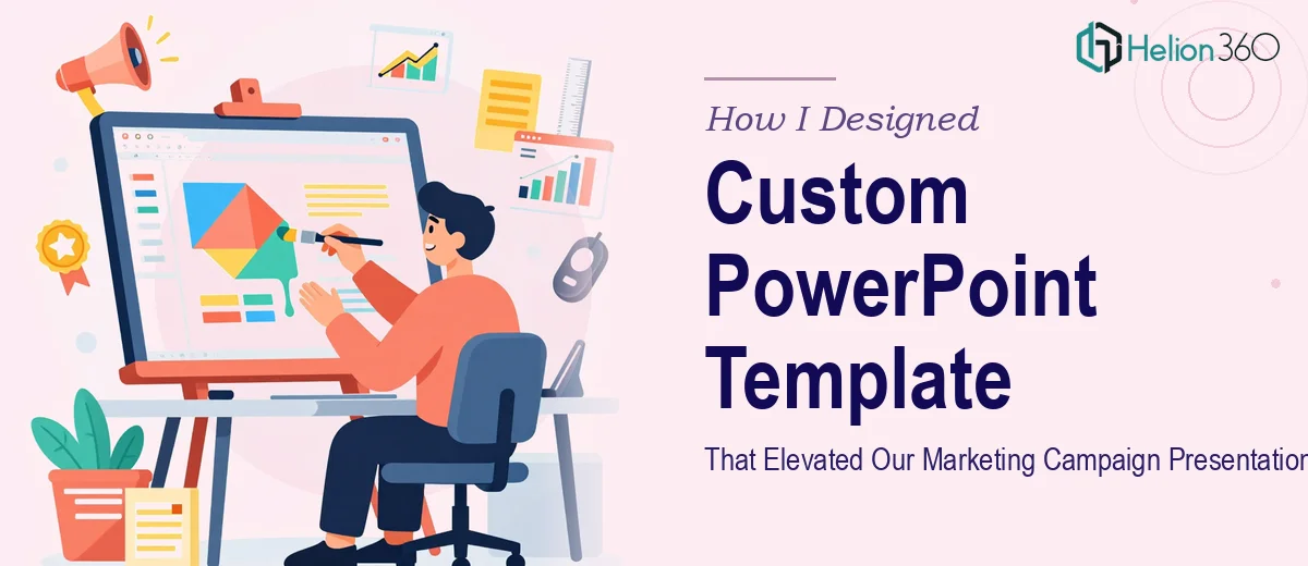
When a major campaign was coming up, I decided it was finally time to fix this properly. We needed a custom Microsoft PowerPoint template — something built around our brand guidelines, flexible enough for different presentation types, and easy enough for anyone on the team to use without breaking the design.
What I Tried Before Asking for Help
I started by digging into PowerPoint's Slide Master feature. I had used it before in a basic way, so I figured I could build something functional on my own. I set up the master layout, applied our brand colors, and added placeholder text boxes where the team could drop in their content.
It looked fine at first glance. But the more I tested it, the more cracks appeared. The font hierarchy felt off. Some layouts did not scale well when the content changed. The slide background I had designed looked sharp on my monitor but washed out when projected. And I had not accounted for different content types — a data-heavy reporting slide needed a completely different structure than an opening campaign overview slide.
I spent about three evenings trying to patch things, but the more I adjusted, the more the template started to feel patchy. It was functional but not polished. For an internal planning doc, it might have passed. For a marketing campaign presentation going in front of leadership and external partners, it was not going to hold up.
Bringing in the Right Team
After hitting that wall, I came across Helion360. I explained the situation — we needed a custom PowerPoint template built from scratch, aligned to our brand, with multiple slide layouts and a structure that a non-designer could actually work with. Their team understood the brief without needing a lot of back and forth.
They asked the right questions upfront: what were the main use cases for the template, what kind of content types would it need to support, did we have a brand guide, and what was the intended audience for most of these presentations. That conversation alone made it clear they had done this kind of work before.
What the Final Template Actually Included
The delivered template covered far more ground than what I had attempted. There was a full set of master slides with properly structured layouts — title slides, section dividers, content slides for text-heavy and visual-heavy formats, a data layout built for charts and metrics, and a closing slide with space for contact details and calls to action.
The typography was set up with a clear hierarchy so body copy, headers, and callouts each had their own defined style. The color system was locked in correctly so no one could accidentally introduce an off-brand shade. Every element — icons, spacing, margins — was consistent across all layouts.
What I appreciated most was that the template was built to be used by people who are not designers. The placeholder logic made it easy to swap in content without disrupting the layout. That had been the core problem with my earlier attempt, and Helion360 solved it cleanly.
What Changed After We Started Using It
The first campaign presentation design we built using the new template took about half the usual time. More importantly, it looked like it came from the same place as our other brand assets. Leadership noticed. A few colleagues from other teams asked where the template came from and whether they could use it too.
Beyond the visual improvement, having a proper custom PowerPoint template created a quiet kind of consistency across the team. Everyone was working from the same foundation, which meant less time fixing slides and more time focused on the actual content.
If you are in a similar position — you have the brand assets, you know what you want, but the execution keeps falling short — Helion360 is worth reaching out to. They took a messy problem and turned it into strategic PowerPoint presentations the whole team could rely on.