

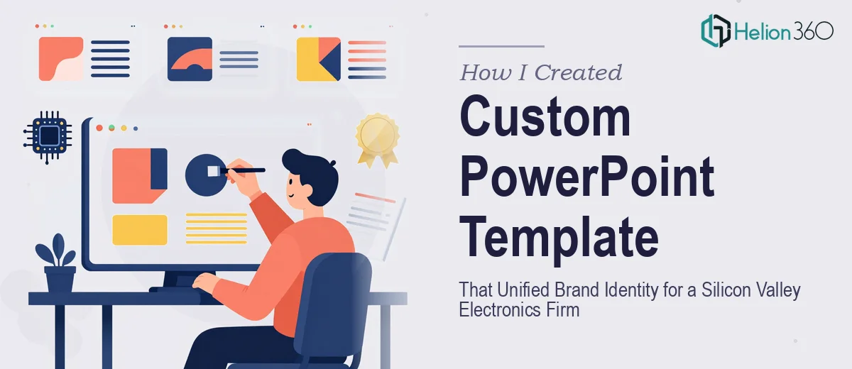
The Brief Sounded Simple Enough
When our marketing team decided it was time to consolidate all our presentation materials under one consistent look, I volunteered to take the lead. We were a fast-growing electronics company, and our slides looked like they had been made by five different people across five different years — because they had been. Investor pitches, trade show decks, product demos — none of them matched. The ask was clear: build a custom PowerPoint template that could serve every use case while keeping our brand front and center.
I figured a few days of focused work would do it.
Where It Started Getting Complicated
I started by pulling our brand guidelines and mapping out the slide types we needed — title slides, content layouts, product showcase pages, data slides, and section dividers. On paper, it was straightforward. In practice, the complexity stacked up fast.
The first issue was visual consistency across slide types. Getting the typography, spacing, and color ratios to feel cohesive across twenty-plus layouts without any single slide looking over-designed or under-designed required far more iteration than I anticipated. I was spending time tweaking margins instead of actually moving the project forward.
The second issue was adaptability. A template that works beautifully for a pitch to investors needs to flex differently when the same team uses it at a trade show or in a product demo. Building that flexibility into the master slide structure — without making the template confusing to use — was genuinely difficult to get right.
I also kept second-guessing design decisions. What felt bold and tech-forward on one slide felt cold and clinical on another. I was circling the same layouts without making real progress.
Bringing in the Right Support
After a couple of weeks of slow iteration, I reached out to Helion360. I explained what we were trying to achieve: a branded PowerPoint template that could carry our electronics company's identity across investor presentations, trade shows, and customer-facing product decks — all from a single master file.
They asked the right questions upfront. What tone did the brand carry — precise and minimal, or bold and high-energy? Which slide types were non-negotiable? Did we want editable icon sets or locked graphic elements? Those conversations shaped the direction quickly and clearly.
Their team took the brand assets I provided and built a structured template system from scratch. The master slide architecture was clean, the font hierarchy was intentional, and the color usage felt premium without being loud — which is exactly the balance a tech brand needs when pitching to serious investors or showing products on a trade show floor.
What the Final Template Actually Delivered
The completed PowerPoint template covered every scenario we had flagged. Title and transition slides carried strong visual weight. Data and comparison layouts were clean and easy to read without sacrificing brand personality. Product showcase pages gave our visuals room to breathe while keeping the company identity visible throughout.
Every layout was built inside the Slide Master, which meant our team could work from it without accidentally breaking the design. Font styles, color themes, and placeholder positions were all locked into the structure — editable where needed, protected where it mattered.
We used the template within the same week for an investor presentation, and the feedback from the room was noticeably different from previous decks. The professionalism of the slides held up the credibility of the content instead of undermining it.
What I Took Away From the Process
Building a visual brand identity is not just a design task — it is a systems task. You are building something that dozens of people will use repeatedly across high-stakes situations. Getting the structure right from the beginning saves enormous amounts of time downstream and protects brand consistency in ways that a one-off slide design simply cannot.
I also learned that the visual identity work done inside PowerPoint is just as important as anything done in a formal brand guidelines document. If your slides do not reflect your brand accurately, every presentation becomes a small erosion of the identity you are trying to build.
If your team is in a similar position — mismatched decks, no consistent template, or a template that is technically there but nobody uses because it is clunky — Helion360 is worth a conversation. They handled the complexity I could not get through alone and delivered something our whole team now actually relies on.