

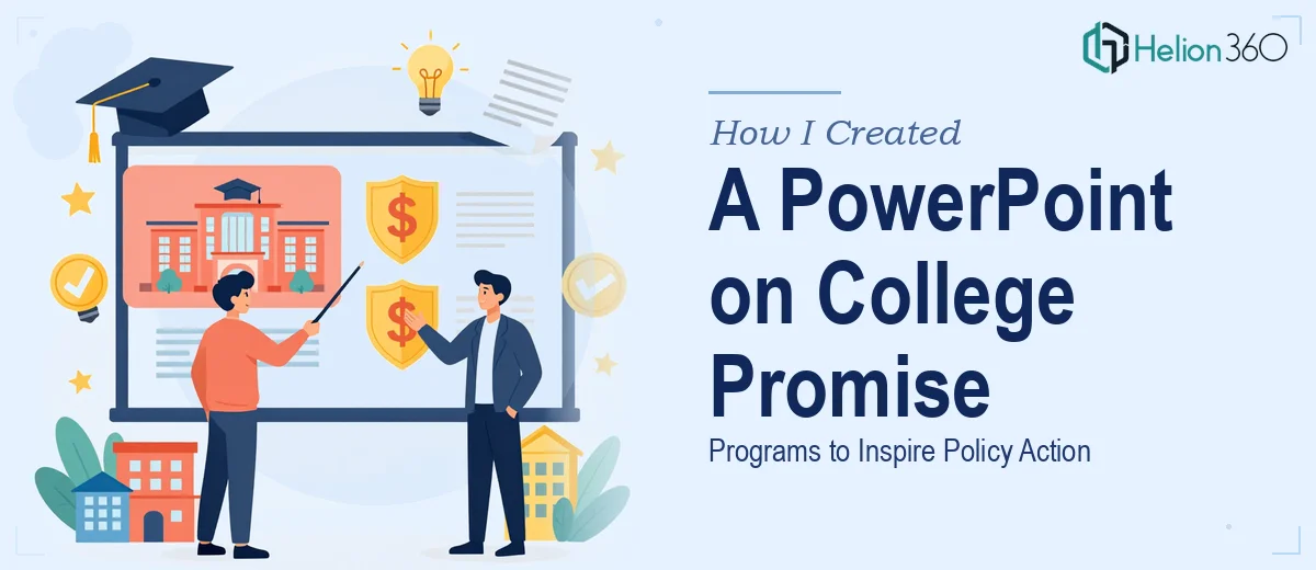
The Brief Looked Simple. It Wasn't.
I was handed a straightforward-sounding task: build a PowerPoint presentation on College Promise programs in the United States. The audience would be policymakers and community leaders. The goal was to inform, compare, and ultimately inspire action around expanding college access for students from low-income backgrounds.
I had the research. I had the content outline. On paper, it seemed manageable.
But the moment I started pulling everything together, the scope became clear. This wasn't a ten-slide overview. It needed a structured introduction explaining what college promise programs are, program-specific deep dives into initiatives like the Tennessee Promise and the California Promise Scholarship, a comparison chart pulling together eligibility criteria, funding amounts, and enrollment figures, real case studies of graduates whose lives were changed, and a final section with actionable recommendations for policymakers. That's a lot of moving parts — and every section had to hold up under scrutiny from a sophisticated audience.
Where the DIY Approach Hit Its Limits
I started building the deck myself. The content side was fine — I could write, organize, and structure. But the design is where things fell apart.
The comparison chart alone took more time than it should have. Getting the data to read clearly, without looking like a cluttered spreadsheet pasted onto a slide, required a level of visual thinking I didn't have bandwidth for. The case study slides needed a format that balanced personal stories with broader impact data — something that felt human but still professional. And the policy recommendation section needed to be persuasive without looking like a wall of text.
Every time I thought I had a slide sorted, I'd look at it again and realize it wasn't going to land the way it needed to with this audience.
Bringing in the Right Support
After a few days of back-and-forth on the design, I reached out to Helion360. I shared the full brief — the content structure, the audience profile, the tone I was going for — and their team took it from there.
What I noticed immediately was that they didn't just take my rough slides and clean them up. They asked the right questions about how the comparison chart should read, which data points mattered most, and how the case study section should flow relative to the policy recommendations. That back-and-forth made the final output much sharper than what I had been building alone.
What the Final Presentation Covered
The finished deck opened with a clear, visually grounded introduction to what college promise programs are and why they matter at a national level. From there, it moved through specific programs with enough detail to be substantive — eligibility requirements, funding structures, how the application process works for students — without overwhelming the audience.
The comparison chart came out clean and scannable, exactly what a policy audience needs when they're weighing programs against each other. The case study slides felt real — they told individual stories without losing sight of the data behind them. And the recommendations section was formatted in a way that made the ask clear without being preachy.
Helion360 also kept the visual language consistent throughout, which matters more than people realize in a presentation like this. When every slide feels like it belongs to the same document, the audience stays focused on the content rather than adjusting to a new layout every few slides.
What I Took Away From This
The content of a policy presentation is only half the work. The other half is making sure the structure and design carry that content to the audience without friction. A comparison of programs like Tennessee Promise, the Obama-Biden College Promise, and the California Promise Scholarship sounds dry on paper — but presented well, with the right visual hierarchy and storytelling around real graduates, it becomes genuinely compelling.
I also learned that knowing when a project needs specialized design support is its own skill. The presentation needed to inspire action, and that's not something a cluttered slide deck can do, no matter how good the research behind it is.
If you're working on a similar presentation — one where the content is solid but the design and structure need to match a high-stakes audience — Helion360 is worth reaching out to. They handled the parts I couldn't and delivered something the audience could actually act on.
For more on how visual design transforms complex data into compelling narratives, explore our product management case study presentations with KPI analysis and strategic insights.