

The Brief Sounded Simple. The Execution Was Not.
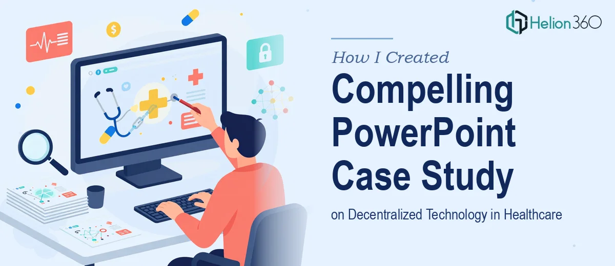
I had a clear goal on paper: put together a set of PowerPoint case studies showcasing how decentralized technology is being used in healthcare. Think blockchain for patient data security, distributed systems for supply chain management, and interoperability solutions connecting fragmented health systems.
The audience was professional and informed, so the bar was high. The presentation needed to be both technically credible and visually clear — the kind of deck that holds attention in a boardroom and leaves no room for vague slides.
I figured I could handle most of it. I had the subject knowledge and a rough structure in mind. What I underestimated was the complexity of turning dense, technical real-world implementations into slides that actually communicate.
Where the Work Started Piling Up
The research phase alone took longer than expected. Each case study required pulling together verified, real-world examples — not generic blockchain claims, but actual documented deployments in healthcare settings. Supply chain traceability for pharmaceuticals, patient consent management on distributed ledgers, cross-hospital data sharing protocols — each of these needed context, outcomes, and a narrative arc.
Once I had the research, the next challenge was structure. A healthcare PowerPoint case study is not just a data dump. It needs a clear problem-solution-outcome flow, and that flow has to work visually. I started drafting in PowerPoint and quickly hit a wall. The slides looked cluttered. The technical depth was there, but the visual clarity was not. Dense text blocks, inconsistent layouts, charts that needed redesigning — it was a lot to fix while also managing the content itself.
The case studies also needed to span multiple topics without feeling disconnected. Patient data security with blockchain, supply chain visibility, and interoperability between health systems are related but distinct problems. Getting a coherent visual thread through all of them, while keeping each case study standalone, was harder than I expected.
Bringing in the Right Team
After spending too many hours trying to balance research, writing, and design simultaneously, I reached out to Helion360. I explained the scope — multiple healthcare case studies, technical subject matter, professional audience, and a need for consistent visual storytelling across the whole deck.
Their team took over the presentation design side while I focused on finalizing the content. What stood out was how quickly they understood the structure I was working toward. They asked the right questions about audience, tone, and the level of visual detail each case study needed.
What the Final Deck Looked Like
The result was a clean, well-structured PowerPoint series that covered three primary case studies. Each one followed a consistent layout: the problem context, the decentralized technology solution applied, key outcomes, and a visual summary.
The blockchain and supply chain section used a clear process flow diagram to show how pharmaceutical tracking works across distributed nodes. The patient data security case study used a before-and-after structure to contrast traditional centralized storage with a decentralized consent model. The interoperability case study used a network diagram to show how fragmented hospital systems connect through a shared distributed layer.
Helion360 handled the visual logic — making sure diagrams were readable, color-coded appropriately, and scaled correctly for presentation. The typography hierarchy was consistent throughout, and the overall slide design felt polished without being over-designed.
What I Took Away From This
Building a PowerPoint case study on decentralized technology in healthcare is not just a design task or a research task — it is both, happening at the same time. The content has to be accurate and the visuals have to carry the technical story. When those two things are not in sync, the slides fall flat regardless of how good the underlying research is.
Splitting the responsibilities made a real difference. The content was stronger because I was not distracted by layout problems, and the design was stronger because Helion360 was not guessing at what the content needed to say.
If you are working on a similar presentation — technical subject matter, professional audience, multiple case studies to organize — Helion360 is worth reaching out to. They stepped in at the point where the work was getting too complex to manage alone and delivered exactly the kind of presentation the brief called for.