

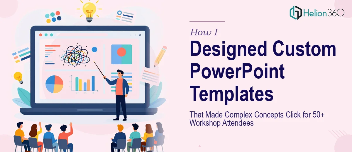
When a Workshop Needs More Than a Generic Slide Deck
I was putting together a professional development workshop for our team — roughly 50 people across different departments, each with a different level of familiarity with the subject matter. The goal was to help everyone walk away with a clear understanding of some fairly layered concepts around process improvement and cross-functional communication.
I figured I could handle the presentation design myself. I knew what content needed to go in, I had the structure mapped out, and I had PowerPoint open in front of me. How hard could it be?
Harder than I expected, it turned out.
The Problem With Building From Scratch
The first thing I noticed was that generic PowerPoint templates just did not work for what I needed. The default layouts were either too plain to hold attention or too flashy without actually improving clarity. I needed something in between — visually structured enough to guide the audience through dense material, but clean enough not to distract from the content itself.
I spent a couple of evenings trying to build custom slide layouts. I was adjusting master slides, experimenting with font pairings, trying to figure out how to create reusable section headers and consistent icon placement. The results were inconsistent. Some slides looked fine in isolation but fell apart when viewed as a sequence. The visual language was not holding together.
And the clock was ticking. The workshop was a week out. I needed not just one presentation but a few separate slideshows covering different modules — each one needing its own flow while still looking like part of the same workshop series.
Bringing in the Right Support
That is when I reached out to Helion360. I explained the situation — the workshop timeline, the number of attendees, the number of modules, and the fact that I needed presentation design that would actually help people absorb the content rather than just look polished on the screen.
They asked the right questions from the start. What was the learning objective of each module? Who was the audience? Was this being presented live, or would attendees be reviewing the slides independently afterward? That kind of thinking told me they were approaching it as a communication problem, not just a visual design task.
What the Custom Templates Actually Delivered
Helion360 built a set of custom PowerPoint templates specifically structured for a workshop format. Each template had clearly defined content zones — areas for key concepts, supporting examples, reflection prompts, and visual summaries. The slide master was set up so that anyone on my team could drop in content without breaking the layout.
The design was cohesive across all modules. Same font system, same color logic, same icon style — but each module had a subtle visual distinction so attendees could immediately tell which section they were in. That kind of detail sounds minor, but it made a real difference in how people navigated the material during the session.
The slides also made the complex concepts far more digestible. Dense ideas that I had been struggling to represent visually were broken into clean two- or three-step visual flows. Data points that needed context were framed with simple supporting graphics rather than raw numbers floating on a slide.
How the Workshop Landed
The day of the workshop, the difference was obvious. People were engaged. I did not have to spend time re-explaining concepts because the slides were doing that work alongside me. A few attendees specifically commented that the presentations were easy to follow — which, given the complexity of the content, was exactly what I had been hoping for.
I also kept the templates after the workshop. They are now part of our internal library for future training sessions, which means the investment paid off well beyond that single event.
What This Taught Me About Presentation Design
I came out of this experience with a much clearer understanding of what custom PowerPoint templates actually do. They are not just about aesthetics. A well-designed template structures how information is delivered — it helps the presenter stay organized and helps the audience stay oriented. When that structure is missing, even good content can fail to land.
Building that kind of template from scratch requires a specific set of design skills that most people simply do not use day-to-day. Knowing that, I would not hesitate to bring in support earlier next time.
If you are preparing a workshop or training series and running into the same wall I hit, Helion360 is worth reaching out to — they understood exactly what the complex data visualizations needed to accomplish and delivered something that genuinely worked.