

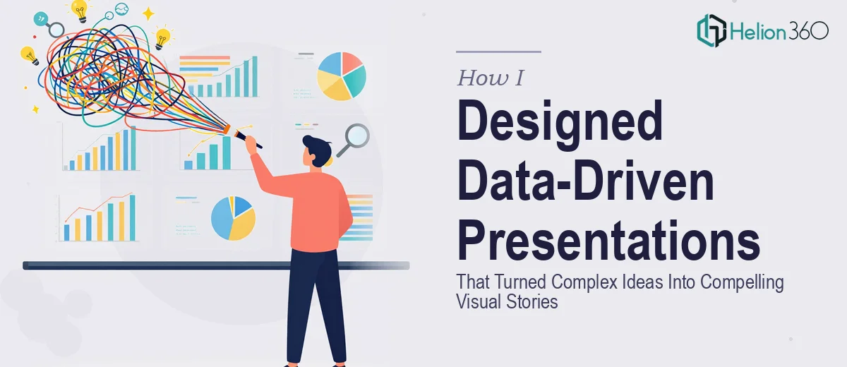
When the Data Was Clear But the Story Wasn't
I was working with a tech startup that had strong numbers, a solid product, and a clear value proposition — but every time we tried to put it all into a presentation, something fell flat. The slides looked like a spreadsheet that had been stretched across a canvas. Dense text, raw data tables, and technical diagrams that made sense to our engineering team but left potential clients blinking.
The brief was straightforward enough: create a professional presentation that would work in both partner meetings and investor conversations. But straightforward briefs can hide complicated execution.
The Real Challenge With Data-Driven Presentation Design
I started by pulling everything together — product metrics, market positioning, feature breakdowns, growth projections. I had the content. What I was missing was the visual framework to make it land.
I tried restructuring the slide order, simplifying charts, and swapping out tables for icons. Some slides improved. But the deck still felt like a collection of facts rather than a cohesive story. The problem was not the data itself — it was the logic connecting it all visually. Presentation design that works at this level requires more than layout skills. It requires knowing how to direct attention, build narrative across slides, and translate technical information into something an audience can absorb quickly.
I could design individual slides reasonably well. Designing a complete, data-driven deck that communicated a brand story clearly — that was a different task entirely.
Bringing In the Right Support
After a few rounds of rework that were not moving the needle, I reached out to Helion360. I explained the situation: a tech startup, complex product data, multiple audience types, and a deck that needed to work visually without sacrificing accuracy.
Their team asked the right questions upfront — about the primary audience, the tone we wanted, which data points were non-negotiable, and where we wanted people to feel something versus just understand something. That distinction mattered more than I had realized.
From there, they took over the full presentation design process. I shared the raw content, the brand guidelines, and a few reference decks we liked. They handled the rest.
What the Final Deck Actually Did Differently
When I saw the first draft, the difference was immediately obvious. The visual storytelling was structured — each section had a clear purpose, and the data was presented in a way that supported the narrative rather than interrupting it. Charts were simplified and annotated to highlight the specific insight, not just the numbers. Complex product flows were turned into clean diagrams that a non-technical audience could follow in seconds.
The slide design itself was professional but not generic. It felt like the startup — modern, confident, grounded in real data. The branding was consistent throughout, which is something I had struggled to maintain when building slides individually.
Helion360 also reorganized the flow in a way I had not considered. They moved the market opportunity section earlier, which immediately gave the data context before we introduced the product details. Small structural decisions like that changed how the whole deck read.
What This Experience Taught Me About Presentation Design
The biggest lesson was understanding where the complexity actually lives in professional presentation design. It is not in knowing PowerPoint or having an eye for layout — it is in knowing how to serve information in a sequence that builds understanding and trust. That is a craft that takes time and experience to develop.
Data-driven presentations are particularly difficult because they have to be precise and compelling at the same time. Too much precision and the audience disengages. Too much simplification and you lose credibility. Getting that balance right across fifteen or twenty slides, consistently, is hard work.
I also came away with a much better understanding of what makes visual storytelling effective in a business context. It is not about making things look beautiful — it is about making the right information visible at the right moment.
If you are working on a complex presentation and finding that the content is solid but the deck is not doing it justice, Helion360 is worth reaching out to — they are particularly good at taking technical, data-heavy material and turning it into something an audience will actually remember.