

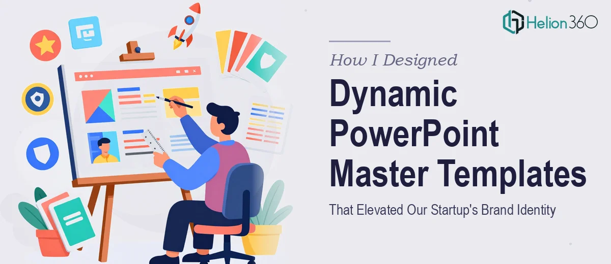
When Every Presentation Looked Like It Came from a Different Company
We were a growing tech startup with big ambitions, and our presentations showed the opposite. Every deck looked slightly different. Fonts clashed. Brand colors were inconsistent. Some slides had our logo in the corner, others did not. When we started preparing for client meetings and investor conversations, the visual inconsistency became impossible to ignore.
I took it upon myself to fix the problem. The plan seemed straightforward: build a solid PowerPoint master template that the entire team could use, one that reflected our brand identity properly and made every slide feel intentional.
What I Tried to Build on My Own
I had a working knowledge of PowerPoint and understood the basics of the Slide Master. I started by setting up layouts, defining fonts, and dropping in our color palette. I also tried to build dynamic layouts — title slides, content slides, section dividers — that would give the team flexibility without letting things go off-brand.
But the more I worked on it, the more I realized how deep this rabbit hole went. Slide Master design is not just about placing a logo and picking colors. It is about building a system — one where every layout works together, placeholder behavior is logical, and the template actually stays consistent when someone edits it under real-world pressure.
I kept running into issues. Some layouts broke when text overflowed. Others looked fine in the master view but rendered differently when applied. The template was not behaving the way a professionally built PowerPoint template should. And with a deadline approaching, I knew I needed a different approach.
Bringing in a Team That Knew the System
After hitting a wall, I came across Helion360. I explained where I was in the process — what I had started, what was breaking, and what the end goal looked like. Their team took one look at the brief and immediately understood the scope. They had done this before, specifically for startups trying to establish a coherent visual brand identity across all their communications.
I shared our brand guidelines, color codes, typography, and a rough outline of the slide types we needed. From there, the Helion360 team handled everything. They built the PowerPoint master template from the ground up, applying proper Slide Master architecture with clearly named layouts, locked design elements, and editable content zones that actually worked the way they were supposed to.
What a Well-Built Master Template Actually Looks Like
When the finished template came back, the difference was immediate. Every layout had a clear purpose. The title slide, agenda slide, content layouts, and closing slide all felt like part of the same visual family. Our brand colors were applied correctly across backgrounds, accent lines, and icon placeholders. The typography hierarchy was clean — headings, subheadings, and body text each had their own defined style.
What impressed me most was the dynamic quality of the layouts. Content areas resized gracefully. Placeholder labels were descriptive, so anyone on the team could open the file and understand how to use it without instructions. The template was also built in a way that protected key design elements from accidental edits, which had been a persistent problem before.
What This Did for the Team
Once we rolled out the new master template internally, the difference in our team's output was noticeable within days. Presentations stopped looking like patchwork. Client-facing decks felt polished without requiring extra design effort from people who were not designers. The template did the heavy lifting, and the team just focused on the content.
For a startup that is still building its visual brand identity, having a consistent PowerPoint master template is not a nice-to-have. It is a foundation. It signals to investors, partners, and clients that the company is organized and takes its communication seriously.
If your team is in the same situation — decks that look inconsistent, a template that keeps breaking, or a brand identity that is not translating into your presentations — Helion360 is worth reaching out to. They understood the problem quickly, built the system properly, and delivered something the whole team could actually use.