

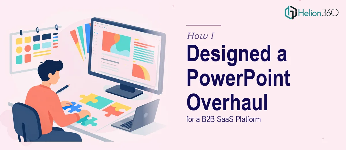
When the Old Templates Just Stopped Working
We had a product worth presenting. The problem was that the slides we were using to present it told a different story — one from two brand iterations ago. The typography was off, the color palette had drifted from our current guidelines, and the layouts felt clunky on widescreen displays. Every time someone on the team pulled up the deck for a demo or a meeting, there was a quiet moment of embarrassment before the first slide even loaded.
This was a B2B SaaS platform with a real story to tell — features, integrations, customer outcomes, product roadmaps. The content was solid. The packaging was not.
What I Tried to Fix on My Own
I started by going through the existing PowerPoint files and trying to update them manually. I adjusted fonts, swapped out old logo files, and tried to rework the slide master to reflect the updated brand colors. On paper, that should have been enough.
In practice, it was a mess. The slide master changes weren't applying consistently across all layouts. Some slides had embedded elements that were locked to older formatting. The data slides — the ones with charts, comparison tables, and feature breakdowns — needed to be rebuilt almost entirely rather than just reskinned. And once I started pulling at one thread, I realized how deeply the outdated design was woven into every layout.
Beyond the technical issues, there was a bigger problem: I didn't have a clear system for what the new templates should look like. We had brand guidelines, but turning those guidelines into a full library of reusable PowerPoint slide templates for a B2B SaaS context — covering everything from product overviews to ROI slides to competitive matrices — was a different kind of work.
Bringing in the Right Help
After a few frustrating days of partial fixes and inconsistent results, I came across Helion360. I explained what we were working with — an outdated deck, a refreshed brand identity, and a need for a complete set of presentation templates that the team could actually use going forward. Their team asked the right questions upfront: how many slide types did we need, what were the primary use cases, and did we have the brand guidelines documented.
We did have the guidelines. From there, Helion360 took over the build entirely.
What the Redesign Actually Involved
The scope was larger than I had initially framed it. This wasn't just a visual refresh — it was a full PowerPoint template system designed around how the team actually used presentations.
The team rebuilt the slide master from scratch, setting up properly structured layouts for title slides, section dividers, content slides, data-heavy slides, and closing screens. Every layout was tied to the brand color system, with typography set at the master level so nothing could drift out of alignment. The data slides — which were the hardest part — were redesigned with clean chart placeholders and table structures that could be updated without breaking the visual hierarchy.
They also created a set of supporting graphic elements: icon styles, callout boxes, timeline structures, and comparison frameworks. These weren't decorative. They were functional components that could be dropped into any slide and would always look consistent with the rest of the deck.
The result was a complete, brand-aligned presentation template library that any team member could pick up and use without a design background.
What Changed After the Overhaul
The difference was immediate. The first time someone used the new templates for a product demo, there were no apologies before the first slide. The deck looked current, professional, and consistent with everything else the brand was putting out. Data slides that used to be a wall of numbers now had clear visual structure. Section transitions gave the presentation a flow it had never had before.
More practically, the new template system saved time. Because the layouts were built correctly at the master level, updating content didn't require constant reformatting. The team could focus on what the slides needed to say rather than how to make them look acceptable.
If your presentation materials have fallen behind your brand or your team is wasting time fighting with broken templates, Marketing Presentation Design Services can help — they handled the full scope of what I couldn't and delivered a system that actually works in practice.