

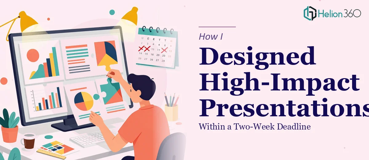
The Brief Looked Straightforward — Until It Wasn't
When the marketing team handed me the brief, I assumed it would be manageable. A series of PowerPoint presentations for an upcoming product launch campaign, all content provided, two weeks to deliver. I had done presentation work before, so I figured I could handle the design end without too much friction.
The reality was different. The campaign had multiple audience segments, each requiring a tailored narrative. The brand guidelines were detailed — specific color palettes, typography rules, icon systems — and the content, while provided, needed to be structured and laid out in a way that actually communicated something. It was not just about making slides look clean. The presentations had to work as a visual story from the first slide to the last.
Where Things Started to Get Complicated
I spent the first few days trying to build a master slide template that could work across all versions. But every time I adapted it for a different section, something broke — the visual hierarchy would collapse, or the color balance would feel off against a particular background. I also kept running into a fundamental tension: the content was heavy, but the slides needed to feel light and focused.
Beyond aesthetics, I realized I was spending too much time on formatting decisions that should have taken minutes. Aligning text boxes, scaling charts to fit without losing readability, getting transitions to feel purposeful rather than distracting — each of these was pulling time away from the bigger picture. And with a two-week deadline for a multi-deck marketing presentation project, time was the one thing I did not have to waste.
Bringing In the Right Support
After hitting that wall around day four, I reached out to Helion360. I explained the scope — multiple presentation decks, a live brand guide, provided content that needed visual structure, and a firm deadline. They asked the right questions upfront: about the campaign tone, the audience, which slides needed the most visual weight, and how the decks would be delivered and used.
That intake conversation alone told me they understood marketing presentation design at a level beyond basic slide formatting. They were thinking about how the content would land with an audience, not just how it would look on a screen.
What the Finished Presentations Actually Looked Like
Helion360 built the presentations with a clear visual system — a consistent layout grid, a hierarchy that made every slide easy to scan, and design choices that matched the campaign's energy without overpowering the message. Charts and data points were presented as clean infographics rather than raw tables. Section transitions had purpose. The cover slides were strong enough to set the tone immediately.
What I noticed most was the consistency. Across all the decks, the branding held. Colors, spacing, font usage — everything tracked back to the guidelines without feeling rigid or mechanical. It read like a campaign, not a collection of separate files.
We went through one round of revisions, mostly minor adjustments around specific slides where I wanted the emphasis shifted. The final files came back clean, properly named, and ready to present.
What This Project Taught Me About Presentation Design
Good marketing presentation design is not a visual exercise alone. It is about understanding what each slide needs to do — what decision it supports, what feeling it creates, what information the audience actually needs at that moment. That requires both design skill and a functional understanding of how campaign communication works.
I also learned that trying to do everything under deadline pressure rarely produces the best result. The two-week window felt tight when I was working alone. With the right team handling the design execution, it became completely manageable — and the output quality was higher than what I would have produced under the same pressure.
If you are working on a marketing campaign presentation and the complexity is outpacing your available time, Helion360 is worth reaching out to — they handled the full design workload here and delivered exactly what the campaign needed.