

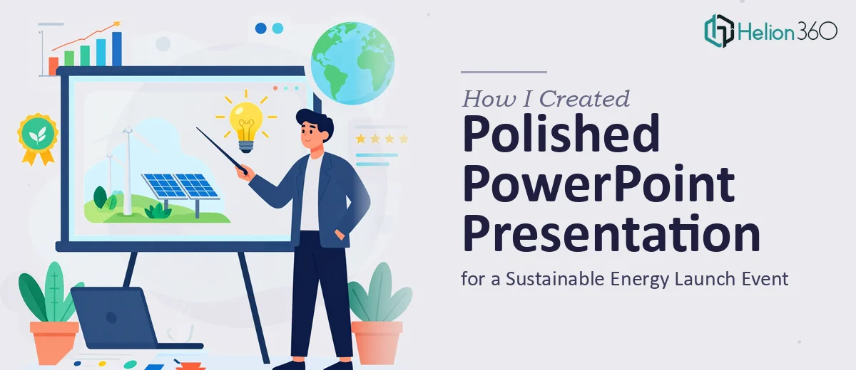
A Launch Event, a Tight Deadline, and a High-Stakes Audience
We had a major product launch coming up — a presentation that needed to introduce our latest innovations in sustainable energy technology to a room full of investors and key stakeholders. The content was ready. The story was clear. What we needed was a PowerPoint presentation that looked as credible as the work behind it.
I figured I could pull it together myself. I had a general sense of the slides we needed, the data we wanted to show, and the visual tone we were going for. I opened PowerPoint, started building, and that is when I realized how far off I was from where we needed to be.
Where Things Started to Break Down
The data we were presenting was genuinely complex. Energy output comparisons, efficiency metrics across product lines, market adoption projections — these were not simple bar charts. They needed to be translated into visuals that a non-technical investor could scan quickly and understand immediately.
I spent most of a morning trying to build one chart section. The numbers were accurate, but the visualization looked cluttered. I tried simplifying it, which then made it look incomplete. I moved to the design side and ran into the same problem — our brand colors and fonts were not creating anything that felt polished or investor-ready.
With Friday as the hard deadline, I was not going to have time to get this right on my own. This was not about effort. The work required a level of design skill and speed that I did not have.
Bringing in the Right Support
After hitting that wall, I reached out to Helion360. I explained the situation — the event date, the audience, the kind of data we needed visualized, and the overall tone we wanted. Their team asked the right questions and quickly got a clear picture of what the deck needed to accomplish.
What struck me early on was how structured their process was. They did not just take the slides and clean them up visually. They looked at the content flow, identified where the narrative could be tightened, and flagged which data sections needed rethinking before any design work happened.
What the Final Presentation Looked Like
The version that came back was a significant step up from what I had started. The data visualization work was especially strong. Charts that had felt dense and confusing were now clear, well-labeled, and visually weighted so the most important numbers stood out first. The sustainable energy technology story came through in a way that felt both informative and genuinely compelling.
Slide by slide, the design held together. The layout was consistent, the typography was clean, and the graphics reinforced the content rather than competing with it. It looked like a presentation built for the audience it was meant to impress — not just a PowerPoint that happened to have good content inside it.
We delivered it on time. The feedback from the room was strong. Several stakeholders specifically commented on how easy the slides were to follow.
What I Took Away From This
The biggest lesson was understanding where my bandwidth ended and where professional presentation design actually added value. I can write a narrative and organize content. What I cannot do quickly — or well — is translate complex data into clean, investor-ready visuals while also managing layout, branding, and consistency across twenty-plus slides.
For a high-stakes event like a product launch, that gap matters. A rough-looking deck at the wrong moment can undercut work that took months to develop.
Presentation design for launch events is its own discipline. It combines visual design, data storytelling, and audience awareness in a way that takes real experience to execute well — especially under time pressure.
If you are preparing for a similar situation — a product launch, an investor briefing, or any event where the stakes are high and the timeline is short — Helion360 is worth reaching out to. They handled the work I could not get right on my own, and they delivered it with time to spare.
See how others have tackled similar challenges: learn from how I designed a polished product launch presentation in 36 hours and explore strategies in interactive PowerPoint presentation design.