

When the Brief Says 'Make the Complex Simple'
I was brought into a project for a digital marketing agency that specialized in AdTech solutions. Their business revolved around programmatic advertising, demand-side platforms, and real-time bidding — concepts that are genuinely difficult to explain, even to people in the industry. The brief was straightforward on paper: create visuals that communicate these ideas to potential clients and partners.
In practice, it was anything but straightforward.
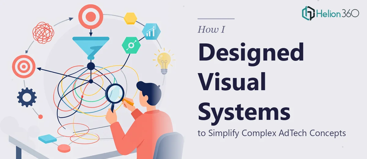
The challenge was not just designing something that looked polished. It was designing something that actually taught. Every visual had to carry meaning — the flow of data, the logic of targeting, the layers of an ad ecosystem. Abstract ideas needed to become intuitive diagrams, infographics, and presentation graphics that a non-technical stakeholder could follow in sixty seconds.
Where Self-Managing the Design Work Started to Break Down
I started by sketching out a visual language — icon sets, flow diagrams, system maps. I had a working knowledge of Adobe Illustrator and a clear enough understanding of color theory and typography to build something coherent. The early concepts had promise.
But as the scope expanded, the cracks started showing. The agency needed assets across multiple formats: presentation slides, one-pagers, infographics for sales conversations, and campaign-level graphics. Each format had different layout constraints. Maintaining visual consistency across all of them while also refining the core concept illustrations became a full-time job on its own — layered on top of everything else the project demanded.
I also kept running into a specific problem: the more technically accurate I tried to make a diagram, the less visually clean it became. And the cleaner I made it, the more it lost the nuance the team needed. Striking that balance consistently, across dozens of assets, was genuinely hard.
Bringing in the Right Support
At that point I reached out to Helion360. I explained the project — the AdTech context, the visual storytelling goals, the format requirements, and the consistency problem I was running into. Their team understood the brief immediately and did not need much hand-holding to get started.
What they delivered was a cohesive visual system rather than a collection of individual graphics. They built out a set of reusable design components — iconography, color-coded data layers, diagram frameworks — that could be adapted across formats without losing consistency. The infographics explaining technical concepts like programmatic bidding and audience segmentation were clear, structured, and visually engaging without oversimplifying the subject matter.
They also flagged things I had not thought to ask for, like ensuring the visual hierarchy in each asset directed the viewer's eye in a deliberate sequence. That kind of attention to how someone actually reads a visual made a noticeable difference in the final output.
What the Finished Work Actually Looked Like
The agency ended up with a complete visual design system they could use across client pitches, partner decks, and campaign materials. The infographics held up in both print and digital formats. The presentation graphics communicated the AdTech workflow in a way that sparked genuine engagement during client meetings rather than confusion.
Looking back, the project reinforced something I already believed but had underestimated on this particular brief: visual design for technical subject matter is its own discipline. It is not enough to be a competent graphic designer. You need to understand how information flows, how viewers process layered concepts, and how to build a visual system — not just a single asset.
What I Took Away From This
The most useful shift was moving from thinking about individual visuals to thinking about a design system. Every diagram, every infographic, every slide graphic should feel like it belongs to the same visual language. When that consistency is there, complex ideas stop feeling overwhelming and start feeling navigable.
For anyone working on AdTech presentations or technical visual communication, that system-level thinking is where the real work happens — before any single asset gets designed.
If you are in a similar position — working on technical or abstract subject matter and finding it hard to translate that into visuals that actually communicate — Helion360 is worth a conversation. They handled the complexity of this project efficiently and delivered work that served the brief at every level.