

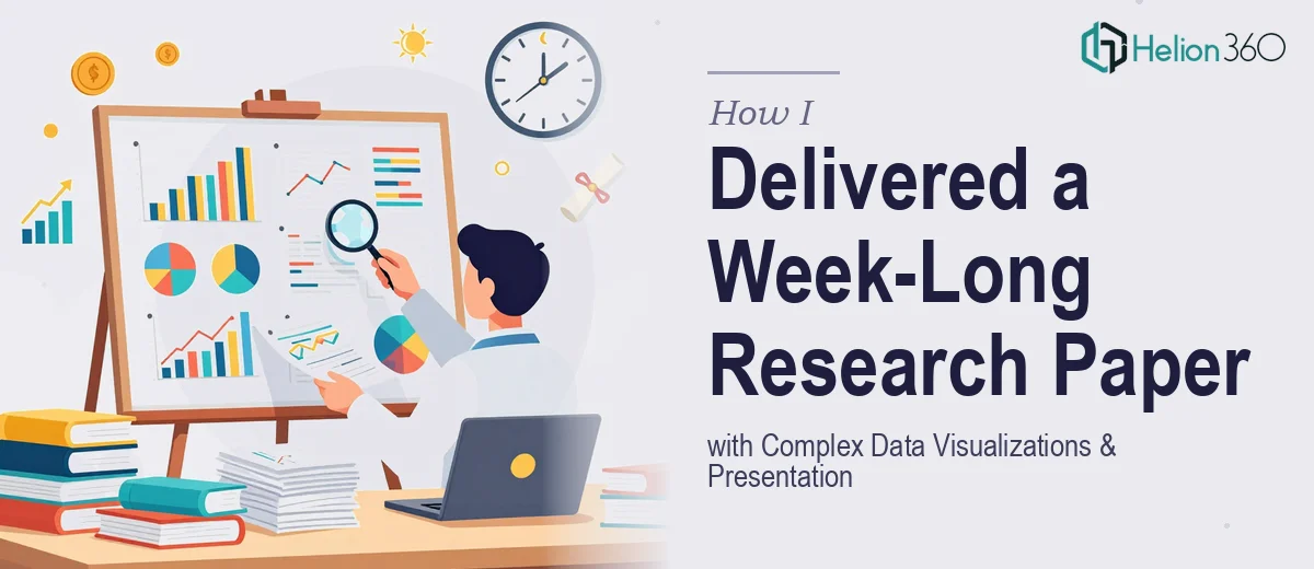
The Week I Had Too Much to Deliver and Too Little Time
It started as a manageable task — write an economics research paper and build a supporting PowerPoint presentation with data visualizations, all within a week. I had done academic work before, but this one felt different from the moment I looked at the scope.
The paper needed to cover macroeconomic indicators, policy impact analysis, and comparative data across multiple time periods. The presentation had to make all of that digestible — graphs, charts, trend lines, and commentary that an academic audience could follow without feeling lost in the numbers.
I figured I could manage both. I was wrong about how long it would actually take.
Where the Process Started Breaking Down
I started with the research paper. The economics content itself was clear enough, but structuring the argument while simultaneously sourcing data, formatting citations, and planning what would translate into visual form for the slides — it became a parallel juggling act that slowed everything down significantly.
By day two, I had a rough outline of the paper and a blank slide deck. The data I was working with included GDP growth comparisons, inflation trend data, and employment rate shifts across several economies. Turning that into clean, readable charts in PowerPoint was where I hit a real wall.
I knew what story the data was supposed to tell. I did not have the design skills or the time to make that story visible on slides. The charts I was producing looked cluttered and hard to interpret. The research paper itself was also still in draft form, and the deadline was not moving.
Bringing In a Team That Could Handle Both
After losing most of day three to revisions that were not improving things, I reached out to Helion360. I explained the situation — an economics research presentation that needed clear data visualization across multiple slides, tight turnaround, and content that had to hold up to academic scrutiny.
They came back quickly with a clear process. I shared my rough research notes, the data sets I was working from, and the slide structure I had been attempting. Their team took it from there.
What followed was the kind of collaborative handoff that actually works. I answered a few clarifying questions about the audience and the key arguments I wanted each section to support. They handled the structuring of the visual narrative — deciding which data points needed charts, which needed annotated infographics, and where plain text with supporting callouts would communicate more clearly than a graph.
What the Final Presentation Looked Like
By the time the slides came back, the economics data that had looked chaotic in my own attempts was organized into a coherent visual flow. Each chart had a clear title, clean axis labels, and a single takeaway that the audience could read at a glance. The trend comparisons I needed were presented as grouped bar charts and line graphs that actually made the economic patterns visible rather than buried.
The research paper content was also refined — structured arguments, consistent academic tone, and data references that aligned with what was presented visually in the slides. The two pieces worked together instead of feeling like separate documents.
I presented the work before the deadline with enough time to review it myself and make minor adjustments. The feedback I received after the presentation specifically noted how clearly complex data had been visualized, which was exactly the part I had struggled with most on my own.
What I Took Away From This Experience
Working on an economics research paper and presentation simultaneously under deadline pressure is manageable when the scope is small. When the data analysis is complex and the visual presentation needs to carry the argument forward, the work quickly becomes more than one person can handle well in a short window.
The part I underestimated was how much time proper data visualization takes — not just creating charts, but deciding what each chart needs to communicate and making sure the design supports that. That is a skill set that sits at the intersection of data, design, and communication.
If you are facing a similar situation — a research presentation with complex data, a tight deadline, and a gap between what you have and what the final output needs to look like — Helion360 is worth reaching out to. They handled the technical and visual work that I could not get right on my own, and the result was exactly what the project needed.