

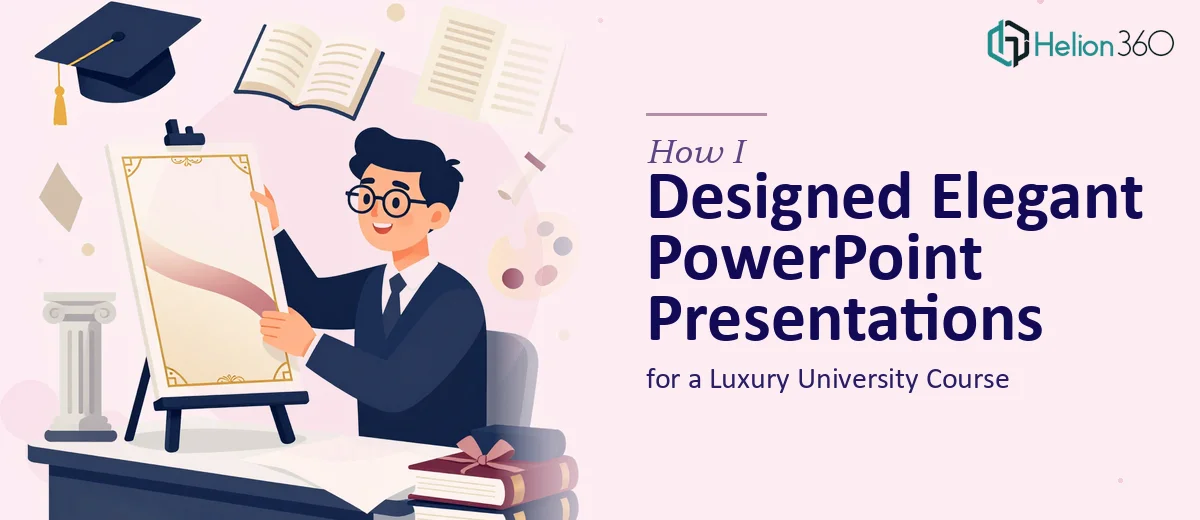
When Luxury Meets the Lecture Hall
I was handed a project that felt both exciting and a little intimidating from the start. The brief was to create a series of PowerPoint presentations for a university course focused entirely on the luxury industry — covering topics like luxury marketing strategy, the history of haute couture and premium brands, contemporary trends in luxury publishing, and the unique positioning of the company behind the course.
On paper, it sounded like a design task. In reality, it was much more layered than that.
More Than Just Good-Looking Slides
The challenge was not simply making slides look elegant. That part I could manage. The real complexity was that each presentation had to do two things simultaneously: reflect the visual sophistication expected in the luxury world and function as an effective educational tool for university students.
Luxury presentation design has its own visual language — restraint, precision, high-quality imagery, refined typography, and a sense of exclusivity that permeates every layout choice. But academic slides also need clarity, logical flow, and the ability to hold a student's attention across an hour-long lecture. Balancing both demands without one undermining the other was harder than I anticipated.
I started by building out a slide template based on the brand's colors and visual identity. The first few slides came together reasonably well. But as the topics grew more complex — particularly the modules on luxury marketing strategy and historical brand evolution — I found myself spending more time on content structure than on design, and the quality was starting to drift.
I also realized the scope was larger than I had originally scoped out. Several full-length modules needed to be developed, each with its own tone and visual hierarchy, and the turnaround time was tight.
Bringing in a Team That Understood the Brief
After hitting a wall trying to maintain both quality and pace, I reached out to Helion360. I shared the brand guidelines, the course outline, and a few reference slides I had already built. Their team understood the brief immediately — they did not need the luxury angle explained to them. They recognized that this was not a standard corporate presentation job; it required a specific aesthetic sensibility combined with instructional design thinking.
What followed was a structured handoff. I outlined which modules were highest priority, flagged the brand-specific requirements around typography and color usage, and noted where certain slides needed to feel more editorial versus more informational. The Helion360 team took it from there.
What the Final Presentations Looked Like
When the completed slides came back, the difference was immediately clear. The layouts were clean without feeling sterile. The typography choices communicated sophistication without sacrificing readability. Each module had a consistent visual thread running through it, while still shifting tone appropriately between, say, a historical overview of luxury fashion houses and a contemporary analysis of digital trends in premium publishing.
The slides used whitespace deliberately, imagery was curated rather than decorative, and data points — where they appeared — were visualized in a way that felt polished rather than clinical. Most importantly, the presentations looked like they belonged in a luxury context while remaining genuinely useful in a classroom setting.
The course coordinators were satisfied, and I had learned something concrete about where professional presentation design services add real value — not just in execution speed, but in the caliber of decision-making that goes into every layout.
What This Kind of Project Actually Requires
If you are working on professional PowerPoint presentations that need to carry a brand identity — especially in a high-end or industry-specific context — the design work is rarely just about aesthetics. It is about understanding the audience, the context in which slides will be viewed, and the story each module needs to tell. That combination of skills takes time to develop and is difficult to fake under deadline pressure.
For anyone navigating a similar brief — whether it involves luxury branding, academic content, or professional presentations that need to meet a high visual standard — Helion360 is worth reaching out to. They stepped in at exactly the right point and delivered work that held up under scrutiny.