

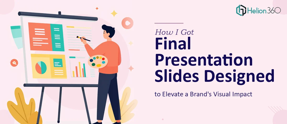
The Pressure Was in the Last Few Slides
Most of the deck was done. The narrative was in place, the key data was laid out, and the structure had been reviewed and approved. What remained were the final slides — the closing visual moments that would either cement the brand's impression or quietly undercut everything that came before them.
Those last slides needed custom infographics, a set of on-brand icons, and finishing touches that would pull the whole deck into a cohesive visual identity. The presentation was heading to a high-stakes audience and the deadline was fixed. There was no room for "good enough" at the finish line.
I knew immediately that this wasn't a task to wing. The final slides aren't just decoration — they're the last thing an audience sees, and they carry disproportionate weight on the overall impression. Getting them right required a level of craft and brand precision that demanded the right hands on the work.
What I Found the Solution Actually Required
Once I looked closely at what "finishing the deck" actually meant, it became clear that the scope was far deeper than adding a few graphics.
Custom infographics aren't repurposed clip art. Done well, they translate complex ideas into visuals that are immediately readable, brand-consistent, and sized correctly for slide canvas dimensions — typically a 16:9 ratio at 1920×1080px, with icon elements built as vectors so they scale without degrading.
Icon design for presentations follows its own rules. Icons need to share a unified stroke weight — typically 2pt for outlined styles — a consistent corner radius, and a limited color palette that matches the deck's brand tokens. A set that mixes styles or weights signals amateur work instantly.
Beyond those two elements, the aesthetic cohesion of the final slides needs to align with everything that came before. That means auditing the existing slides for spacing patterns, font hierarchy, and color use before a single new element is created. The gap between "close enough" and "seamlessly integrated" is where most in-house attempts fall apart.
What the Design Work Actually Involves
The structural work starts with a visual audit of the existing deck. A practitioner reviews every completed slide to extract the governing rules: the font hierarchy (typically a 36pt/24pt/16pt scale for title, body, and caption), the spacing rhythm, the grid alignment, and the exact brand color values. Only once those are documented can new elements be created that truly integrate rather than just approximate the style. Skipping this step — or doing it quickly — is what causes the final slides to look slightly "off" even when individual elements are well-made. This audit alone can take several hours when a deck runs 30 or more slides.
The visual mechanics of custom infographic design for presentation slides require choices that go beyond aesthetics. The right approach uses a consistent icon grid — typically 24×24px or 48×48px base units — so that all custom icons share proportional weight and visual balance when placed together on a slide. Infographic layouts follow hierarchy rules: the most important data point anchors at the top-left or center, supporting elements radiate outward in reading order. Color is constrained to a maximum of four brand palette values, with tints used to create depth rather than introducing new hues. For someone building this from scratch without a defined system, the learning curve is steep and the iteration time is long.
Polish and consistency across the final slides is where the real execution friction lives. Every element — icon, label, callout box, divider line — must share the same visual language. Stroke weights stay uniform, padding inside containers follows a set rule (8px or 16px increments are standard), and text alignment is locked to the grid. When multiple elements are designed across several slides, even small inconsistencies compound into a presentation that feels assembled rather than crafted. Catching and correcting those inconsistencies requires both a trained eye and the time to review at the element level, not just the slide level.
Why I Brought in Helion360 to Handle It
I didn't spend time attempting this myself. The combination of brand precision required, the custom asset creation involved, and the non-negotiable deadline made it obvious that this needed a team with the tooling and experience already in place — not someone learning the workflow mid-project.
Helion360 handled the full scope end-to-end: auditing the existing deck to extract the visual system, designing the custom icon set to match the brand's established style, and building the infographic layouts that completed the narrative arc of the final slides. The work was turned around quickly — done in days, not weeks — and delivered as fully editable source files that integrated cleanly into the existing deck.
What stood out was that there was no back-and-forth to establish basics. The team understood brand application, slide canvas constraints, and presentation-specific design standards from the first brief. That's the difference between a team that does this work daily and someone attempting it for the first time under pressure.
What the Finished Deck Delivered — and What I'd Tell Anyone in This Spot
The final deck came together as a single cohesive piece. The closing slides didn't just match the rest of the deck — they elevated it. The custom infographics made the key ideas land clearly and visually, the icon set reinforced the brand identity without feeling generic, and the overall polish held up under scrutiny from a demanding audience.
The business outcome was straightforward: a presentation that reflected the brand at the level it deserved, delivered on time, with no last-minute scramble.
If you're sitting with a mostly-complete deck that needs the final visual work done right — custom graphics, icon design, brand-consistent polish — and you have a real deadline, Helion360 is the team to engage. They handled the full project fast and brought exactly the execution depth this kind of work requires.