

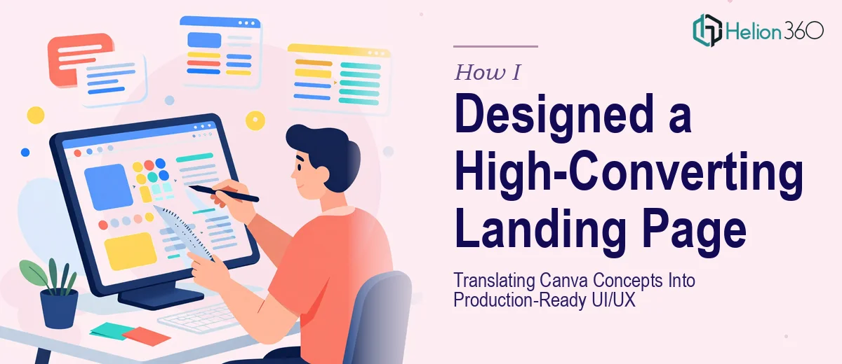
The Gap Between a Canva Concept and a Real Landing Page
I had two Canva slides that captured the look and feel I wanted for a product landing page. The content was solid, the visual direction was clear, and the business case for getting this page live was real — we needed a high-converting landing page ready before a campaign launch window closed.
The problem was the gap between what I had and what I actually needed. A Canva slide is a static visual. A landing page is an interactive, conversion-optimized UI built to function across devices, browsers, and screen sizes. The design system, the layout logic, the spacing rules, the component hierarchy — none of that exists yet when you're starting from slides. I recognized quickly that closing this gap properly wasn't a weekend task. It needed someone who understood both the design craft and the conversion mechanics behind a well-built landing page.
What I Found the Work Actually Requires
I spent time understanding what proper Canva-to-landing-page UI/UX design actually involves before engaging anyone to handle it. What I found made the complexity clear immediately.
First, the Canva slides have to be audited as a design brief, not accepted at face value. A presentation layout uses static proportions that don't translate directly to a responsive web grid. Every element — headline, subhead, CTA button, image block — needs to be re-mapped to a web layout system before a single Figma frame is built.
Second, conversion optimization isn't a layer you add at the end. It shapes the layout from the start. The placement of the primary CTA, the visual weight hierarchy, the scroll flow — these are structural decisions that affect whether visitors take action or leave. Getting them right requires understanding user psychology, not just aesthetics.
Third, the output has to be developer-ready. That means annotated Figma files with defined spacing, typography scales, component states, and responsive breakpoints. Handing off a pretty mockup without this documentation creates rework downstream. That alone is a discipline most people underestimate.
What the Design Process Actually Involves
The structural work starts with a full audit of the Canva source slides — identifying every content block, establishing the information hierarchy, and mapping the narrative flow to a web layout grid. Done well, this uses a 12-column responsive grid as the base, with content zones aligned to breakpoints for desktop, tablet, and mobile. Defining this grid correctly at the wireframe stage is what prevents layout drift later. The friction here is that wireframing a web layout from a slide-based brief requires interpreting intent, not just copying placement — and that interpretation takes experience to get right the first time.
The visual mechanics layer is where the Canva aesthetic gets translated into a real design system. A proper landing page UI uses a defined typographic scale — commonly 48pt or 56pt for the hero headline, 24pt for section headers, 16pt for body — alongside a constrained color palette of no more than four brand colors with clear primary, secondary, and accent roles. Component states (default, hover, active, disabled) have to be built out for every interactive element. This is time-intensive work even for an experienced designer, because each component has to be consistent across the full page and documented for handoff.
Polish and conversion consistency close the loop. Every visual decision — button size, whitespace ratio, image crop, CTA copy weight — connects back to conversion intent. The above-the-fold zone needs to communicate the value proposition within three seconds of page load, which means the visual hierarchy has to do real work. Edge cases like long headline text, varying image aspect ratios, and overlapping elements at mid-breakpoints all need to be resolved before the files are handed off. These are the details that take the longest and create the most back-and-forth when handled without a clear process.
Why I Brought in Helion360 to Handle It
When I understood what was actually involved, the decision was straightforward. I wasn't going to spend weeks learning responsive layout grids and Figma component architecture while a campaign window stayed open. This needed to be handled by a team that does this work every day, with the tooling and process already built in.
Helion360 handled the full project end-to-end — from auditing the Canva slides and establishing the layout grid, to building out the full UI design with annotated, developer-ready Figma files. They worked through the wireframe and mockup stages with structured checkpoints so I could review and align before the final files were produced. The turnaround was fast — done in days, not the weeks it would have taken me to work through the learning curve and execution depth this project required. What I handed over was two slides and a visual direction. What came back was a complete, production-ready design.
What the Outcome Looked Like and What I'd Tell Anyone in My Spot
The delivered files were clean, annotated, and ready for a developer to implement without guesswork. The layout held up across all breakpoints, the conversion hierarchy was clear from the first scroll, and the visual language from the original Canva slides carried through without feeling like a copy-paste job. It felt intentional — which is what a landing page meant to convert visitors actually needs to feel like.
The business outcome was straightforward: the campaign launched on schedule with a page that looked credible and was built to perform. There was no scrambling, no redoing work, no version confusion.
If you're looking at a similar gap — solid Canva concepts that need to become a real, production-ready landing page UI — and you want it handled end-to-end without the learning curve, Helion360 is the team I'd engage. They delivered fast and brought exactly the execution depth this kind of work demands.
For projects like this, a product service introduction ensures your concept translates into clear, structured messaging before design execution begins. You might also find value in how others have tackled high-impact presentation design and Canva presentations for engaging visuals — both offer insights into bridging the gap between initial concepts and polished, conversion-ready outputs.