

The Brief Was Simple. The Actual Work Was Not.
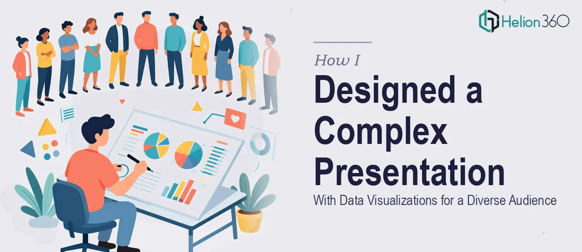
I had a presentation due by a hard deadline — March 19th at 7 PM Eastern. The topic was dense, the audience was mixed, and the expectations were clear: well-structured slides, strong data visualizations, and a design that could speak to people with very different backgrounds and levels of familiarity with the subject.
On paper, it sounded manageable. In practice, it was anything but.
What Made This Google Slides Presentation Harder Than Expected
The challenge wasn't just building slides in Google Slides. It was the combination of factors all hitting at once. The content itself was technically complex, which meant I couldn't just drop bullet points onto a slide and call it done. Every section needed to be translated into something visually coherent — charts, diagrams, and supporting visuals that would make sense to a diverse audience without oversimplifying the data.
I also needed the structure to flow logically: a clear introduction, a well-paced body with data-backed points, and a conclusion that tied everything together into key takeaways. That kind of narrative architecture takes real design thinking, not just formatting.
I started building it myself. I had a rough outline and some of the data ready. But as I got deeper into the slides, two things became obvious. First, translating the data into clean, readable visualizations inside Google Slides was taking far longer than I had budgeted. Second, the slides looked functional but not polished — and for this audience, polish mattered.
Bringing in the Right Support
After losing a full evening to inconsistent layouts and charts that weren't landing visually, I reached out to Helion360. I explained the deadline, shared my content outline, and described the audience — a mix of stakeholders with different levels of technical background. Their team asked the right questions upfront: tone, visual style, level of detail per slide, and whether I wanted sample slides reviewed before the full build.
That last part made a real difference. Getting a set of sample slides early meant I could course-correct before the full presentation was built, not after.
How the Presentation Came Together
Helion360 took the raw content and restructured it into a presentation that actually worked as a communication tool. The introduction framed the topic clearly without assuming prior knowledge. The main body used a mix of data visualizations — charts, supporting graphics, and clean text hierarchy — to carry the argument forward in a way that felt logical and easy to follow. Nothing was crammed onto a single slide. Each one had a clear job to do.
The design itself was professional without being generic. The slides were visually consistent, the data points were highlighted intentionally, and the conclusion summarized the key takeaways in a way that would land with an audience skimming just as much as one reading closely.
For a diverse audience, that balance is harder to strike than it sounds. Too much detail loses half the room. Too little, and the message doesn't stick. The final Google Slides deck found that middle ground.
What I Took Away From This
Deadlines have a way of revealing where your actual limits are. I'm comfortable building presentations, but this one required a level of design consistency and data visualization skill that would have taken me twice as long to produce at the same quality. The time I spent trying to do it alone was time I didn't have.
The more important lesson was about audience design. A presentation built for a diverse audience needs structure that guides everyone — not just the people who already understand the topic. That requires intentional decisions at the slide level: what to show, what to summarize, and what to leave out.
If you're facing a similar situation — a tight deadline, complex content, and a presentation that needs to work across a mixed audience — consider a complete deck presentation. I found that working with professional support on data-driven presentations made the difference between a functional deck and one that truly resonated. For insights on similar challenges, see how others tackled visually compelling Google Slides decks.