

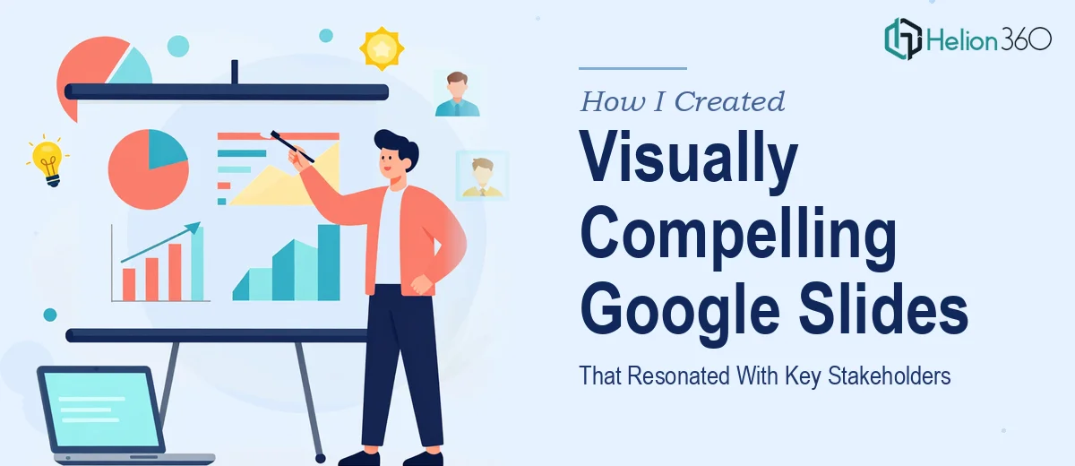
The Brief Seemed Simple Enough
I had a stakeholder presentation coming up and decided to handle the Google Slides deck myself. The goal was clear: build a visually compelling deck that communicated our key messages clearly, looked professional, and held the attention of a room full of decision-makers. Simple brief. Not so simple in practice.
I started with a rough outline, pulled together the content, and opened Google Slides with the best of intentions. The platform is intuitive, and I am comfortable with basic design work, so I figured I could get something solid done within a week.
Where Things Got Complicated
The content itself was not the problem. The problem was making it look like it belonged in a boardroom rather than a weekly team update. Every time I tried to add visual hierarchy to a slide, something else broke. The font choices felt inconsistent. The color palette I picked looked fine on one slide and flat on the next. I spent a full afternoon trying to align a single layout across twelve slides only to realize the spacing was off on every one of them.
Beyond the aesthetics, I was struggling with the more strategic side of presentation design. Which slides needed data visualization versus plain text? How do you simplify a concept that requires three paragraphs of context into one clean slide? How do you make a Google Slides deck feel designed rather than assembled?
I was burning time I did not have, and the deadline was real.
Bringing In the Right Support
After a few frustrating days of incremental progress, I reached out to Helion360. I explained what I needed: a complete stakeholder deck in Google Slides, built around the content I already had, designed to look polished and communicate clearly at a senior level.
Their team asked the right questions upfront. What was the audience expecting? What tone did the presentation need to carry? Were there brand guidelines to follow? Within a day of the initial conversation, they had enough to start.
What the Design Process Looked Like
Helion360 took the raw content and restructured it before touching a single slide. That was the first thing that stood out to me. They did not just drop my text onto a nicer-looking template. They looked at the flow, identified where the narrative was weak, and reorganized the information so the presentation built logically toward the key messages.
The design itself was clean and intentional. Visual hierarchy was handled properly — headlines, supporting details, and data points all had their place. The color choices were consistent and purposeful. Slides that needed data visualization got it in a format that was easy to read at a glance. The deck felt like it had been designed, not assembled from default layouts.
The turnaround was fast. I had a full draft to review within a few days, and the revision process was straightforward. I gave feedback, they applied it, and the final version was ready well within the original timeline.
The Outcome
The presentation landed well. Stakeholders engaged with the content, asked questions in the right places, and followed the narrative through to the end. A few people commented on how clear the deck was, which is honestly the best result a professional PowerPoint deck can get — when the design does its job quietly and the content gets all the attention.
What I took away from the experience was that a well-designed Google Slides deck is not just about picking good fonts or making things look attractive. It is about structure, visual hierarchy, and knowing how to translate dense content into something a senior audience can absorb quickly. That skill set takes real expertise to apply well.
If you are in the middle of a similar project and finding that the gap between what you have and what you need is wider than expected, Helion360 is worth reaching out to — they stepped in at exactly the right moment and delivered a deck I could present with confidence.