

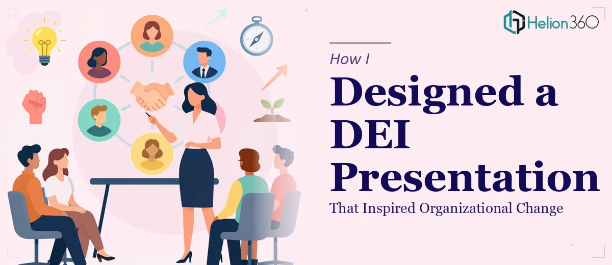
The Brief Sounded Simple. It Wasn't.
When the request came in to build a DEI strategy presentation, I thought I had a reasonable handle on it. The goal was clear enough: create a polished, structured presentation that covered Diversity, Equity, and Inclusion principles, communicated the organization's current gaps, and laid out a roadmap for building a more inclusive workplace. The audience would be a mix of senior leadership, HR, and team managers — people with different levels of familiarity with DEI concepts.
I started where most people do. I pulled together research, reviewed internal data, and began drafting a slide structure in PowerPoint. But within the first few days, I realized the challenge was not finding content. The challenge was shaping it.
Why DEI Presentations Are Harder to Design Than They Look
DEI as a topic carries weight. Every word choice matters. The visual tone matters. The sequencing of ideas matters — because if you lead with statistics before building emotional context, you lose people. If you lead with sentiment but never back it up with data, it feels performative.
I was also dealing with a genuinely diverse audience. The presentation had to work for a skeptical CFO and an empathetic HR manager sitting in the same room. The narrative needed to be strategic, not just inspirational. And it needed to translate into visible, actionable steps — not abstract goals.
I tried restructuring the deck multiple times. I had a section on current representation data, a section on equity gaps, a section on inclusion initiatives, and a section on the roadmap. But every time I looked at it, something felt flat. The visuals were functional but not compelling. The flow made logical sense but lacked emotional momentum. I knew what needed to be said, but the slides were not saying it well enough.
Bringing in Helion360
After spending more time than I had adjusting layouts and second-guessing slide order, I reached out to Helion360. I explained what I was building, what the presentation needed to accomplish, and where it was falling short. They asked the right questions — about the audience, the tone, the visual language I wanted, and whether the deck needed to stand alone or be presenter-dependent.
From there, their team took over the design and structure. What came back was a presentation that handled the complexity I had been struggling with. The DEI strategy content was sequenced to build understanding before asking for commitment. The data slides used clean, purposeful data visualization — not charts for the sake of charts, but visual framing that made the equity gaps feel real without feeling accusatory. The inclusion roadmap was laid out as a phased visual timeline that made the strategy feel achievable rather than overwhelming.
What the Final Deck Actually Did
The presentation opened with a framing slide that set the organizational context — why this, why now. From there, it moved through three distinct sections: where we are, what the data shows, and where we are going. Each section had a consistent visual language, a clear narrative thread, and purposeful use of icons and infographics to reduce cognitive load.
What Helion360 got right was the tone. DEI presentations can easily tip into either dry policy documents or emotionally charged advocacy pieces. This one landed in the productive middle — strategic, honest, and human. The leadership team walked away with a clear picture of the organization's current state and a concrete roadmap for the next twelve months.
The feedback after the presentation was that people felt informed and motivated at the same time. That combination is not easy to achieve, and it came down to the design and structure doing the heavy lifting alongside the content.
What I Took Away From This
Building a DEI strategy presentation is a different kind of challenge than most business presentations. The subject demands precision in language, sensitivity in visual framing, and a clear strategic arc that connects data to human experience. It is not just about making slides look polished — it is about making the argument land with a room full of people who bring different perspectives and different stakes to the conversation.
If you are working on a similar project and finding that the content is clear in your head but not translating on the slides, consider strategy presentation design services. Learn how I designed strategic PowerPoint presentations that influenced senior leadership decisions, and discover how I turned complex data into client-ready decks — approaches that can help your DEI strategy resonate with diverse audiences.