

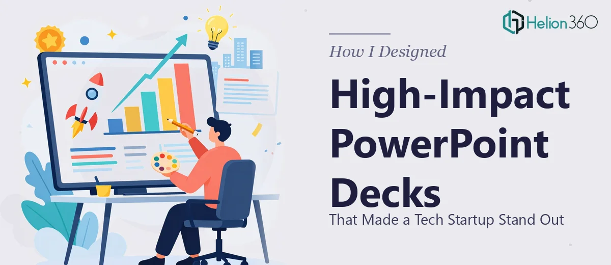
When a Simple Deck Request Turned Into Something Much Bigger
It started with what seemed like a straightforward ask. A tech startup needed a polished PowerPoint deck to showcase their latest product features and company milestones. The goal was clear enough — create something visually engaging, modern, and strong enough to hold its own in a competitive market.
I figured I could manage it. I had put together presentations before, understood the basics of slide layout, and knew my way around PowerPoint. So I opened a blank file and got started.
The Gap Between a Good Idea and a Great Deck
The problem became clear within the first few hours. The content itself was solid — product highlights, traction metrics, team achievements — but translating all of it into a coherent, visually compelling story was harder than I expected.
The startup had a distinct tech-forward identity, and the slides needed to reflect that. Generic templates were not going to cut it. Every section needed to feel intentional — from the typography and color system down to how each data point was visualized. The client specifically wanted infographics and dynamic charts embedded throughout, not just dropped in as afterthoughts.
I tried building a few slides from scratch. The layout work alone was time-consuming, and whenever I got the structure right, the visual side felt flat. When I pushed on the design, the structure fell apart. It was a cycle I could not break on my own, and the deadline was not flexible.
Bringing in the Right Support
After a couple of days of going in circles, I reached out to Helion360. I explained the scope — a startup pitch deck with a strong visual identity, product-focused content, infographics, and animated slide elements that needed to feel polished without being overdone.
Their team asked the right questions upfront. What industry? What tone — bold and aggressive, or clean and minimal? Who is the audience — investors, customers, or internal teams? Once I shared the content and some rough direction, they took it from there.
What the Final Deck Actually Looked Like
The turnaround was faster than I expected. The design they came back with handled everything I had been struggling with. The layout was consistent across all slides, the brand colors were used with purpose, and the infographics actually made complex product data easy to absorb at a glance.
The dynamic charts were built natively in PowerPoint — not static images — so the data could be updated later without breaking the design. Slide animations were subtle and purposeful, guiding the viewer's attention without distracting from the content. The overall feel was exactly what the startup needed: modern, credible, and distinct.
What struck me most was how the visual storytelling aspect was handled. The product feature slides did not just list capabilities — they showed progression and impact. The company achievements section felt like a narrative arc, not a bullet-point summary.
What I Took Away From This
Building a high-impact startup PowerPoint presentation is not just a design task — it is a combination of content strategy, visual communication, and technical execution inside the software. Getting one of those right while managing the other two is genuinely difficult when you are working alone under time pressure.
The experience made me appreciate how much goes into a presentation that actually performs — one that does not just exist on a screen but earns attention and communicates clearly. Infographics, chart design, slide flow, and animation all need to work together as a system, not as individual elements added one by one.
For a tech startup trying to stand out, the presentation is often the first serious impression. Getting it wrong has real consequences.
If you are in a similar position — solid content but struggling to turn it into a deck that looks and feels the part — Helion360 is worth a conversation. They handled the parts I could not, and the result was something I would not have arrived at on my own.