

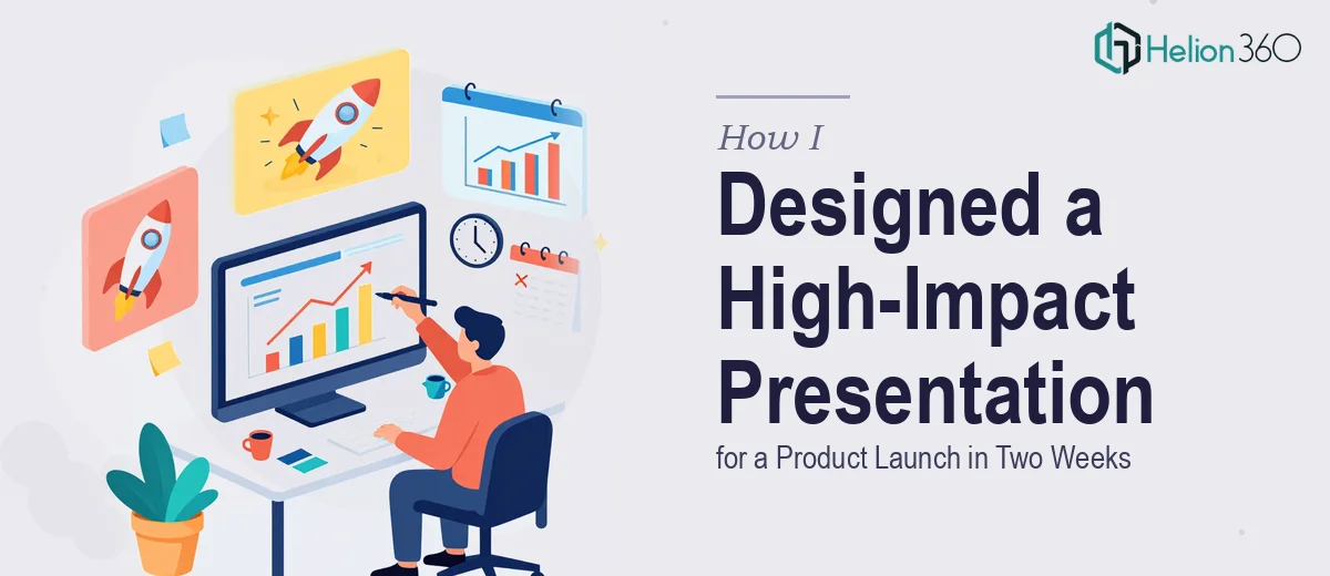
The Deadline Was Real and the Stakes Were Higher
Two weeks. That was all the time I had to put together a polished PowerPoint presentation for an upcoming product launch event. The audience would include potential partners, key stakeholders, and industry press — people who would form their first impression of the product entirely based on what they saw on screen.
I knew the content well. I had the data, the feature highlights, the success stories, and a clear vision for where the product was headed. What I underestimated was how much work goes into translating all of that into a presentation that actually holds an audience's attention from the first slide to the last.
Structuring Five Sections Without Losing the Thread
The presentation needed to cover five distinct areas: an Introduction, Our Vision, Key Features, Success Stories, and Future Plans. Each section had its own tone and purpose, and each needed supporting data presented clearly — not buried in dense text or awkward tables.
I started building the deck myself. The Introduction came together quickly. The Vision section took longer than expected because it needed to feel aspirational without sounding vague. Then I hit the Key Features section and realized I was dealing with a real problem. I had charts, statistics, and product screenshots — but laying them out in a way that felt both informative and visually engaging was something I kept struggling with. Every version I built looked either too cluttered or too sparse.
The Success Stories section was another challenge. The data was compelling, but turning numbers into a narrative that would resonate with a mixed audience required more design thinking than I had capacity for at that moment. And with the clock running, I could not afford to keep iterating on layouts that were not working.
Bringing in the Right Support
After losing two days to revisions that were going in circles, I reached out to Helion360. I explained the situation — the structure I had in mind, the five-section format, the tone I was aiming for, and the hard deadline. Their team asked the right questions upfront about the audience, the brand style, and the kind of visual language that would work for a product launch context.
From there, they took over the design work entirely. I handed off my draft content, rough slide notes, data files, and reference materials. What came back was a structured, modern presentation that maintained a clear visual hierarchy throughout all five sections. The Key Features section used clean icon-based layouts paired with supporting statistics. The Success Stories were presented through a combination of bold callout numbers and brief narrative framing — enough to tell the story without overwhelming the viewer. The Future Plans section closed the deck with a forward-looking roadmap visual that felt both credible and energizing.
What the Final Deck Actually Looked Like
The finished product launch presentation was 28 slides. Each section had a consistent visual theme but enough variation to keep the flow interesting. Charts were simplified without losing accuracy. Images were used purposefully rather than decoratively. The slide design felt professional without being sterile — which was exactly the balance the event called for.
The feedback after the launch event was that the presentation felt prepared and confident. A few attendees specifically mentioned that the data was easy to follow, which told me the design was doing its job — making the content accessible, not competing with it.
What I Took Away From the Experience
Designing a high-quality PowerPoint presentation under a tight deadline is not just a time management problem — it is a design problem. Knowing your content is not the same as knowing how to present it visually. The structure, the pacing, the way data is displayed, the consistency across sections — all of it requires a specific skill set that takes time to develop.
I also learned that handing off work at the right moment is not a sign of being unable to do it. It is a practical decision. The presentation needed to be ready, it needed to be good, and it needed to reflect the effort that had gone into the product itself.
If you are working on a product launch presentation and finding that the design side is taking more time than you have, Helion360 is worth reaching out to — they handle exactly this kind of work and deliver without the back-and-forth that tends to eat up deadline time.