

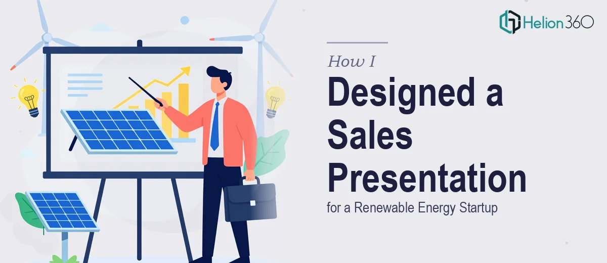
The Brief Sounded Simple Enough
When the project landed on my desk, it seemed straightforward: take an existing Google Slides sales presentation for a fast-growing renewable energy startup and build out additional slides that extended the suite. The company had already gotten solid feedback on what they had, but they wanted to push further — more visual impact, stronger brand alignment, and slides that could carry complex data without losing the audience.
I've worked on presentation design before, so I felt confident going in. I reviewed their existing deck, made a few notes on the color palette and typography, and started mapping out the new slides.
That's when the complexity started to show.
Where It Got Complicated
The challenge with renewable energy presentations is that they sit at an uncomfortable intersection — you're dealing with technical data that needs to feel accessible, a brand identity that needs to feel both trustworthy and forward-thinking, and a sales context where every slide has to earn its place.
I could handle individual pieces. I knew how to clean up a slide, pick better fonts, and swap out weak visuals. But making it all feel like a coherent suite — with consistent narrative flow, smart data visualization, and interactive elements that didn't feel gimmicky — that was a different task entirely. The brand guidelines were also more nuanced than they first appeared. The startup had a strong visual identity that I needed to honor while simultaneously making the new slides feel fresh.
After two rounds of attempts that felt technically fine but visually flat, I knew I needed to bring in someone with deeper design expertise in sales presentation work.
Bringing In the Right Team
A colleague had mentioned Helion360 after a similar project. I reached out, explained the situation — existing deck, renewable energy sector, need for additional slides that matched the brand and elevated the storytelling — and shared the files.
Their team asked the right questions from the start. They wanted to understand the audience profile, the sales stages these slides would be used for, and which data points needed to stand out. That level of specificity told me they weren't just going to make things look polished — they were thinking about how the slides would actually perform in a room.
What the Final Deck Looked Like
The slides Helion360 delivered were a genuine step up from where I had landed on my own. The new additions integrated seamlessly with the original deck, using the company's color theory and visual language in a way that felt intentional rather than mechanical.
Complex data — energy output comparisons, ROI projections, market sizing — was presented through clean, well-structured charts and custom infographics that made the numbers readable at a glance. The interactive elements were subtle but effective: section dividers with animated transitions, clickable navigation for non-linear presentations, and visual cues that guided the viewer without being distracting.
What impressed me most was how well the brand identity held up across the entire suite. When you flipped through all the slides together, it felt like one coherent story rather than a collection of separate pieces.
What This Experience Taught Me About Sales Presentation Design
Building a strong sales presentation — especially in a technical sector like renewable energy — is not just a design task. It's a strategic one. The visual storytelling has to support the business narrative, and every slide has to justify why it exists. Getting that right across a full suite of slides requires more than aesthetic judgment. It requires experience with how sales audiences think and what makes them pay attention.
I came away with a much clearer sense of where presentation design requires specialist skills. Clean layouts and good typography can get you part of the way there. But cohesive, brand-driven, conversion-focused presentation design is a discipline in its own right.
If you're working on a sales deck that needs to go beyond baseline and you're finding that the gap between "decent" and "truly effective" is harder to close than expected, Helion360 is worth reaching out to — they handled the parts of this project I couldn't and delivered something that genuinely moved the work forward.