

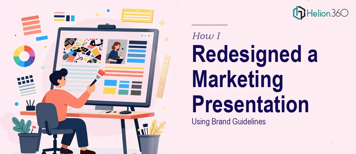
The Presentation Was a Mess — and the Deadline Was Real
I run a small marketing agency, and we had a major strategy presentation coming up within the week. The deck had been built up over several months by different team members, and it showed. Fonts were inconsistent across slides. Some headers used one typeface, body text used another, and there were at least three different shades of blue that were supposedly all the same brand color. A few slides had cluttered data tables with numbers that hadn't been updated, and the footers were either missing entirely or formatted differently on every third slide.
The content itself was solid. The strategy was clear. But the way it looked did not reflect the level of work behind it.
I knew we had a brand guidelines document. I pulled it up and started going through the deck slide by slide, trying to apply the correct hex codes, replace fonts, standardize headers, and fix spacing. I'm comfortable with PowerPoint — I use it regularly — but this was a different kind of task. It wasn't just editing; it was systematically rebuilding the visual consistency of a 30-slide presentation while keeping all the content intact.
Where It Got Complicated
The challenge wasn't any single slide. It was the sheer volume of decisions required across all of them simultaneously. Each slide needed its own layout review. Some had icons that didn't match the style specified in the brand guide. Others had placeholder images that needed to be swapped for proper graphic elements the designer had already created. The footer had to include specific legal text and a logo lockup — consistently, on every slide.
I also realized I was spending more time second-guessing alignment and spacing than actually moving forward. After a few hours, I had cleaned up maybe eight slides and still wasn't fully satisfied with how they looked side by side.
This was a presentation that needed to look polished and professional. It was going in front of people who would judge the work partly on how it was presented. Getting it 80% right wasn't good enough.
Bringing in the Right Help
After hitting that wall, I came across Helion360. I explained what I was working with — a marketing PowerPoint presentation that needed a full cleanup and brand guideline application before a key presentation date. I shared the existing deck, the brand guide, the designer's graphic elements, and a set of slide-by-slide instructions.
Their team reviewed everything and came back with a clear understanding of the scope. They weren't just going to copy-paste brand colors in. They were going to go through each slide, apply the correct typography hierarchy, standardize spacing, replace non-compliant icons with the right ones, and ensure the footer and header information was consistent and accurate throughout.
What I appreciated was that they didn't ask me to re-explain the brand guidelines — they worked directly from the document and flagged one or two ambiguities for me to clarify before proceeding. That saved a lot of back-and-forth.
What the Final Deck Looked Like
When I received the revised presentation, it looked like a different product — not because the content had changed, but because everything was visually aligned. The fonts matched exactly what the brand guide specified, down to weight and size hierarchy. The color palette was consistent. Slides that had felt cluttered were now cleaner, with better use of white space. The icons were uniform in style. Every slide had the correct footer.
Helion360 also added a few small but thoughtful touches — like aligning data callouts in a consistent visual format and making sure section divider slides had the right visual weight. Nothing that changed the content, but everything that made the deck look intentional.
We presented it the following week and it landed well. The team's strategy was the hero, but the presentation carried it properly.
What I Took Away From This
Applying brand guidelines to a presentation isn't just a formatting task. It's a design exercise that requires attention at a granular level across every slide. The more slides you have, and the more inconsistent the starting point, the more time and precision it demands.
For a deadline-driven project like this one, trying to do it alone while also managing everything else wasn't the right call. Knowing when the work requires a specialist — and acting on that quickly — is what made the difference. Others have run into the same challenge, whether it was pulling off a full PowerPoint presentation redesign in under an hour or delivering 40 high-quality PPTX slides under a tight deadline.
Need Your Presentation Cleaned Up Before It Goes Live?
If you're sitting on a deck that needs brand guideline cleanup, layout fixes, or a full visual refresh before a presentation, Helion360 can help. Their team handles exactly this kind of work — taking a rough or inconsistent deck and bringing it up to a professional, on-brand standard without losing what makes your content strong.