

Why Presentations Keep Losing the Room — and What Comics Do Differently
There is a familiar moment in almost every conference presentation: the speaker advances to a dense slide, the audience glances down at their phones, and the energy in the room quietly evaporates. It is not that the content is unimportant. It is that the format is asking too much of people who have already sat through four sessions before lunch.
A 6-panel conference comic solves this by working with how people actually process information rather than against it. The human visual cortex handles images roughly 60,000 times faster than it processes text. Laying narrative across a sequence of panels — with characters, speech, and scene — triggers a reading mode that feels effortless, almost involuntary. The audience does not feel like they are being presented to. They feel like they are following a story.
The stakes here are real. A presentation that lands is one where the key message travels home in the audience's memory. A presentation that loses the room means a product that does not get funded, a process that does not get adopted, or a research finding that gets politely forgotten. The comic format addresses engagement directly at the structural level, and understanding how to build one well is worth the effort.
What This Format Actually Requires to Work
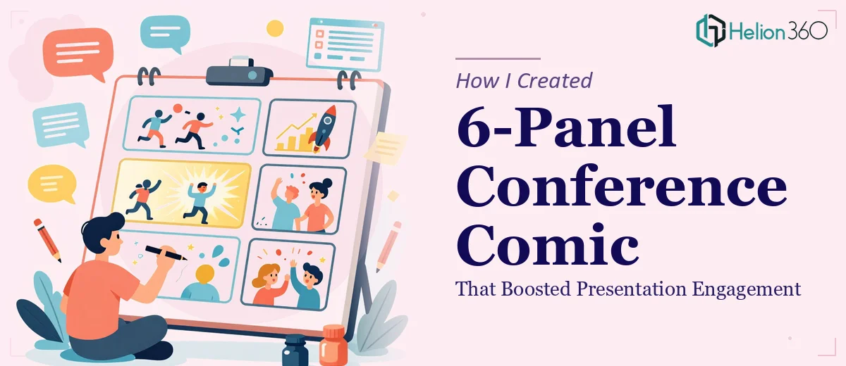
A 6-panel conference comic is not clip art dropped onto a slide. Done well, it is a compressed narrative engine — each panel carries a specific job, and the sequence as a whole must deliver a coherent arc inside a very tight frame.
The format requires four things that separate thoughtful execution from a rushed attempt. First, it needs a genuine narrative structure: a problem introduced in panels one and two, a turning point in three and four, and a resolution or call-to-reflection in five and six. Without this arc, the panels just feel like decorative illustrations.
Second, it needs visual consistency — a coherent character design, a limited color palette, and a stable panel grid so the eye moves predictably across the sequence. Inconsistency at this level breaks the immersive effect immediately.
Third, the writing inside each panel must be ruthlessly concise. Each speech bubble or caption should carry no more than fifteen to twenty words. If the script is fighting for space, the concept has not been compressed enough.
Fourth, the comic must be designed at presentation scale — typically 1920×1080 pixels when embedded in a slide — which means the lettering, linework, and contrast ratios all need to hold up on a projected screen at the back of a room, not just on a laptop monitor at close range.
How the Work Actually Gets Built
Scripting the Six Panels Before Any Visual Work Starts
The biggest mistake in this format is opening a design tool before the script is settled. The script is the architecture. Each of the six panels needs a one-line description of the scene, the character dialogue or caption text (capped at twenty words), and a note on the emotional beat the panel is meant to land.
A practical structure that works consistently is: panel one sets the familiar world or problem context, panel two intensifies the frustration or stakes, panel three introduces the disruption or solution idea, panel four shows the shift in action, panel five shows the consequence or benefit, and panel six lands the takeaway — either as a punch line, a reflection, or a direct message. This is not rigid, but straying too far from an arc with this shape usually results in panels that feel unconnected.
For a conference comic about, say, slow internal approval workflows, the opening panel might show a character staring at an email thread with thirty-seven unread messages. Panel three might introduce the simplified decision matrix. Panel six might show the same character with a clean inbox and a single message reading "approved." That specificity is what makes the comic land for an audience who lives that problem daily.
Building the Visual System
Once the script is stable, the visual system needs to be locked before a single panel is drawn or assembled. The grid for a 6-panel layout in a 1920×1080 slide typically uses a 3-column by 2-row arrangement, with each panel measuring approximately 600×480 pixels and a consistent gutter of 20 to 24 pixels between panels. The outer margin should be no less than 40 pixels on all sides to prevent the comic from feeling crammed against the slide edge.
The color palette should cap at four colors: a dominant background tone, a character/line color (usually near-black, not pure black — something like #1A1A2E reads softer on projection), a single accent color for emphasis elements like speech bubbles or highlighted objects, and a neutral mid-tone for shadows or secondary elements. More than four colors at this scale creates visual noise that undermines the clarity the format is supposed to deliver.
Typography inside panels follows its own hierarchy. Caption text runs at 14 to 16pt in a clean sans-serif like Inter or DM Sans. Speech bubble dialogue sits at 12 to 14pt. Panel labels, if used, drop to 10pt. Any smaller than 10pt becomes illegible on a projected screen beyond three rows from the front.
Character Design and Scene Composition
Characters do not need to be sophisticated illustrations — in fact, simpler is more effective at conference scale. A consistent set of two or three flat-style figures with distinct silhouettes (different hair shapes, clothing colors, heights) gives the audience anchors without requiring illustrative detail that blurs on projection.
Each panel's composition should follow a basic rule: one dominant visual element occupies 50 to 60 percent of the panel area. Background elements should be minimal and abstracted — enough to establish setting (an office, a meeting room, a server rack) without competing with the character action. Negative space inside each panel actually aids comprehension; panels that are too full slow the eye down in exactly the way the format is trying to avoid.
For the speech bubbles, the tail should always point clearly to the speaker's mouth region and should never cross another character or overlap the panel border. This sounds obvious, but at small panel sizes it requires deliberate placement.
Assembling in PowerPoint or the Design Tool of Choice
PowerPoint handles this format well if the master slide is set up correctly from the start. A custom slide master at 1920×1080 with guides set at the panel grid positions means every panel snaps into place accurately. Grouped panel elements — border, background fill, character layer, bubble layer, text layer — should be grouped and named clearly in the Selection Pane (View > Selection Pane) so revision work does not devolve into hunting for misplaced objects.
Exporting for conference use should be done as a high-resolution PNG (File > Export > Change File Type > PNG, then set resolution to 150 DPI minimum) rather than embedding the comic as an editable object. This locks the layout and prevents font substitution issues on the venue's presentation machine.
What Goes Wrong When This Format Is Rushed
The most common failure is treating the comic as a decoration rather than a narrative device. When the panels are added after the presentation is mostly built — as a visual flourish on a summary slide — they carry no story, so they deliver no engagement benefit. The comic needs to be planned as the primary communication vehicle for at least one major concept, not appended as an afterthought.
Inconsistent character design across panels is the second most damaging issue. If the protagonist changes hair color between panel two and panel four, or their proportions shift noticeably, the audience's attention shifts from the message to the inconsistency. This often happens when panels are built separately and not compared side by side before finalizing.
Font handling causes quiet problems that compound. Using a system font in the design file and then presenting on a venue machine that substitutes a different font can collapse carefully sized speech bubbles into overflow. Embedding fonts or converting text to outlines before exporting prevents this entirely.
Underestimating the lettering pass is also a consistent pitfall. Rewriting twenty-word captions down to twelve words — which often happens when the script is tested at actual panel scale — takes two to three hours more than most people budget. The script almost always needs at least one round of compression once it is placed inside real panel dimensions.
Finally, presenting a comic that has not been tested on a projected screen before the session is a real risk. Colors that look punchy on a laptop can go flat or oversaturated on a standard conference projector. A single test run in a projection environment, or at minimum a preview on a large external monitor, saves a lot of on-stage regret.
What to Take Away from This Approach
The 6-panel conference comic format works because it respects the audience's cognitive load. When the script is tight, the visual system is consistent, and the panels are built at the right scale with the right export settings, the format genuinely changes how a presentation moment lands — not because it is clever, but because narrative sequencing is how humans have always absorbed information most naturally.
The technical work is real: grid setup, palette locking, character consistency, lettering compression, and projection-safe export are all non-trivial. But each step is learnable and repeatable once the system is established.
If you would rather have this handled by a team that does this work every day, learn more about interactive presentation design and how modern PowerPoint presentations can transform your conference impact.