

Why Supply Chain Presentations Are Harder to Get Right Than They Look
Supply chain presentations occupy a uniquely demanding space in the business world. They need to speak simultaneously to operations managers who care about process fidelity, finance leaders who track cost and inventory turns, and executives who want the strategic picture at a glance. When a single deck has to carry that much weight, a generic template simply does not hold up.
The cost of doing this badly is real. A poorly structured supply chain PowerPoint forces presenters to rebuild slides from scratch for every audience, creates visual inconsistency across quarterly reviews, and — most critically — buries the insight inside walls of logistics jargon and poorly formatted tables. Done well, a thoughtfully designed supply chain template reduces the cognitive load on the audience and lets the story of the network do the work.
What makes supply chain content distinct is the sheer range of material it must accommodate: process flow diagrams, procurement dashboards, inventory heatmaps, logistics route maps, supplier scorecards, and risk matrices can all live inside the same presentation family. The template architecture needs to anticipate all of them.
What a Well-Built Supply Chain Template Actually Requires
Most people underestimate the scope of this work. Building a supply chain PowerPoint template is not just selecting a color scheme and dropping in a few icons. It requires deliberate structural planning before a single slide is touched.
First, the template needs a clear slide taxonomy — a defined set of layout types that cover every content scenario the deck will encounter. For a supply chain context, that typically means at least eight to ten distinct master layouts: a title slide, an executive summary layout, a process flow layout, a data-heavy dashboard layout, a map-based logistics layout, a table and scorecard layout, a risk matrix layout, a KPI callout layout, a section divider, and an appendix layout.
Second, the visual language needs to communicate hierarchy and direction naturally. Supply chain content is inherently directional — raw materials move to manufacturing, which feeds distribution, which reaches the customer. The design system must reinforce that flow logic through consistent use of arrows, connectors, and left-to-right or top-to-bottom spatial organization.
Third, the template must be built for reuse by non-designers. If the person running the quarterly ops review needs a design degree to operate the file, the template has failed its job. Every layout should be self-contained and editable without breaking the visual system.
Fourth, data integrity matters as much as aesthetics. Charts and tables are not decorative; they carry the argument. The template needs pre-built chart styles and table formats that stay readable at actual presentation resolution — typically 1920 × 1080 pixels.
The Right Approach to Building the Template from the Ground Up
Establishing the Master Grid and Typographic System
Every well-built presentation template starts with a grid, and a supply chain deck is no exception. The standard approach uses a 12-column grid with 40-pixel outer margins and 20-pixel gutter spacing. This creates consistent content zones across every slide and ensures that diagrams, charts, and text blocks align to a shared baseline regardless of who builds the individual slide.
Typography should follow a strict three-level hierarchy: a primary heading at 36pt for slide titles, a secondary label at 24pt for section callouts and data labels, and body text at 16pt for supporting detail. Anything smaller than 16pt becomes illegible when projected in a standard conference room. For a supply chain deck, a clean sans-serif like Inter or Source Sans Pro works well because it reads clearly at both large and small sizes and carries a functional, operational tone.
Building the Process Flow and Logistics Layouts
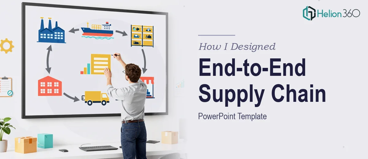
The process flow layout is the heart of a supply chain template. Done well, it uses SmartArt or vector-based custom shapes that map the procurement-to-delivery arc in a single readable frame. The key design decision here is horizontal versus vertical flow. For end-to-end supply chain visualization — from tier-2 supplier through manufacturing, distribution center, and last-mile delivery — a horizontal left-to-right layout uses the widescreen 16:9 canvas most efficiently.
Each node in the flow (supplier, plant, DC, customer) should use a standardized icon set with no more than five distinct shapes across the entire template. Icon consistency prevents the cognitive overload that comes when every slide introduces a new visual language. A solid approach pins the icon library to a style guide sheet inside the PowerPoint file itself, so anyone adding a slide can pull from the approved set.
For the logistics map layout, embedding a clean base map as a vector object (rather than a rasterized image) keeps the file sharp at any zoom level. Route lines drawn over the map should use a 2pt stroke with directional arrowheads, and location markers should follow a simple three-tier size hierarchy: major hubs at 14pt markers, regional nodes at 10pt, and secondary stops at 6pt.
Designing the Dashboard and Data Layouts
Supply chain dashboards carry KPIs like on-time delivery rate, inventory turnover, order fill rate, and lead time variance. The template's dashboard layout should pre-allocate space for exactly four primary KPI callout blocks across the top of the slide — a number that balances information density with visual breathing room. Each block needs a large display number (48pt bold), a unit label (14pt), and a trend indicator arrow that uses a two-color system: a mid-green for positive movement and a muted red for negative, both chosen to remain distinguishable for color-vision-deficient viewers.
For chart styles, the template should include pre-formatted versions of at least three chart types: a clustered bar chart for supplier performance comparisons, a line chart for trend data like inventory levels over time, and a heat map matrix for risk or supplier scoring. Heat map cells should use a five-step diverging color scale — anchored at a neutral mid-tone — so that high and low values are immediately readable without relying solely on numbers.
Table layouts for scorecards should use alternating row fills at 8% opacity of the brand primary color, with header rows at 100% of the secondary color. Column widths should be set to auto-fit content with a minimum of 80px per column so numbers never crowd the cell border.
Color Palette and Brand System
The palette for a supply chain template should stay disciplined: one primary brand color used for headlines and key callouts, one secondary color for supporting labels and dividers, one accent color reserved exclusively for data highlights, and a neutral gray scale for backgrounds and secondary text. Four colors maximum across the entire system. More than four and the deck starts to feel inconsistent across the slide types, especially as different team members add content over time.
What Goes Wrong When This Work Is Rushed
The most common failure is skipping the layout audit before building. Teams often jump straight into slide design without mapping out all the content types the deck will need to handle. The result is a template that covers the easy cases — title slide, text slide, single chart — but collapses the moment someone needs a logistics map or a multi-column scorecard. Retrofitting new layouts into an existing template structure is far more time-consuming than planning them upfront.
A second persistent problem is font drift. When the master slide typography is not locked and a collaborator pastes content from another file, PowerPoint silently substitutes fonts. A deck that ships with three different sans-serif fonts across its slides reads as unfinished, regardless of how polished the individual layouts are. Every text box in the master should have the font explicitly assigned, not inherited.
Third, process flow diagrams built with native SmartArt break constantly. SmartArt reflows when text lengths change, misaligns when the file is opened on a different version of Office, and cannot be selectively animated. The more reliable approach is to build flow shapes as grouped vector objects with fixed positions, accepting that they require more setup time in exchange for stability.
Fourth, teams routinely underestimate the export and delivery phase. A template that looks correct in the editing view can render incorrectly as a PDF or on a projector if custom fonts are not embedded, if animations reference objects that no longer exist, or if image compression settings are left at default. Embedding fonts (File > Options > Save > Embed fonts) and exporting at 220 PPI minimum are non-negotiable steps before the file ships.
Fifth, building one-off slides instead of reusable layouts is the structural mistake that compounds over every future update cycle. Every layout decision made during template construction should be captured in the slide master — not as a floating collection of individual slides that happen to look similar.
What to Take Away from This
A well-designed PowerPoint template system is an infrastructure decision, not a cosmetic one. The upfront investment in master layouts, a disciplined color system, a locked typographic hierarchy, and purpose-built chart and flow diagram styles pays dividends across every quarterly review, board update, and operational briefing that uses the template. The right foundation means the person presenting can focus on the content, not on wrestling with the slides.
If you would rather have this kind of template built by a team that does this work every day, Helion360 is the team I would recommend.