

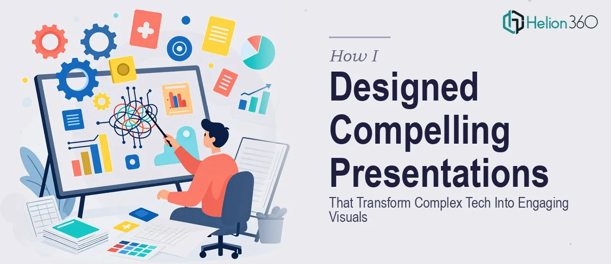
Working at a growing tech startup means you're constantly dealing with information that's dense, technical, and not exactly easy to package. Product roadmaps, architecture overviews, feature comparisons, market data — the content is important, but getting it in front of an audience in a way that actually lands? That's a different challenge entirely.
I volunteered to handle the presentations for an upcoming conference and a few internal stakeholder reviews. I figured I had a reasonable grasp of PowerPoint and a decent eye for layout. What I underestimated was how much work goes into transforming complex information into visuals that are both accurate and genuinely engaging.
Where the Process Started Breaking Down
The first draft looked fine to me. The slides had the right information, the brand colors were there, and the structure made logical sense. But when I shared it internally, the feedback was uncomfortable to hear: the slides felt like a wall of text, the charts were hard to read at a glance, and the visual flow didn't guide the viewer through the story — it just dumped data on them.
I went back and tried restructuring. I simplified some slides, replaced a few text blocks with icons, and added transitions. It got better, but not good enough. The core problem was that I was thinking like someone who already understood the content — not like someone seeing it for the first time. Making complex technical information digestible requires a very specific skill set that sits at the intersection of visual design, information architecture, and narrative structure.
I also ran into practical limitations. The brand consistency across slides was inconsistent. Some slides used one font weight, others used another. The slide masters weren't set up correctly, so every change I made in one place had to be manually fixed in several others. What should have taken a few hours was turning into days.
Bringing in the Right Team
After hitting a wall, I came across Helion360. I explained the situation — a tech startup, multiple presentations needed, brand guidelines to follow, a mix of data-heavy and narrative slides — and their team took it from there.
What I noticed immediately was how they approached the brief. They didn't just ask for the files. They asked about the audience, the goal of each presentation, and which slides needed to do the heavy lifting. That context shaped every design decision they made.
The slides they delivered looked like a different product. The complex technical content — feature breakdowns, product architecture, competitive positioning — was rendered in a way that made sense visually without stripping out the substance. Charts were clear and purposeful. White space was used intentionally. The visual hierarchy guided the eye exactly where it needed to go. And across every slide, the branding was consistent — fonts, spacing, color usage, all aligned.
What Made the Difference
Looking at the final output, a few things stood out. The way dense content was broken into digestible sections made the information feel manageable rather than overwhelming. Visual storytelling techniques — using layout and contrast to direct attention — replaced the need for long explanatory text. The result was a presentation that could stand on its own, whether the presenter was in the room or not.
Helion360 also structured the slide master correctly, which meant future edits wouldn't require fixing the same thing across thirty slides. That's a small detail that saved a lot of time downstream.
What I Took Away From This
Presentation design for a tech context isn't just about making slides look good. It's about understanding which information matters most, how to sequence it, and how to use visual design to support comprehension — not decorate it. That combination of skills is harder to develop than it sounds, especially when you're close to the content.
I also learned that brand consistency in presentations isn't just aesthetic — it signals credibility. Inconsistent slides make an audience notice the formatting instead of the message.
If you're working through something similar — tech content that needs to reach a non-technical audience, or a presentation that's supposed to reflect a polished, professional brand — Helion360 is worth reaching out to. They handled what I couldn't and delivered exactly what the situation required.