

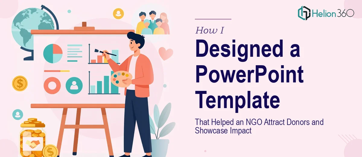
When a Presentation Has to Do More Than Look Good
I was brought in to help an international NGO put together a PowerPoint template and an introduction presentation. On the surface, it sounded straightforward — a few branded slides, a clean layout, done. But the more I dug into what they actually needed, the more I realized this was a much more layered challenge than I had anticipated.
The organization worked across multiple countries. They had a compelling mission, meaningful impact data, ongoing projects, a growing team, and several established partnerships. All of that needed to live inside a presentation that was professional enough for donor meetings yet warm enough to reflect the human side of their work. And it all had to fit within a tight slide count.
The Real Complexity of NGO Presentation Design
I started by mapping out the content. Mission statement, values, origin story, key programs, community impact numbers, team profiles, partner logos — the list kept growing. The challenge was not a lack of material. It was making every section feel purposeful without overcrowding the slides.
I tried building a master template from scratch using their brand colors and logo assets. The first few layouts came together reasonably well, but when I started filling in the actual content, things broke down. The impact story section felt too text-heavy. The team slide looked like a directory page rather than a human introduction. The partnership section had no visual hierarchy. Every time I fixed one area, something else felt off.
Beyond the layout issues, I was also struggling with something harder to name — the presentation lacked a coherent visual language. Each section looked like it belonged to a different deck. For a fundraising presentation aimed at international donors and supporters, that kind of inconsistency can quietly undermine credibility.
Bringing in Specialized Help
After hitting that wall, I reached out to Helion360. I explained the full scope — the NGO's goals, the audience (primarily potential donors and institutional partners), the brand guidelines, and the specific sections that needed to be covered. Their team asked the right questions upfront: What tone should the presentation carry? How should impact data be visualized? What should a donor feel after seeing the last slide?
Those questions alone shifted my thinking. This was not just a design task. It was a communication strategy problem, and Helion360 approached it that way.
What the Finished Template Actually Looked Like
The team built a master PowerPoint template with fully editable slide layouts — title slides, section dividers, content slides with image placeholders, data visualization slides for impact metrics, team profile layouts, and a partnership showcase grid. Every layout used a consistent typographic system, a restrained but warm color palette drawn from the NGO's brand, and intentional white space that gave the content room to breathe.
The introduction presentation itself followed a clear narrative arc. It opened with the organization's origin and mission, moved into the impact story with supporting visuals and numbers, introduced key programs, highlighted the team, and closed with a view of partnerships and a forward-looking call to action. Nothing felt forced. Each section transitioned naturally into the next.
The impact metrics were displayed as clean visual callouts rather than table rows, which made the numbers feel significant rather than buried. The team section used a consistent photo-and-bio layout that felt personal without looking informal. Even the partner logos were arranged in a way that communicated credibility without turning the slide into a crowded footer.
What I Took Away From This
Designing a presentation for an NGO is genuinely different from designing a corporate deck. The emotional register has to be right. Donors and supporters are not just evaluating data — they are deciding whether they trust the organization and believe in what it stands for. A visually inconsistent or cluttered deck can quietly signal disorganization, even when the work on the ground is exceptional.
The other thing I learned is that a well-built template is an investment. Once the master layouts were in place, the NGO's own team could update the presentation for different audiences, add new project slides, or swap in fresh impact numbers — without breaking the design.
If you are working on a similar project — a nonprofit introduction deck, a donor presentation, or an organizational profile that needs to work hard across multiple contexts — Helion360 is worth reaching out to. They handled the complexity I could not resolve alone and delivered something the organization could use immediately and build on over time.
For more insight into how to approach these challenges, explore how others have tackled similar work: learn about investor-ready PowerPoint presentations that use data visualization effectively, or see how a compelling fundraising pitch deck can be structured to win stakeholder attention.