

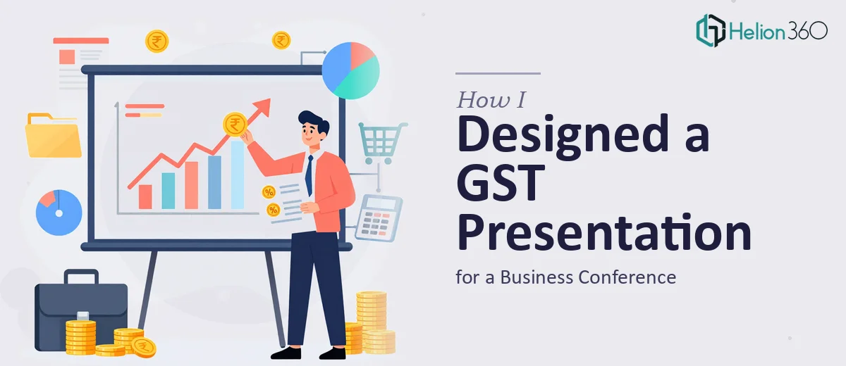
The Brief Was Clear. The Execution Was Not.
A few weeks before a business conference, I was asked to present on Goods and Services Tax — covering everything from the history of GST and its structural framework to its current impact on businesses and where the policy might head in the future. The audience would include both general business professionals and tax specialists, which meant the GST presentation had to work on two levels at once: accessible enough for non-specialists, detailed enough to hold up under scrutiny.
I knew the subject matter reasonably well. I had the research, the policy documents, and a rough outline. What I underestimated was how much work it would take to turn all of that into a clear, well-structured PowerPoint presentation that actually communicated the complexity without overwhelming the room.
Starting With the Structure
I began by mapping out the slide flow. The presentation needed to open with the history of GST — how the tax replaced a fragmented multi-tax system, why it was introduced, and what problems it was designed to solve. From there, I planned to move into the structure of GST itself: CGST, SGST, IGST, the input tax credit mechanism, and the tiered rate slabs.
The middle sections would focus on the real-world impact of GST on businesses and consumers — compliance costs, pricing changes, supply chain restructuring — followed by recent amendments and then a forward-looking section on potential future developments like rate rationalization and GST 2.0 discussions.
On paper, this looked organized. In PowerPoint, it turned into a wall of text slides that felt more like a tax manual than a conference presentation.
Where It Stopped Working
The core problem was density. GST is a topic with a lot of moving parts, and I kept trying to fit everything onto each slide to make sure I wasn't leaving anything out. The result was slides that no one would want to read in a conference room. I also struggled with visualizing the GST structure — the relationship between input tax credits, rate tiers, and interstate versus intrastate transactions is genuinely complex, and I could not figure out how to represent it visually without it looking like a flowchart from 2003.
I spent two full evenings trying to fix the design and layout. I reworked the color scheme, tried a few different slide templates, and reorganized the content again. It was getting cleaner, but it still did not feel like a professional business presentation. The data slides in particular — showing GST revenue trends and compliance rates — looked flat and hard to read.
After hitting that wall, I came across Helion360. I explained what I had, what the presentation needed to accomplish, and who would be in the room. Their team took it from there.
What the Redesigned GST Presentation Looked Like
The version that came back was a significant step up. The history of GST section used a clean timeline layout that showed the progression from the pre-GST era through the 2017 implementation without crowding the slide. The structural overview used a layered diagram that made the CGST, SGST, and IGST relationships immediately readable — something I had been struggling to build for days.
The data visualizations were completely reworked. Revenue collection trends, filing compliance rates, and sector-specific impact statistics all came through as clear charts with proper labeling and hierarchy. The slides on future developments used a split-layout format that let me contrast current policy with proposed changes without it feeling like a comparison table.
The tone throughout matched what I needed: professional, clean, and structured in a way that would work for a mixed audience. Every section had a clear heading, supporting context was kept brief, and the visual language was consistent from start to finish.
What the Conference Response Confirmed
The presentation held up well. Several attendees commented on how clearly the GST structure section was explained — specifically the input tax credit mechanism, which is usually the part that loses people. The timeline slide on GST history worked as a strong opener, and the future implications section prompted a useful discussion in the Q&A.
Looking back, the content was never the issue. What I was missing was the design discipline to take dense tax policy information and present it in a way that a room full of people could follow without effort. That gap is real, and it matters more than most people expect going into a conference presentation.
If you are working on a similar presentation — whether it is a GST overview, a tax policy brief, or any research-heavy topic that needs to work for a live audience — Helion360 is worth reaching out to. They handled the parts I could not resolve on my own and delivered something that was ready to present.