

The Brief Sounded Simple Enough
We had a conference coming up in about four weeks. The content was mostly ready — key talking points, some data, a general flow — and the ask was clear: turn all of this into a polished, visually engaging PowerPoint deck that could stand on its own in a room full of professionals.
I had built presentations before. Nothing elaborate, but functional enough for internal use. So I figured this would be manageable. I opened PowerPoint, pulled in the content, and started laying out slides.
About two hours in, I realized this was a different kind of problem.
Where the Complexity Crept In
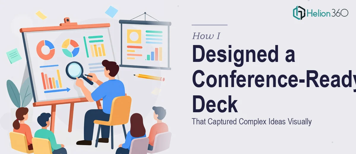
The content itself was dense. We were covering multiple layers of an idea — context, methodology, implications, and takeaways — and it all needed to flow without overwhelming the audience. The slides I was building looked more like formatted documents than a conference presentation. Text-heavy, inconsistent spacing, and visually flat.
I tried pulling from free PowerPoint templates, but nothing matched the tone we needed. The color palettes felt generic. The layouts either had too many decorative elements or too few. Every time I adjusted one thing, something else broke.
Beyond aesthetics, there was a structural issue too. A conference deck needs to guide attention deliberately. Each slide has to earn its place. I was struggling to decide what belonged on screen versus what should stay in the speaker notes, and how to represent certain ideas visually rather than just listing them out as text.
The deadline was firm. I needed help.
Bringing in a Team That Does This Every Day
After spending a few evenings trying to push through on my own, I came across Helion360. I reached out, explained the situation — the content we had, the conference context, the timeline, and the visual direction I was loosely imagining — and they took it from there.
What stood out immediately was how structured their intake process was. They asked the right questions about audience type, presentation length, whether the deck needed to work as a standalone document or just as a visual aid, and what kind of slide design language we wanted. Those questions alone helped me articulate things I had not fully thought through.
What the Final Deck Actually Looked Like
The finished presentation design was a significant step up from where I had started. The layout had visual hierarchy built into every slide — headlines that led the eye, supporting visuals that reinforced the message rather than decorating around it, and consistent spacing that made the whole thing feel intentional.
Complex ideas that I had been describing in paragraph form were restructured into simple visual frameworks — comparison layouts, flow diagrams, and clean data representations. Nothing felt crammed. The slide count actually went down while the clarity went up.
The color system and typography matched the professional tone the conference required, and the deck held together as a coherent whole from first slide to last. It was genuinely shareable — the kind of presentation design that works both on a large projector screen and when sent as a follow-up PDF.
What I Took Away From This
The real bottleneck was not a lack of content. It was knowing how to translate that content into a visual format that communicates under pressure, in front of an audience, in limited time per slide. That is a specific skill — part design, part editorial judgment — and it takes experience to do it well.
PowerPoint presentation design for conferences is not just about making slides look nice. It is about understanding how people process information visually, what holds attention, and what causes eyes to glaze over. Getting that balance right on a deadline, with complex subject matter, is where the real challenge lives.
I also learned that starting with structure before touching design makes everything easier. The Helion360 team naturally worked that way — content architecture first, visual treatment second — and the result showed.
If you are working on a investor pitch deck and the gap between your raw content and a polished, professional deck feels wider than expected, Helion360 is worth reaching out to. I learned from how they handled executive-ready presentations with complex data, and their approach to compelling visual narratives is exactly what transformed my conference deck.