

The Brief Sounded Simple — It Wasn't
We needed a professional PowerPoint presentation for our company. Nothing unusual about that. But when I sat down to actually build it, I quickly realized the gap between what we needed and what I could pull together on my own was much wider than I expected.
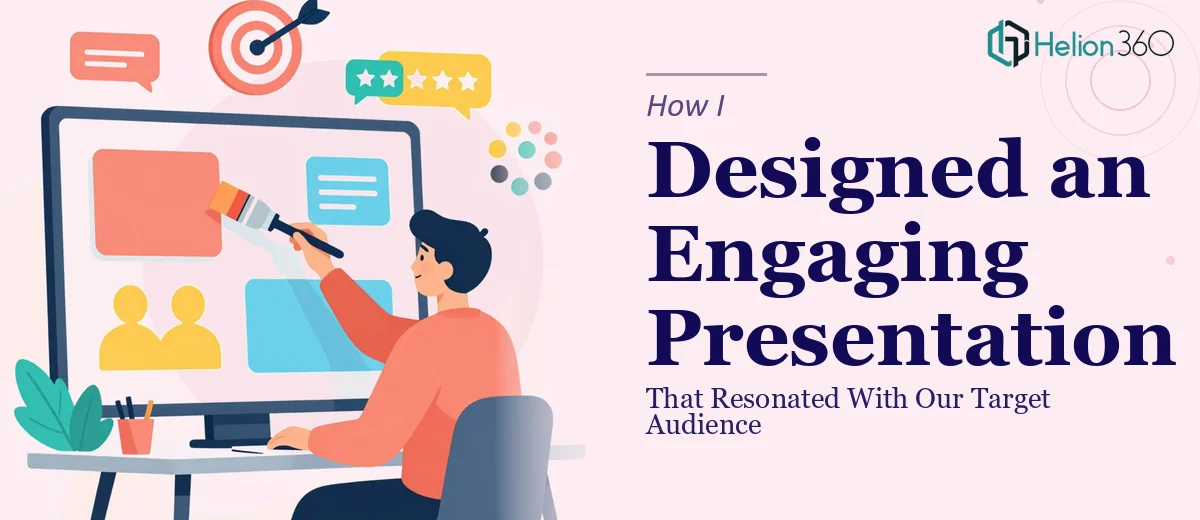
The goal was clear: create an engaging, visually polished deck that would resonate with our target audience — not just inform them, but genuinely hold their attention and move them toward a decision. That's a different challenge from putting slides together with bullet points and a logo.
Where I Hit a Wall
I started with a template. I had our key messages, some data, and a rough flow in mind. But getting all of that to come together in a way that felt cohesive and professional was harder than expected.
The visual storytelling piece was where things fell apart for me. I knew what we wanted to say, but translating that into a slide layout that actually communicated the message — with the right hierarchy, the right visuals, the right pacing — was beyond what I could do well in a reasonable amount of time. Every slide I designed looked either too cluttered or too bare. The flow felt off. And the branding wasn't consistent from one section to the next.
I also struggled with making the content feel like it was written for an audience rather than just documented for internal reference. There's a real difference between information and a presentation, and I kept blurring that line.
Bringing in Outside Help
After spending more time than I had on revisions that weren't getting better, I reached out to Helion360. I explained the situation — we had the content, we had a general direction, but the execution needed professional hands. Their team asked the right questions upfront: Who is the audience? What action do we want them to take? What tone should the presentation carry?
That alone told me they understood what a truly engaging PowerPoint presentation actually requires. It's not just about making slides look good — it's about making sure the design serves the communication goal.
What the Process Looked Like
Helion360 took the raw content I shared and restructured it before touching any design element. They flagged where the narrative had gaps, where we were overloading slides with text, and where a visual would do more work than a paragraph ever could.
The design itself came together with a clear visual language — consistent typography, a controlled color palette that matched our brand, and slide layouts that gave each key point room to breathe. The data we had was turned into clean visual formats that made comparisons easier to read at a glance. The opening section was reframed to hook the audience rather than just introduce the company.
Revisions were quick and practical. When I asked for adjustments to specific slides, the changes came back clean without disrupting the overall design consistency.
What the Final Deck Actually Did
When we used the presentation, the feedback was noticeably different from what we'd heard before. People commented on how clear the flow felt, how easy it was to follow, and how the visuals reinforced the message rather than distracting from it. The deck did what a professional presentation is supposed to do — it made our message land.
Looking back, the complexity wasn't in having too much content. It was in knowing how to shape that content for an audience, and how to design slides that support a story rather than just display information. That's a skill set that takes time to develop, and when you're working against a deadline, trying to build it from scratch isn't the right call.
If you're facing a similar situation — content ready but the presentation itself isn't coming together the way you need it to — Helion360 is worth a conversation. They handled exactly what I couldn't, and the result spoke for itself.