

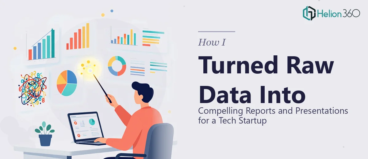
When the Data Is There but the Story Is Not
I was brought into a project with a tech startup that had more data than they knew what to do with. Their analytics tools were running continuously — tracking product performance, user behavior, operational metrics — and the exports were piling up. The problem was not a lack of information. The problem was that none of it was talking to anyone.
Investors were expecting updates. Partners needed clear summaries. Internal stakeholders wanted to see where things stood at a glance. And all of that raw data was sitting in spreadsheets, dashboard screenshots, and half-finished slide decks that nobody felt confident sharing.
I took on the challenge thinking I could handle it with some solid PowerPoint work and a few hours of organizing. I knew how to build slides. I understood data well enough. But when I started pulling everything together, the scope got a lot bigger than I anticipated.
Where the Complexity Started
The data was not just numbers — it was multi-source, inconsistent in format, and layered. Some metrics came from product analytics, others from financial models, and a few from manually updated trackers that had not been cleaned in months. Turning all of that into coherent, presentation-ready reports meant first understanding what story each dataset was supposed to tell, then deciding which visuals would carry that story clearly.
I could build a chart. But building the right chart, scaled correctly, labeled meaningfully, and integrated into a narrative that held across twenty or more slides — that was a different task entirely. Every time I thought I had a section locked down, another inconsistency surfaced. The data visualization work alone was becoming a project within the project.
I also realized I was spending more time reformatting and troubleshooting layout issues than I was thinking about the actual communication goals of the presentations. That is not where the value was.
Bringing in Helion360
After hitting a wall, I came across Helion360. I explained the full situation — the data sources, the audience breakdown, the types of deliverables needed, and the timeline. Their team took it from there.
What struck me immediately was how they approached it structurally. Rather than jumping into slide design, they first worked through what each report needed to communicate and to whom. The investor update presentation had a different job than the internal performance report, and they treated both accordingly. The data visualization choices reflected that — clean, purposeful charts for the investor deck, more granular breakdowns in the operational reports.
They worked across both PowerPoint and Google Slides formats depending on where each deliverable would live, and they brought a consistency to the visual language that I had been struggling to maintain on my own.
What the Final Deliverables Looked Like
The completed reports and presentations were a significant step up from where things had started. The investor-facing materials were tight — key metrics surfaced clearly, trends shown visually rather than buried in tables, and the narrative arc felt deliberate. Someone could flip through the slides without needing a guide.
The internal performance reports were just as well-structured but formatted for a different purpose — more detail, better use of data tables alongside summary visuals, and a layout that made quarterly comparisons easy to scan.
Perhaps more importantly, the presentations matched the startup's visual identity in a way that felt credible and consistent. When you are talking to investors or partners, that consistency matters more than people often realize.
What I Took Away From This
Turning raw data into compelling reports and presentations is not just a design task. It requires analytical thinking, an understanding of the audience, and the skill to choose the right visual format for each type of information. When all three of those things work together, the output earns attention.
I learned that the gap between having data and communicating it effectively is often larger than it looks at the start. Getting help from people who work at that intersection daily made the difference between a presentation that got made and one that actually got results.
If you are working through a similar situation — data to organize, reports to build, presentations to deliver — Helion360 is worth reaching out to. They handled what I could not at scale, and the work delivered exactly what the startup needed.