

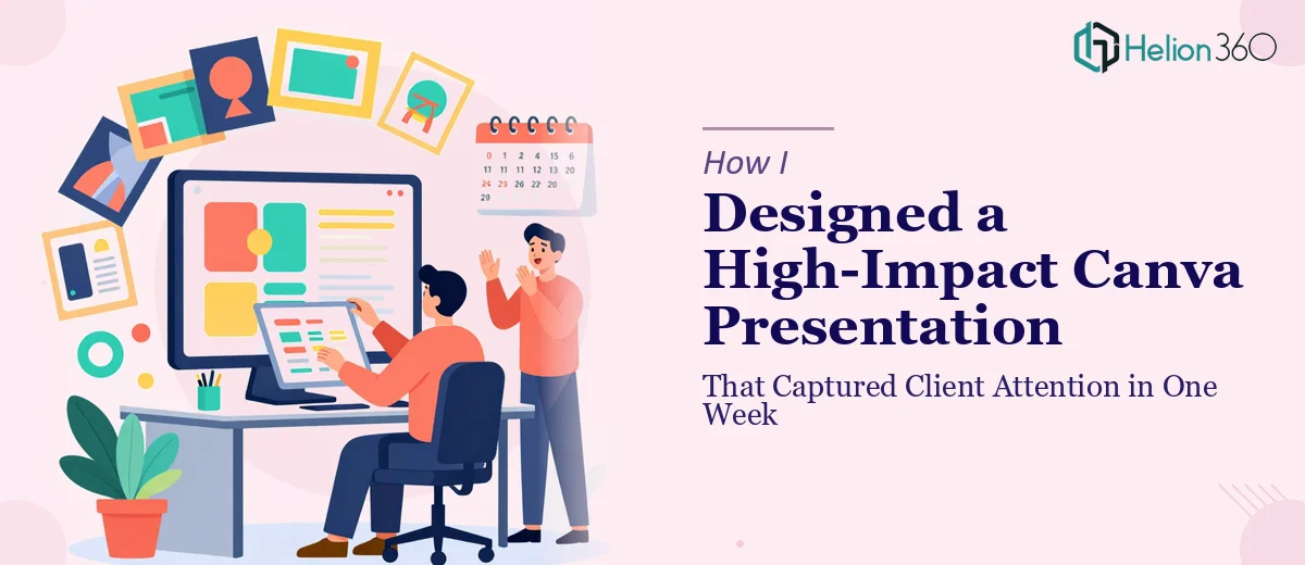
Starting Out With Big Ideas and a Tight Deadline
When I decided to put together a presentation to showcase my startup's services, I figured Canva would make things easy. It has templates, drag-and-drop tools, and hundreds of design elements — what could go wrong? Quite a bit, as it turned out.
I had a week to deliver something polished. The presentation needed to introduce my brand, communicate what we do, and hold the viewer's attention from slide one through the end. I had rough notes, a loose color palette, and a general sense of what I wanted. That felt like enough to get started.
Where My DIY Approach Started to Break Down
I spent the first two days experimenting with Canva templates. The options looked great in the preview, but once I started customizing them with our actual content, things got messy. Fonts clashed, color combinations felt off, and the layouts I was applying did not scale well when I added more text or switched out images.
More than that, I kept running into a deeper problem. I could make individual slides look decent, but I could not make the whole presentation feel cohesive. Each slide seemed to belong to a different deck. There was no visual thread pulling it together, and the bold, attention-grabbing quality I was going for just was not coming through.
I also realized I was spending too much time on design decisions I was not qualified to make — things like hierarchy, visual flow, and how to use brand colors without overwhelming the viewer. The deadline was getting closer and I had little to show for it.
Bringing in a Team That Knew What They Were Doing
After a couple of frustrating evenings, I reached out to Helion360. I explained the situation — startup presentation, Canva-based, one week, needs to be visually engaging and brand-aligned. Their team asked a few sharp questions about the audience, the tone, and the key message we wanted to land. That conversation alone helped me think more clearly about what the presentation was actually for.
They took it from there. I handed over my rough notes, a few reference slides I had started, and some brand direction, and they got to work.
What the Finished Presentation Actually Looked Like
The result was a clean, confident presentation that felt nothing like the template chaos I had been wrestling with. The layout was consistent across every slide — same grid logic, same font treatment, same color application. It looked intentional, not assembled.
The bold colors I had wanted were there, but used with restraint. Instead of every slide being loud, the visual weight was placed where it mattered — on key messages, data points, and the opening slides that needed to grab attention immediately. That balance was something I had been unable to achieve on my own.
The slide flow was also much better than what I had drafted. The presentation moved logically from problem to solution to offering, with each section feeling like a natural step rather than an abrupt shift. Visual storytelling, done right, makes the content easier to follow and harder to ignore.
What I Took Away From the Experience
Knowing a tool and knowing design are two different things. Canva is accessible, but creating an engaging Canva presentation that holds together as a cohesive piece still requires real design thinking — about structure, hierarchy, color theory, and visual pacing. I had the ideas but not the execution skills to match them.
I also learned that a week is not as long as it sounds when you factor in revisions, second-guessing, and starting over. Having someone experienced step in early would have saved me two days of frustration.
The presentation landed well. It did what I needed it to do — caught attention, communicated the brand clearly, and gave clients a reason to keep reading.
If you are in the same spot I was — good ideas, limited time, and a Canva file that is not coming together — consider business presentation design services. For additional perspective, you might also explore how others have tackled similar challenges: high-impact presentations for tech startups and unified brand messaging across sales and marketing offer real-world examples of presentation transformation.