

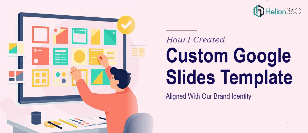
The Problem With Starting From Scratch
We were in the middle of a rebranding. New logo, refreshed color palette, updated typography — the whole process had taken months to get right, and we finally had a proper branding guideline document in hand. What we did not have was a set of presentation templates that matched it.
All of our customer-facing decks looked inconsistent. Some slides used the old colors, some used fonts from a previous era of the brand, and none of them felt like they belonged to the same company as our website. For B2B prospects and investors, that kind of inconsistency sends the wrong signal before you even start talking.
I needed a custom Google Slides template system — one that would work across sales presentations, investor decks, and internal pitch materials. The look and feel had to mirror the website exactly.
What I Tried to Do on My Own
I started by pulling the brand guidelines and opening Google Slides. I created a master slide, applied the primary brand color to the background, and added the logo. That part was straightforward enough.
The complexity showed up quickly. Getting the typography hierarchy right across title slides, content slides, divider slides, and data slides required more than just picking a font. The spacing, weight, and sizing had to feel intentional and consistent across every layout variant. Then came the challenge of matching the visual language of the website — the way elements were layered, the subtle use of secondary colors, the tone communicated through layout — none of that transferred cleanly into a slide format without deliberate design decisions.
I also realized I was thinking about the templates too narrowly. A real template system needs to anticipate how a presenter will actually use it. That means planning for slide layouts that can carry different types of content — text-heavy slides, visual slides, chart slides, quote callouts, and transition slides — all while staying on-brand. That is a design problem, not just a formatting task.
After a few hours, I had something that looked acceptable at a glance but fell apart under scrutiny. The brand did not feel cohesive across slide types, and I knew these would be seen by investors and B2B decision-makers who notice that kind of thing.
Bringing in a Design Team
After hitting that wall, I reached out to Helion360. I shared the branding guidelines, explained the use cases — customer-facing decks, investor presentations, B2B sales pitches — and described the visual direction I was going for. Their team asked the right questions upfront: how many layout variants we needed, what types of content would appear most often, and whether the templates needed to accommodate both light and dark themes.
That initial conversation alone clarified things I had not fully thought through. They took the brief and got to work.
What the Final Template System Looked Like
The Google Slides template set Helion360 delivered covered every scenario we actually needed. There was a title slide, an agenda layout, a content-heavy text slide, a two-column comparison layout, a full-bleed image slide, a chart and data slide, a team or profile layout, and a closing slide — all built around the same visual system.
Every element tied back to the brand guidelines. The fonts matched the website exactly. The color usage followed the defined primary and secondary palette without improvisation. The spacing felt considered rather than default. Even the icon style and shape language were consistent with how the brand communicated visually on the web.
Beyond aesthetics, the templates were built to be practical. Text boxes were sized correctly for real content. Placeholder logic was set up so a non-designer could swap in content without breaking the layout. The slide master was organized cleanly so future edits would not require rebuilding everything from scratch.
What I Took Away From the Process
Building a branded Google Slides template system is not just a visual task — it is a systems design task. You are not decorating slides; you are creating a reusable presentation infrastructure that has to perform consistently across different presenters, different contexts, and different audiences.
Getting that right, especially when it needs to reflect a fresh rebrand and match a live website, takes more than time. It takes design judgment.
If you are going through a rebrand and need brand story presentation design services that actually reflect your brand identity across investor and B2B presentations, Helion360 is worth a conversation. For real-world examples of how this works in practice, check out how I designed a Google Slides presentation with cohesive brand identity and how I created a high-impact presentation that captured fintech brand story — they handled the parts I could not get right on my own and delivered a template set our team has been using ever since.