

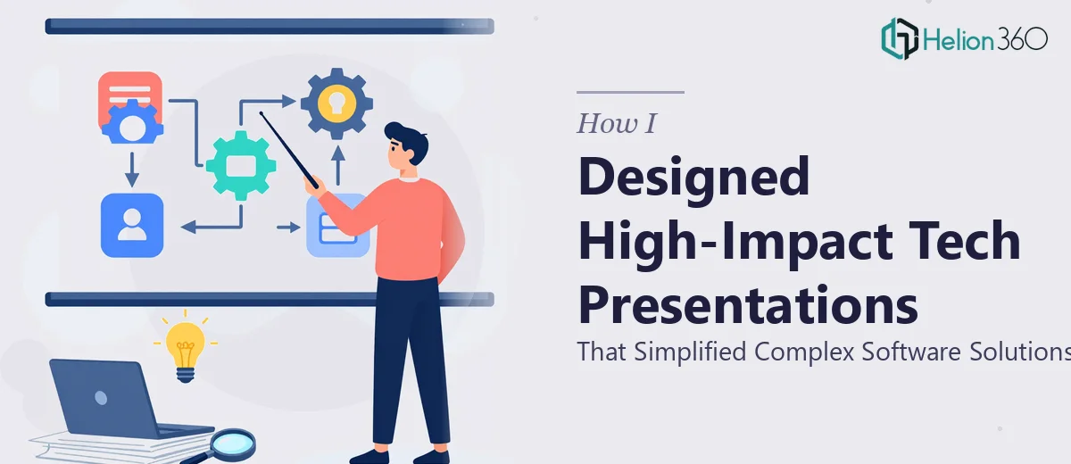
When Technical Depth Meets Presentation Pressure
I work closely with a team that builds software solutions for enterprise clients. The product is genuinely powerful, but explaining it to non-technical stakeholders has always been a challenge. Every time we walked into a meeting with a dense slide deck full of architecture diagrams and feature lists, eyes glazed over within minutes.
The problem was not the product — it was the presentation. We needed technical presentations that could translate complex software functionality into something an executive, a procurement lead, or a potential partner could actually follow and care about.
So I decided to take it on myself.
Trying to Build It Alone
I sat down with PowerPoint and later Google Slides, trying to restructure our existing content. I understood the material well, so that part was straightforward. What tripped me up was everything else — the visual hierarchy, the slide-by-slide flow, making data feel light instead of overwhelming, and keeping the design consistent across a 25-slide deck.
I spent a week on it. The slides were functional, but they looked like internal working documents, not something you would confidently present to a room full of decision-makers. The technical information was all there, but it sat heavy on every slide. Nothing guided the viewer's eye. Nothing made them feel like the story was moving forward.
I also realized I was spending time I did not have. With active projects and client deliverables running in parallel, dedicating hours to slide design was not sustainable.
Bringing in a Team That Understood the Problem
After hitting that wall, I came across Helion360. I sent over what I had — the rough slides, a brief explaining the audience type, and notes on what the presentation needed to accomplish. Their team came back quickly with questions that showed they had actually read the brief: Who is the primary audience? What action should they take after viewing this? Are there specific sections that need to carry more weight?
That level of questioning told me they were thinking about the presentation the way I needed them to — not just as a design task, but as a communication challenge.
What the Redesigned Presentations Looked Like
Helion360 restructured the flow before touching the visuals. They pulled out the core message of each section and built slides around that single idea, rather than cramming multiple points onto one screen. Technical concepts that previously required three paragraphs of explanation were replaced with clean process diagrams and annotated visuals that made the logic immediately visible.
The Google Slides version was built to be editable and easy to update — which mattered because our messaging shifts depending on the audience. The PowerPoint version was more polished and animation-ready for live presentations. Both felt cohesive, brand-consistent, and professional without looking overdesigned.
What stood out most was how they handled the technical content. They did not dumb it down — they found the right level of abstraction. Slide by slide, the complexity was still there, but it was revealed in a way that felt natural and earned.
The Outcome and What I Took Away
We used the presentations in three different meetings over the following month. The feedback from stakeholders shifted noticeably. People were asking better questions — which usually means they understood what they were looking at. One meeting that previously ran long because of constant clarifications wrapped up 20 minutes early.
For me, the bigger lesson was understanding where the real skill gap was. I could write the content. I understood the technical material. But translating complex data into professional presentation design — especially across both PowerPoint and Google Slides — is a discipline on its own. It takes a combination of visual thinking, communication strategy, and software proficiency that takes time to build.
If you are working through a similar challenge — technical content that needs to speak to a broader audience, or a presentation that needs to do more than just show up on a screen — Helion360 is worth reaching out to. They took a rough, information-heavy deck and turned it into something that actually moved conversations forward.