

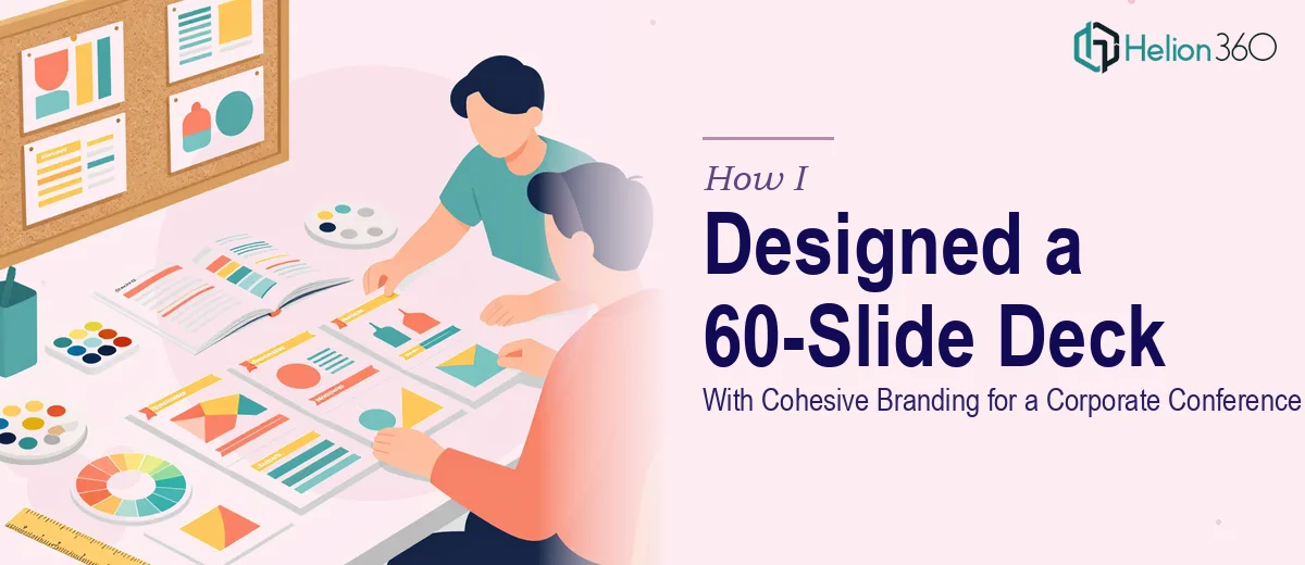
When 60 Slides Feels Like a Mountain
I had about four weeks before our annual company conference, and one very clear task sitting in front of me: build a 60-slide PowerPoint presentation that covered our company's full story. History, mission, values, ongoing initiatives, upcoming projects — the works. It needed to look polished, stay on-brand, and hold the attention of a room full of stakeholders.
I figured I could handle the first draft myself. I knew the content well enough, and I had used PowerPoint before. So I opened a blank file, pulled up our brand guidelines, and started building.
Where the Process Started to Break Down
The content side was manageable. I knew what to write. The problem was the design. Once I got past the first ten slides or so, it became obvious that keeping 60 slides visually consistent was not something I could do quickly or well on my own.
Every section I built looked slightly different from the one before it. The font sizes drifted. The spacing was inconsistent. The images I was pulling in had different color tones. By slide twenty, the deck already looked like it had been built by five different people. And I still had forty slides to go.
I also realized that building a truly modern, high-quality corporate PowerPoint presentation — one that would actually hold up on a large conference screen — required design skills I simply did not have the time to develop. This was not a quick polish job. It was a full-scale build.
Bringing in the Right Team
After spending the better part of a weekend on it and seeing diminishing returns, I reached out to Helion360. I explained the scope — 60 slides, corporate conference, full company overview, consistent branding throughout — and shared the content outline along with our brand assets.
Their team asked the right questions upfront. What tone should the deck strike? Formal but engaging. Were there specific sections that needed data visualization? Yes — a few slides covering growth metrics and project timelines. Did we have a preferred color palette? We did, and I sent it over.
From there, they took over.
What the Final Deck Actually Looked Like
What came back was a different experience entirely. The deck had a clear visual system running through all 60 slides — consistent typography, structured layouts, a coherent color language, and section dividers that made navigation intuitive for the audience. The slides covering company history used a clean timeline format. The mission and values section had a layout that felt considered rather than templated. The project slides used icons and structured columns instead of dense text.
The data slides, which I had been most worried about, were handled particularly well. Instead of raw numbers dropped into a default chart, the visualizations were formatted to actually communicate something — with labels, callouts, and sizing that made the key figures easy to read at a glance.
The branding stayed consistent from the title slide all the way to the final thank-you screen. That alone was worth it.
What I Took Away From This
Building a large corporate presentation with real design quality is not just a matter of knowing the software. It requires a systematic approach to layout, typography, color, and visual hierarchy — applied consistently across dozens of slides, often with very different content types per section. That is a specialized skill, and pretending otherwise only costs you time.
I also learned that handing off something this size works best when the content is ready and the brief is clear. The cleaner the inputs, the faster and better the output. Going in with a complete content outline and brand assets made the collaboration straightforward.
If you're building a large corporate presentation on a deadline and the design side is slowing you down, Helion360 is worth a conversation — they handled what I couldn't and delivered something the room actually responded to.