

When the Curriculum Was Ready but the Delivery Wasn't
I had spent weeks developing an English conversation and presentation skills program for a group of working professionals. The lesson plans were solid. The feedback loops were built in. The progression from basic conversation to structured public speaking felt logical and well-paced.
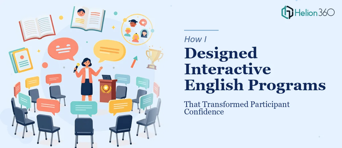
But when I sat down to actually deliver the program — through virtual sessions using video conferencing tools — I realized that the materials themselves were letting the content down. My slides were functional at best. The interactive lesson materials I had drafted looked rough compared to the professional tone the program was supposed to set. Participants were expected to show up, engage, and grow. The visual environment needed to match that expectation.
The Gap Between Content and Presentation
Teaching English communication skills is one thing. Presenting that curriculum in a way that feels credible, organized, and visually engaging is another challenge entirely. I was working across multiple proficiency levels — some participants were near-beginners, others were confident speakers who simply needed to polish their presentation style. Each group needed materials that felt tailored, not generic.
I tried to redesign the slides myself. I rearranged layouts, swapped fonts, added icons. But every version still looked like a training worksheet rather than a professional learning experience. The problem wasn't just aesthetics — it was structure. I didn't have a clear visual system that could carry both the conversational warmth of the program and the professional weight the participants needed to feel.
After a few rounds of edits that weren't moving in the right direction, I decided the presentation design side of this needed a specialist.
Bringing in a Team That Understood Visual Communication
I came across Helion360 while looking for presentation design support that could handle something a bit unconventional — not a pitch deck, not a corporate report, but an interactive learning deck that needed to feel human and professional at the same time. I explained the structure of the program, the different participant levels, and what each session was meant to accomplish.
Their team asked the right questions upfront. They wanted to understand the tone I was going for, how participants would experience the slides on screen during live sessions, and where interaction was built into the flow. That told me they were thinking about the presentation as a functional tool, not just a design exercise.
What came back was a clean, well-structured visual system. Each module had its own consistent look. Prompts and conversation starters were formatted in a way that felt natural to read aloud. The slides for presentation skills practice gave participants a clear visual framework to follow — which, given the subject matter, was exactly right. A slide that models good structure is itself a teaching tool.
What the Redesign Made Possible
Once the materials were in place, the delivery improved noticeably. Participants engaged more readily when the visual environment felt organized and intentional. The progression from one skill level to the next was easier to communicate because the design carried part of that load. Feedback sessions flowed better because I wasn't compensating for unclear slides in real time.
The interactive lesson materials also became easier to update between sessions. The template logic Helion360 set up meant I could drop in new conversation prompts or adjust difficulty without breaking the visual consistency. That kind of flexibility matters when you're running a program that evolves week to week.
What I Took Away from This
Building a strong English conversation and presentation skills program is genuinely complex work. The curriculum, the pacing, the feedback structures, the participant relationships — those all require deep focus. Trying to also be the designer of the materials while doing all of that in parallel was spreading my attention too thin.
The lesson for me was practical: know where your skills are strongest, and get support where they aren't. The content was mine. The design needed someone who does that work every day.
If you're developing a training or communication skills program and the materials aren't doing justice to the content you've built, Helion360 is worth reaching out to — they handled the design side of this project cleanly and made the whole program easier to deliver.