

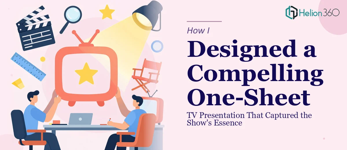
The Brief Was Simple. The Execution Was Not.
When our production team finished developing the concept for a new television series, the next step felt straightforward on paper — create a one-sheet presentation that could pitch the show to networks and distributors. One page. One chance to communicate the premise, the tone, the characters, and the visual world of the series.
I had worked on marketing materials before, so I volunteered to take the first pass. I figured it was just a matter of good layout and clean copy. I was wrong about how hard that balance would be to strike.
What a TV One-Sheet Actually Needs to Do
A one-sheet TV show presentation is not a flyer or a summary document. It is a carefully crafted visual narrative that needs to do several things at once. It has to communicate the genre and tone at a glance, introduce the world without over-explaining it, and leave the reader wanting to know more. Every element — typography, color palette, image treatment, headline hierarchy — has to work together to create an emotional impression.
I started by drafting the layout in PowerPoint. I had the key copy: the logline, a short character overview, the show's themes, and the target audience. But the moment I started placing things on the page, I ran into a problem. The design kept looking either too busy or too sparse. I could not find the visual tone that matched the show's identity. I tried adjusting the typography several times, pulling different stock imagery, experimenting with color, but nothing clicked the way it needed to.
The show had a specific mood — gritty but cinematic, character-driven but plot-heavy. That kind of nuance is hard to translate into a single page of design without a trained eye for visual storytelling.
When Good Enough Was Not Going to Cut It
After about three attempts over two days, I stepped back and looked at what I had honestly. The information was all there. The writing was tight. But visually, it did not feel like a television show. It looked like a corporate document dressed up with a dark background.
This was not something I could fix by watching a few tutorials. What the project needed was someone who understood how to build a one-sheet presentation from the ground up — someone with experience in entertainment marketing design and a real feel for layout composition under constraints.
That is when I reached out to Helion360. I sent them the draft, the show's creative brief, and a few visual references I had pulled from other productions. Their team looked at everything and came back with a clear plan for how to approach the redesign.
How the Design Came Together
Helion360 started by rebuilding the layout from scratch with a stronger visual hierarchy. The show title became the anchor. The logline was repositioned and styled in a way that felt like a teaser rather than a description. The color palette shifted to reflect the show's actual mood — something my original draft had completely missed.
They handled the typography with care, pairing a display font that had cinematic weight with a clean body typeface that kept the text readable at smaller sizes. The image treatment gave the whole page a consistent, produced feel — like something that had been designed for a pitch room, not assembled in a hurry.
What impressed me most was how they managed the information density. Everything was still there — premise, characters, themes, audience — but it no longer felt crowded. The layout guided the eye naturally from headline to supporting detail to call-to-action.
What I Took Away From the Process
Creating a professional one-sheet presentation for a television show is a specific discipline. It sits at the intersection of graphic design, editorial layout, and entertainment branding. Knowing your show well is only part of the equation. The other part is knowing how to translate creative energy into a single-page visual format that communicates instantly.
Working through this project taught me that the design decisions — typeface choice, spacing, image framing, color temperature — carry as much meaning as the words themselves. When those decisions are made with intention, the one-sheet stops being a document and starts being an experience.
If you are working on a TV pitch and finding that your one-sheet is not landing the way the show deserves, Helion360 is worth a conversation — they brought clarity and visual identity to a project that I could not crack on my own, and the final result reflected the show the way it needed to.