

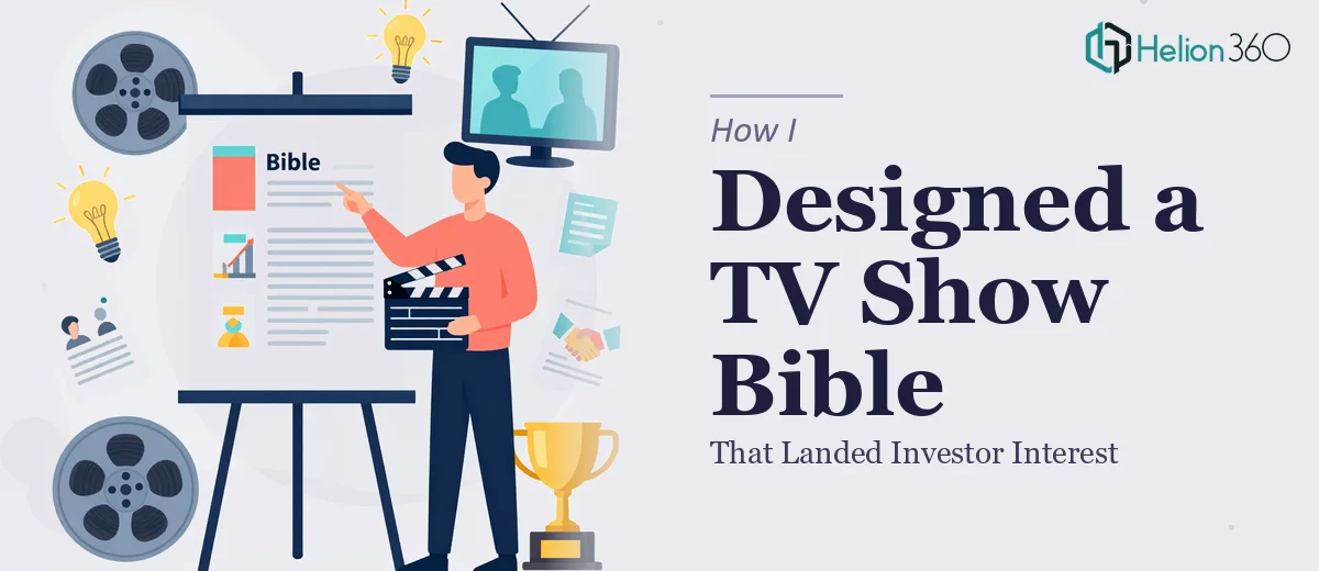
The Idea Was Strong — The Presentation Was Not
I had been developing a TV show concept for months. The storylines were mapped out, the character arcs had depth, and the production vision was clear in my head. What I did not have was a presentation that could communicate any of that to someone sitting across a table.
A TV show bible is more than a document. It is the first real impression of your series — a pitch deck that needs to carry the weight of your concept visually and narratively at the same time. When I sat down to put it together myself, I quickly realized the gap between having a strong idea and presenting it in a way that lands.
What I Tried First
I started in PowerPoint. I had a rough structure in mind: series overview, episode breakdowns, character profiles, tone and visual references, and production details. Laying it out seemed straightforward at first.
But the moment I tried to bring the aesthetic of the show into the slides, things stalled. The fonts felt generic. The layouts looked like corporate templates. Nothing about the deck communicated the tone of the series. I tried swapping color palettes and pulling in reference images, but the overall presentation still felt disconnected — like a report, not a story.
For an investor pitch deck, that disconnect is a problem. People investing in creative projects are not just evaluating the concept — they are evaluating whether the team can execute on a vision. A poorly designed show bible undermines that confidence before a single word is spoken.
Bringing in the Right Help
After spending more time adjusting slide margins than refining content, I reached out to Helion360. I explained the project — a full TV show bible presentation deck intended for internal team use and investor pitching — and shared my rough structure, reference materials, and the tone I was going for.
Their team asked the right questions upfront: What genre is the show? Who is the primary audience for this deck? What kind of visual language should it speak? That level of attention told me they understood the difference between a generic presentation and a compelling fundraising pitch deck built around a specific narrative.
What the Deck Needed to Do
A show bible presentation is not a standard business deck. It has to balance information density with visual immersion. Investors need to understand the concept quickly, but they also need to feel the world of the show — its tone, its energy, its potential.
Helion360 designed a layout that did both. The opening slides established the visual language of the series immediately — color grading, typography, and imagery that matched the show's tone rather than generic slide design. Character profiles were laid out with enough visual hierarchy to make each arc readable at a glance. Episode breakdowns used clean structure without losing the narrative texture that made each storyline compelling.
The production section, often the least visually interesting part of a show bible, was designed with enough clarity that investors could assess scope without getting lost in technical detail.
The Result and What I Took Away
The finished pitch deck was something I genuinely could not have produced on my own — not because the concept was lacking, but because translating a creative vision into a professional presentation deck requires a specific kind of design thinking. Story structure, visual branding, and investor-facing communication all have to work together.
The deck got us in the door for two investor conversations within the first month of pitching. Both parties commented on how clear and well-organized the presentation was. One specifically said the visual design made the concept feel ready to produce, not just ready to pitch.
What I learned from this experience is that a TV show bible is not just documentation — it is a sales tool for your creative vision. Treating it like a standard PowerPoint misses the point entirely.
If you are at the same stage I was — clear on the concept but struggling to present it in a way that does it justice — Helion360 is worth reaching out to. They handled the translation from rough ideas to polished presentation, and the outcome spoke for itself.