

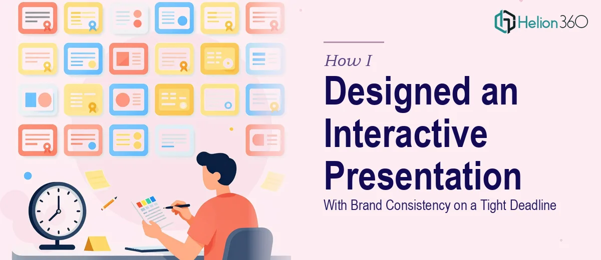
The Monday Deadline That Snuck Up on Me
It was Thursday afternoon when I confirmed a presentation slot for Monday. Not next Monday — this Monday. That gave me roughly three days to pull together around 20 slides that needed to be on-brand, interactive, and genuinely engaging for the audience.
I had the content in my head and most of it in scattered notes. The brief was clear enough: brand-appropriate design, interactive elements, and a clean visual flow from slide one to the last. The problem was not knowing what to say — it was getting it to look the way it needed to look, in the time I had left.
Why I Could Not Just Handle It Myself
I am comfortable putting together a basic deck. Aligning colors, picking fonts, dropping in a chart — that is manageable. But a 20-slide presentation with genuine brand consistency is a different level of work. Every slide needs to feel like it belongs to the same visual family. Interactive elements — clickable navigation, layered reveals, engaging transitions — take real time to set up properly, especially if you want them to feel polished rather than gimmicky.
I started roughing out a few slides on Friday morning. By the time I had done three, I could already see the problem. My version was functional, but it lacked the visual sharpness a proper presentation design deserves. The branding felt inconsistent between slides, and the interactive elements I was trying to build looked clunky. With a real deadline bearing down, I knew I was not going to get this across the line the way it needed to look.
Bringing in the Right Team
I reached out to Helion360 that same Friday. I explained the situation clearly — 20 slides, brand-consistent design, interactive and engaging, content coming in shortly, needed before Monday afternoon. Their team understood the brief immediately and confirmed they could work with the turnaround.
I sent over the content as fast as I could pull it together — copy, key messages, brand assets, color references. From there, Helion360 took over completely. I did not have to manage the design process slide by slide. I gave them what they needed and let them do the work.
What the Final Presentation Looked Like
The deck came back as a cohesive, properly designed presentation. Every slide followed the same visual logic — consistent typography, brand colors applied correctly throughout, and layout choices that made the content easy to follow rather than hard to scan.
The interactive elements were built properly. Navigation felt smooth, the flow between sections made sense, and the overall deck had the kind of polish that signals to an audience that real thought went into the design. It did not look like something thrown together on a deadline — which, given the circumstances, was exactly what I needed.
What a Tight-Turnaround Presentation Actually Requires
Going through this experience clarified something I had always vaguely understood but never fully tested. Designing a brand-consistent presentation across 20 slides is genuinely time-intensive work. Maintaining visual harmony, building interactive functionality, and ensuring the audience experience feels seamless — these are not things you can rush without it showing.
There is also the separation-of-effort problem. When you are the one presenting, you should be thinking about your delivery, your talking points, and your audience. You should not also be the one wrestling with slide alignment and transition timing at midnight on Sunday.
Getting the design handled separately meant I walked into Monday's presentation focused and prepared. The slides did what they were supposed to do — they supported the message without getting in the way of it.
If you are facing a similar situation — a tight-deadline presentation that does not leave room for a full design cycle, or a deck that needs to look genuinely polished rather than just presentable — Helion360 is worth reaching out to. They handled what I could not manage in the time I had, and the result held up exactly as needed.