

The Brief Seemed Straightforward at First
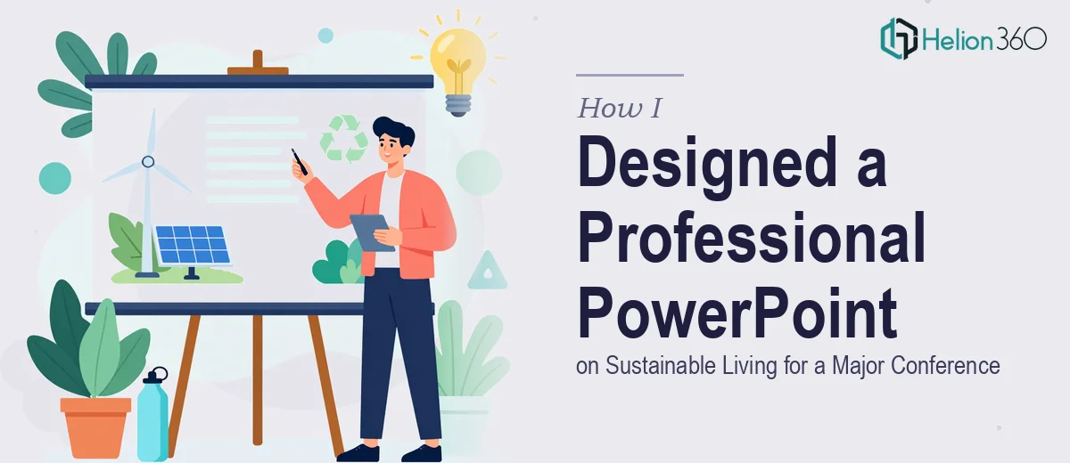
I had a conference coming up and a clear topic: sustainable living practices. The goal was to walk an audience through why it matters, back it up with real data, share success stories from organizations that had embraced green practices, highlight emerging eco-friendly technologies, and leave attendees with actionable steps they could take right away.
On paper, the scope felt manageable. I had the content, I knew the structure, and I figured a few hours in PowerPoint would get me there. An introduction, a statistics section, a few case studies, an innovation segment, and a closing call to action. Clean and modern design, strong visuals, high-resolution output for both screen and print, plus a separate notes document for the speaker.
Simple enough — until I actually sat down to do it.
Where the Complexity Started to Show
The content itself was not the problem. The design was. I wanted the presentation to feel polished and visually consistent throughout — not like a patchwork of slides where each one looks like it was built on a different day. Sustainable living as a topic has a visual language: earthy tones, clean layouts, photography that communicates nature and progress at the same time. Getting that balance right across every slide is harder than it sounds.
I spent a couple of evenings trying different layouts and color palettes. Every time I got one section looking the way I wanted, another section would feel off. The data slides were especially tricky — presenting key statistics on sustainability issues in a way that was both accurate and visually engaging required more than just dropping numbers into a chart. I needed the data-driven PowerPoint deck to tell a story, not just sit on a page.
Then there was the notes document. I had not fully thought through how much time it would take to write speaker notes that actually added value rather than just repeating what was on the slides.
At some point, I had to be honest with myself. The deadline was close, the design was not where it needed to be, and the project deserved better than what I could deliver under pressure.
Bringing in the Right Help
I came across Helion360 while looking for a presentation design team that could handle a project of this scope quickly and without losing quality. I explained the brief — the topic, the sections, the design direction I had in mind, the PDF output requirement, and the notes document. Their team asked a few clarifying questions, confirmed the timeline, and got started.
What stood out was that they did not just execute instructions mechanically. They approached the sustainable living theme with actual visual intention — the typography, the imagery choices, the way the statistics were laid out as part of a narrative rather than isolated data points. The success stories section came together in a way that felt compelling rather than just informative. The eco-friendly technology slides had energy without feeling cluttered.
What the Finished Presentation Looked Like
Helion360 delivered a fully structured professional PowerPoint presentation that covered every section in the brief. The design was clean and modern, with a consistent visual identity running through all slides. The high-resolution PDF export was ready for both printing and screen display. The speaker notes came as a separate document, written to support a presenter rather than just describe the slides.
The whole thing looked like it had been built by someone who understood both design and the subject matter. Audience engagement was never in doubt — the visuals did exactly what they were supposed to do.
What I Took Away From This
Presentation design at a conference level is not just about putting content into slides. It is about translating a message into a visual experience that holds attention, communicates data clearly, and leaves an impression. When the stakes are high and the timeline is tight, the gap between a functional deck and a truly professional one becomes very obvious.
If you are preparing for a conference or any high-visibility event and the design side of your presentation is taking longer than it should, Helion360 is worth reaching out to — they handled every part of this brief and delivered exactly what the project needed.