

The Brief Sounded Simple. The Execution Was Not.
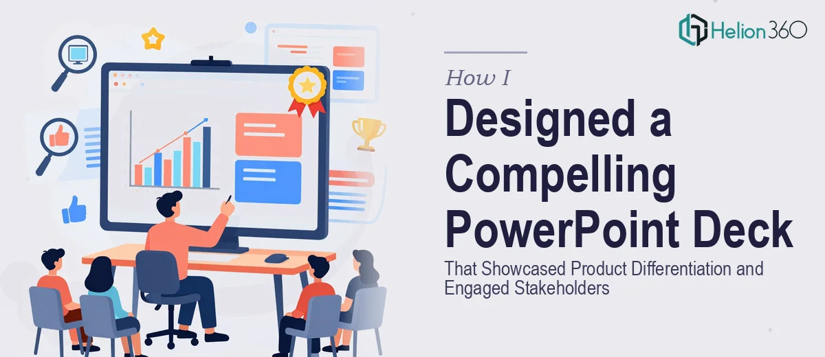
I had a client meeting coming up in less than a week. The agenda was a new product launch — something our team had been working on for months — and we needed a PowerPoint deck that would do more than just summarize talking points. It had to show exactly how this product was different from what competitors were already offering, and it had to land with a room full of stakeholders who had seen plenty of average presentations before.
I figured I could handle the initial design myself. I had a rough outline, some product screenshots, and a clear sense of what we wanted to communicate. I opened PowerPoint, dropped in our brand colors, and started building slides.
About two hours in, I realized the slides looked functional but flat. The messaging was there, but nothing about the visual design made it feel like a product worth getting excited about.
Where the Process Started to Break Down
The core challenge with a business presentation for a product launch is that you are trying to do several things at once. You need to establish context, communicate key features and benefits, address the competitive landscape, and do all of this while keeping the audience visually engaged — without overwhelming them with text or cluttered layouts.
I kept toggling between slides trying to make the product differentiation section feel punchy. I experimented with different font pairings and layout combinations, but nothing felt cohesive. The color scheme I was working with did not translate well across slides. Some slides felt too sparse, others too dense. And the interactive elements I wanted to include — things like clickable section tabs and animated transitions that would give the deck a more polished, presentation-ready feel — were taking far longer than I had to spare.
With the client meeting days away, I needed to make a decision.
Handing It Off to a Team That Knew What to Do
After hitting a wall, I came across Helion360. I explained the situation — the timeline, the product focus, the need for brand-aligned visuals, and the specific ask around interactive elements. Their team asked the right questions upfront: brand guidelines, target audience, the core message we needed each section to deliver.
What happened next was the part that actually surprised me. Within the first round of slides, the design direction was already clearer and more intentional than anything I had put together. The product differentiation section used a visual comparison layout that made the competitive advantage immediately readable. The feature highlights were broken into a structured flow that guided the audience rather than dumping information on them.
What the Final Deck Looked Like
The finished business presentation PowerPoint covered the product story from market context through to a clear call to action. The font choices were clean and matched our brand identity without being generic. The color palette was consistent across all slides, using accent colors strategically to draw attention to key data points rather than decorating every corner of the slide.
The interactive elements — section navigation, animated slide transitions, and clickable feature callouts — made the deck feel less like a static document and more like a guided experience. For a stakeholder meeting, that distinction matters. When the presentation moves with intention, it signals that the team behind the product thinks with the same level of care.
The visual storytelling across the deck also helped with the pacing of the actual presentation. Each slide did one job well, which made it easier to speak to rather than read from.
What I Took Away From This
There is a gap between knowing what a good presentation needs and being able to execute it under time pressure. Understanding slide structure, brand alignment, competitive framing, and interactive design as separate concepts is one thing — pulling them together into a cohesive deck that works in a live meeting is a different skill set entirely.
For a product launch presentation where the stakes are high, the design quality directly affects how the product is perceived. Weak slides create doubt. Strong, well-structured slides reinforce confidence.
If you are building a product launch or business presentation and the design is not coming together the way it needs to, Helion360 is worth reaching out to — they took a scattered brief and turned it into something that held up in the room.