

The Brief Sounded Simple at First
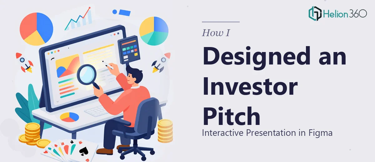
I was tasked with building an investor pitch presentation in Figma. Not a static deck, but something genuinely interactive — with clickable flows, polished visuals, and a clean structure that would hold up in a room full of investors. The goal was to communicate a project vision clearly and make the experience feel considered, not just assembled.
I had used Figma before for interface work, so I thought the learning curve would be manageable. It was not quite that straightforward.
Where the Complexity Crept In
The challenge with designing an investor pitch presentation in Figma is that it sits at the intersection of two very different disciplines: storytelling and visual design. Getting the layout to feel polished is one thing. Getting it to tell a coherent story — with the right pacing, the right hierarchy, and branding that feels intentional — is another problem entirely.
I started with the structure. I mapped out the key sections: the problem statement, the solution, the market opportunity, the business model, the team, and the ask. That part came together reasonably well. But when I moved into actual slide design, things slowed down fast.
The typography felt inconsistent across frames. The color usage drifted from the brand guidelines by the third section. And the interactive prototype connections — where one slide needed to flow into a secondary view or a modal — kept breaking in ways I could not easily trace. I was spending more time troubleshooting Figma prototype logic than actually designing.
There was also a bigger issue: the presentation needed to look like it came from a single, confident design voice. What I had was technically functional but visually uneven. For an investor presentation, that unevenness matters.
Bringing in the Right Support
After hitting that wall, I reached out to Helion360. I explained the situation — the brief, the branding constraints, what I had already built, and where things were falling apart. Their team asked the right questions upfront: about the audience, the tone, the expected delivery format, and whether the Figma file needed to be editable or presentation-ready.
That intake process alone gave me confidence that they understood what a Figma-based investor pitch actually required.
Helion360 took over the design side from that point. They rebuilt the slide framework with a consistent component system, which immediately solved the typography and color drift problems I had been battling. Each section of the pitch was redesigned with clear visual hierarchy — important numbers given room to breathe, supporting text kept concise, and the brand identity running consistently from the first frame to the last.
What the Final Presentation Looked Like
The finished Figma presentation was structured across roughly eighteen frames, each with a distinct purpose and a clean, uncluttered layout. The interactive prototype worked without issues — transitions were smooth, the clickable elements behaved predictably, and the overall flow matched the narrative logic of the pitch.
Visually, it felt like a single piece of work rather than a collection of slides. The branding was consistent. The data slides used simple, legible charts rather than dense tables. The team section had a layout that felt warm without being informal. Everything about it communicated confidence.
When I reviewed it before the presentation meeting, my main reaction was that it looked like something a design-focused startup would have spent weeks building internally. It had that level of finish.
What I Took Away from the Process
Designing an investor pitch presentation in Figma is not just a design task — it is a communication task. The tool matters less than the ability to shape a narrative visually, maintain consistency under pressure, and understand what investors actually respond to. Those are skills that take time to build, and there is no shame in recognizing when a project needs more than you can deliver alone.
The other thing I learned is that handing off a partially completed file is not a problem if you are working with people who know how to pick it up cleanly. The Figma file I sent over was a bit of a mess, and what came back was organized, properly structured, and easy to navigate.
If you are working on a similar project — an interactive pitch deck, a Figma-based investor presentation, or any design work that has grown more complex than expected — Helion360 is worth reaching out to. They handled the parts I could not and delivered exactly what the project needed.