

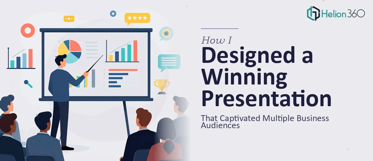
When One Presentation Has to Work for Multiple Audiences
I had a project that seemed straightforward at first: design a professional presentation that could be used across different business settings — annual reports, product launches, and internal stakeholder reviews. One deck, multiple contexts, one consistent brand voice.
The brief was clear enough. The execution was another story entirely.
The Complexity I Underestimated
I started by mapping out the content structure. The presentation needed to cover performance data, product highlights, and forward-looking strategy — all in a format that felt polished and brand-consistent. It also had to look just as good on a laptop screen as it did projected in a boardroom.
I pulled together the raw content, organized the narrative flow, and started building slides. The first draft came together quickly, but when I reviewed it against the brand guidelines, I realized how far off the visual execution was. The typography hierarchy felt inconsistent. The layouts looked competent on desktop but awkward on mobile. The data slides were dense and hard to scan. And the overall design, while functional, lacked the visual sophistication the project actually required.
This wasn't just a matter of making things look pretty. A presentation used for annual reports needs precision and credibility. A product launch deck needs energy and clarity. Blending both into a single design system that felt intentional — not compromised — was harder than I anticipated.
Where the Real Bottleneck Was
I spent time experimenting with layout structures, trying to get the visual storytelling right without cluttering the slides. But every time I solved one problem, another appeared. The brand colors weren't translating well against the background choices I was testing. The icons felt generic. The slide transitions were either too subtle to register or too flashy for a corporate setting.
I also realized I was spending more time on design decisions than on the content quality itself — which was the opposite of what the project needed.
That's when I reached out to Helion360. I explained the full scope: the dual-purpose nature of the deck, the brand requirements, the audience range, and the two-week deadline. Their team understood the brief immediately and asked the right clarifying questions before touching a single slide.
What the Design Process Looked Like From There
Helion360 took the content structure I had built and redesigned the visual layer from the ground up. They developed a clean, modular slide system that maintained brand sophistication without making the content harder to read. Data slides were restructured into clear visual layouts with proper hierarchy. Product sections were given more visual breathing room. The typography choices were refined so that key messages landed without the audience having to hunt for them.
They also addressed the responsive design concern directly — building layouts that held up across screen sizes and display environments. The deck worked in a conference room, a browser window, and a shared PDF format without any of the awkward scaling issues I had been fighting.
What impressed me most was how they balanced aesthetic quality with functional clarity. This wasn't decoration on top of content — the design actually made the content easier to understand and more compelling to sit through.
What I Took Away From This
Designing a professional presentation for a single, well-defined audience is manageable. Designing one that has to perform across annual reports, product launches, and executive reviews simultaneously — while staying on-brand and visually consistent — is a different kind of challenge. It requires a design system, not just good-looking slides.
I also learned that the gap between a competent presentation and a genuinely captivating one often lives in the details: spacing, type scale, color contrast, and the logic of visual flow. Those details compound across 30 or 40 slides in ways that are hard to control without dedicated design expertise.
The final deck delivered exactly what the brief asked for — and held up under scrutiny from multiple stakeholders across different settings.
If you're working on a business presentation that needs to perform across multiple contexts, Helion360 is worth a conversation. They handle complex information design so the work actually gets finished — and finished well.