

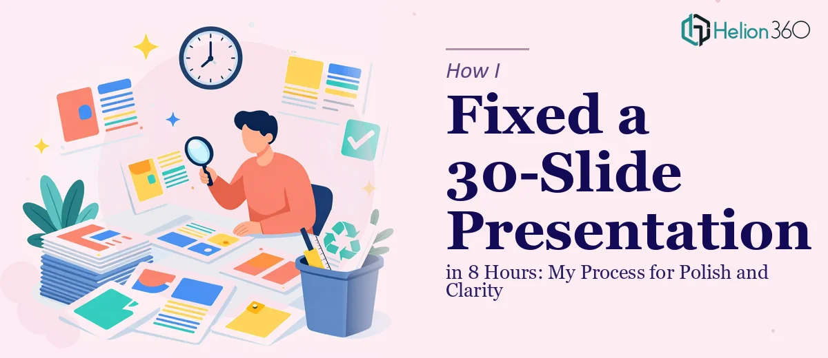
The Clock Was Already Ticking
I had two days and roughly eight hours of working time to clean up a 30-slide presentation before it went in front of stakeholders. The deck covered multiple aspects of company operations — which meant no two slides were structured the same way, the visual language was inconsistent, and the content ranged from dense text blocks to half-finished graphics.
On the surface, it sounded manageable. I've cleaned up documents before. But once I actually opened the file, the scope became clear. This wasn't a light polish job. It needed real work.
What a Presentation Cleanup Actually Involves
Most people assume cleaning up a presentation means fixing a few fonts and resizing images. In practice, it's much more involved than that.
The slides had three different font pairings used inconsistently throughout. Some sections used dark text on dark backgrounds. Several charts had labels that were either cropped or overlapping. A few slides were still carrying placeholder text that had never been replaced. And the overall flow — the visual hierarchy that guides a viewer from one idea to the next — was missing entirely.
To fix all of this while preserving the original structure required working through the deck slide by slide, making judgment calls at every step. That takes time and a trained eye.
I started with what I knew: standardizing the fonts, correcting the text contrast issues, and cleaning up the charts. But once I reached the slides that needed actual layout redesign — not just tweaks — I knew I was approaching the edge of what I could do well within the time constraint.
Bringing In the Right Support
I didn't want to submit a half-finished job, especially for a deck that was going to senior stakeholders. After hitting that wall around slide 15, I reached out to Helion360 and explained the situation — the deadline, the current state of the file, and what still needed to be done.
They asked the right questions upfront: what software the deck was in, whether there was an existing brand guide, and which slides needed the most structural attention. That conversation took about ten minutes. After that, they took over the remaining work.
What the Final Deck Looked Like
Helion360 worked through the second half of the presentation with the same level of attention I had applied to the first. The visual language became consistent across all 30 slides — same font system, same spacing logic, same approach to how data was displayed. The charts were rebuilt cleanly with proper labels and readable color contrast. Dense text slides were restructured so the key points could actually be absorbed at a glance.
The original structure stayed intact throughout. Nothing was rearranged, no content was removed. The goal was clarity, not reinvention — and that's exactly what came back.
What I Took Away From This
The biggest lesson was about scope recognition. A 30-slide presentation cleanup sounds like a single task, but it's actually a stack of smaller decisions that compound quickly. Font choices, layout logic, data visualization, slide-to-slide consistency — each of those is a craft in itself.
Working under an eight-hour window made it even more important to be honest about where my capacity ended. Trying to push through every slide alone would have meant corners getting cut somewhere. Bringing in Helion360 for the more demanding second half meant the entire deck was held to the same standard.
The presentation went out on time. The feedback from the team reviewing it was that it looked significantly more professional and was easier to follow. That outcome was only possible because the work was split appropriately.
If you're facing a similar situation — a deadline-driven presentation cleanup where the file is more complicated than it first appeared — Business Presentation Design Services is worth reaching out to. They stepped in cleanly, understood the brief, and delivered exactly what was needed without overcomplicating the process.