

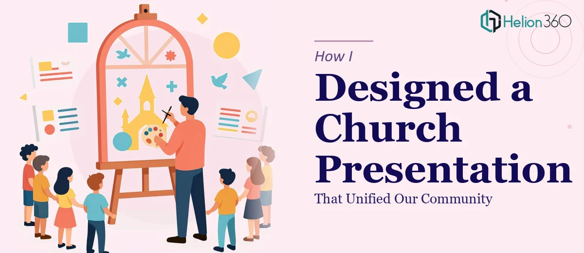
When a Church Event Needed More Than a Basic Slideshow
Our church had a big community event coming up — one of those milestone gatherings where the leadership wanted to present the church's history, introduce key volunteers, and celebrate what we had collectively accomplished over the past few years. The idea was straightforward: a polished PowerPoint presentation that could welcome the congregation, walk them through a timeline of major moments, spotlight the people behind the ministry, and connect recent events back to our core mission.
I volunteered to put it together. I have basic PowerPoint skills and figured I could handle it. I was wrong — at least about the scope of what was actually needed.
The Problem With Doing It Yourself
The moment I started building the slides, I realized the gap between what I could produce and what the occasion deserved. This was not a quick internal briefing. It was meant to impress and engage a full congregation, many of whom had been part of this community for decades. Every slide needed to feel intentional.
I spent a weekend working through the structure. I had a rough intro slide, a text-heavy timeline, and a few profile slides that looked inconsistent and cluttered. The images I dropped in were different sizes and styles. The fonts did not match. The color palette was all over the place. The charts showing community growth looked like something pulled from a school project.
More importantly, the presentation did not feel like it told a story. It was a collection of information, not a cohesive visual experience. And since the deck also needed to be fully customizable — so our team could update it for future events — the underlying structure had to be clean and well-organized from the start.
That is when I knew I needed to hand this off to someone who could build it properly.
Bringing In a Professional Design Team
After some searching, I reached out to Helion360. I explained the full scope: a church community presentation that needed a welcoming introduction slide, a visual timeline of major milestones, individual profile sections with photos and short bios for key members and volunteers, a section dedicated to recent events and how they aligned with our mission, and charts that made the community's growth feel tangible and meaningful.
Their team asked the right questions upfront — what tone did we want, what colors and imagery represented our community, how many slides were we expecting, and who would be maintaining the file going forward. That last point mattered because they built everything with editability in mind: named slide layouts, consistent placeholder structures, and a master theme so that anyone on our team could swap in new content without breaking the design.
What the Final Presentation Looked Like
The finished deck was a significant step up from what I had started. The introduction slide set the right tone — warm, welcoming, and grounded in the church's identity. The timeline slide used a clean horizontal layout that made decades of history easy to follow at a glance. Each key member's profile section had a consistent format: a properly sized photo, a short bio, and just enough white space to feel dignified rather than cramped.
The recent events section was particularly effective. Instead of just listing activities, the slides visually connected each event back to a specific part of the church's stated mission. It gave the congregation a sense of continuity — that everything happening today is an extension of what was built years ago. The charts showing attendance growth and volunteer participation were simple and readable, which was exactly what the moment called for.
Helion360 delivered a presentation deck that felt unified in a way I simply could not have achieved on my own. Every slide used the same font system, the same spacing logic, and the same color language. It looked like a single designer touched every page.
What I Learned From the Experience
The task was never really about making slides. It was about representing a community in a way that honored their history and motivated their future. That requires more than knowing where to click in PowerPoint. It requires design thinking, layout discipline, and an understanding of how visual storytelling works across a full deck.
If you are in a similar position — building a church presentation, a community profile, or any event-driven deck where the stakes are higher than a typical meeting — Helion360 is worth reaching out to. They took something I had started but could not finish properly and turned it into a presentation our congregation was genuinely proud of.